Founded in 2017, Feeding Trends is a young company that provides digital content and web-based
industry solutions. The Feeding Trends website supports organizers with cost-effective event
ticketing solutions and engages users through published articles and stories.
I was part of the team for almost two years as the lead designer. During that time,
I worked closely with the company’s co-founders, developers, content writers, and designers
to completely overhaul the design, establish a new design system, and introduce features that
aligned with customer needs. Most importantly, I focused on enhancing user experience across
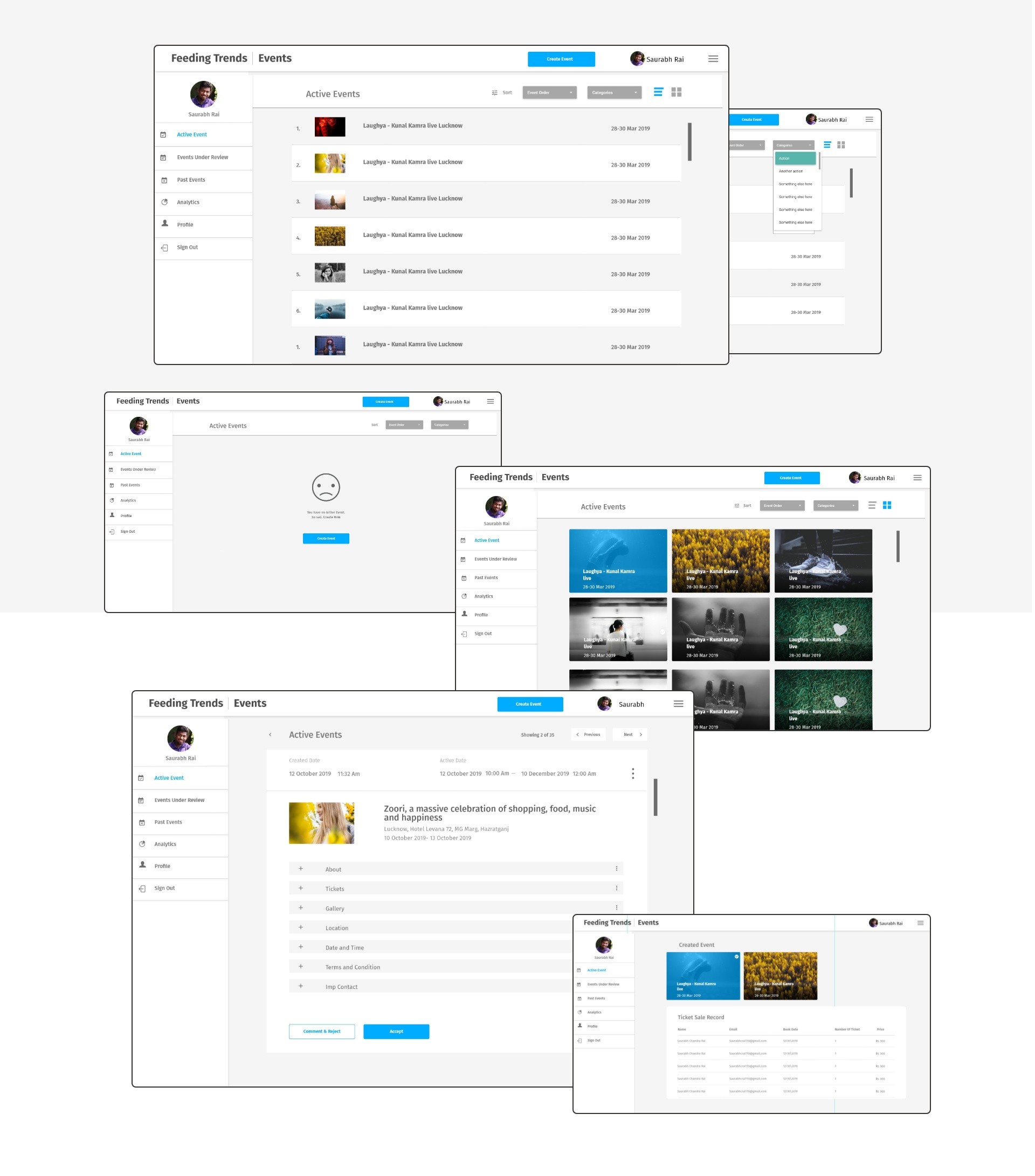
all projects I contributed to. One of the key internal projects I worked on was FT Event.
FT Event is an event platform where users can book tickets and create events.
Through the FT Events website, users can register for events, purchase tickets, create
and manage events, and oversee ticketing from a dedicated dashboard. Additionally, the platform
provides access to information about past and upcoming events, event results, image galleries,
charity event organizers, participating musicians, exclusive Feeding Trends advertisements, and more
This case study captures the design work I delivered for FT Events five years ago.
At that time, the platform was still in development, and the final product might have evolved
from my initial designs. Looking back, I hope the project turned out as envisioned, and I
appreciate the hard work Shekhar and the team put into bringing it to life.
The idea was to make Feeding Trends to the Beat website as a one-stop-destination
for all-inclusive information and updates on everything associated with the event.
Challenge
The biggest challenge was making the event portal feel connected to Feeding
Trends while keeping it unique. Since Feeding Trends already had a website and brand
identity, the event portal needed to blend in while standing out.
Additionally, the event booking space is highly competitive, with many
platforms offering similar services. The goal was to create something intuitive and
simple yet engaging enough to attract users, encourage event discovery, and make ticket
booking seamless. Balancing familiarity, uniqueness, and usability was the key challenge.
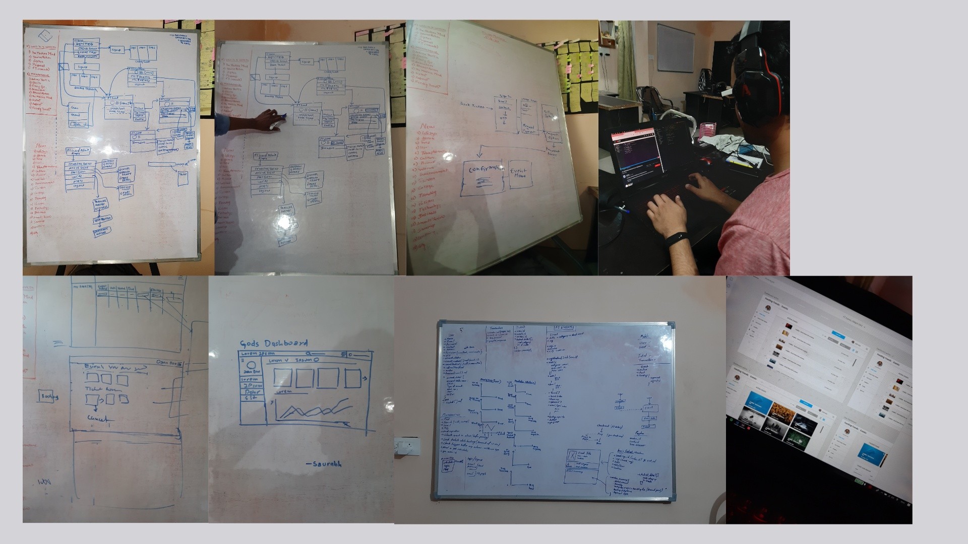
Research and Ideation
After thorough research, we planned how users would interact with the platform and
identified ways to monetize it. This helped us create a clear website structure and site map
for a smooth experience.
From our past experience with Feeding Trends, we learned the challenges of building a
content platform. To keep the design simple and scalable, we followed Google’s Material
Design Guidelines, making development and implementation easier.
After the initial findings and research, I decided to coordinate a Google Design Sprint to
align the team on how we could encourage users to share events on other platforms while
keeping the experience intuitive. I gathered people from product, engineering, customer success,
and marketing for a 5-day sprint where we ideated, sketched, discussed, designed, and tested our
concept with customers to gather real insights.
Is it the right page? Does the page have the content which I am looking for?
Do they have anything better, if this is not what I’m looking for? What is expected of me now?
I asked these questions again and again, discussed it, researched existing solutions, came up with different possibilities. Started
designing UI in XD which I was sure of and as I got further, things got easier and easier.
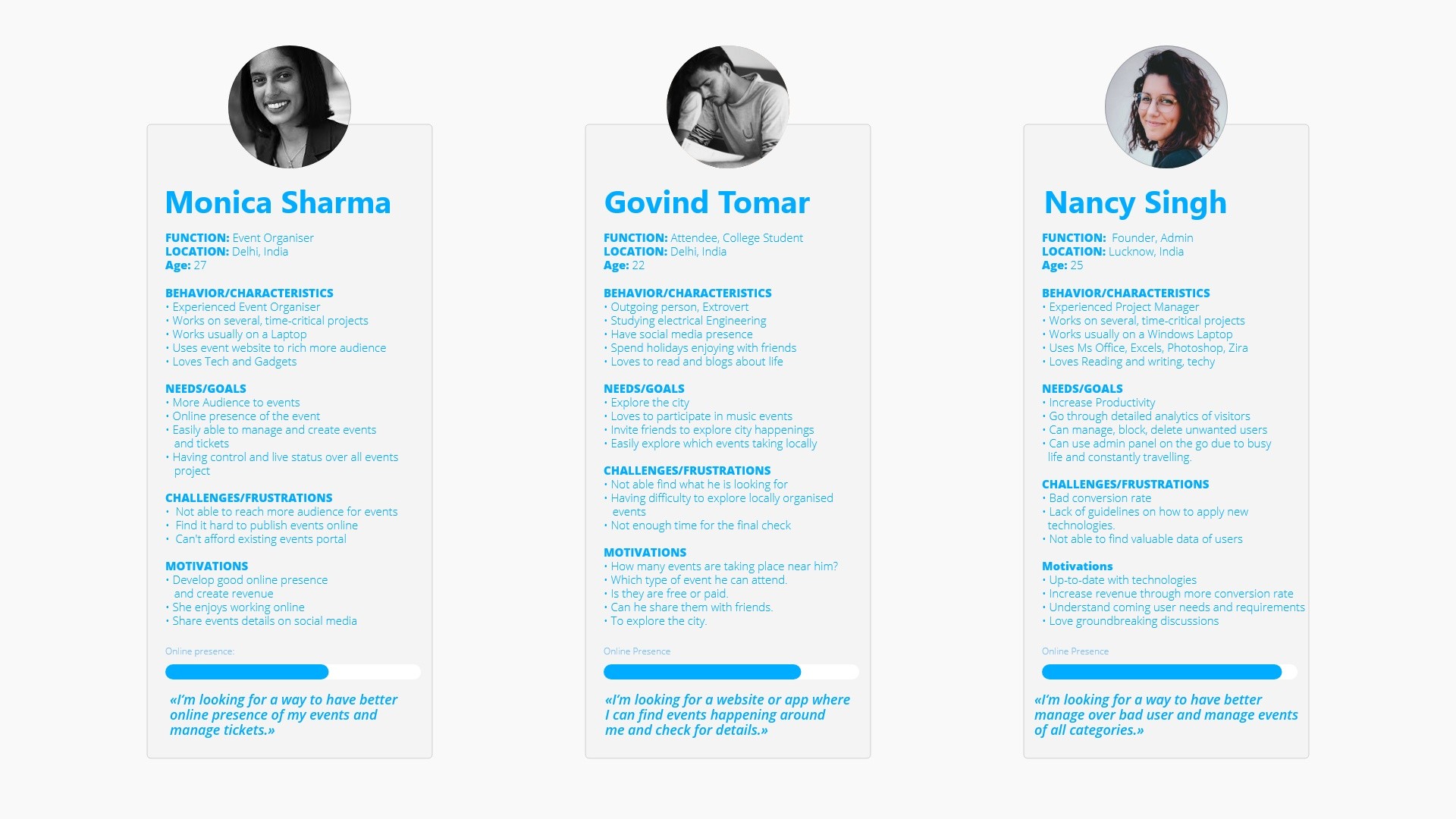
User Personas
Competitive Analysis
I analyzed event booking platforms like Townscript, 10Times, Insider, Eventbrite,
and Paytm Events to understand their strengths and weaknesses. Eventbrite had a smooth
event creation process, while Insider offered great personalized recommendations. Paytm
Events was strong in payments but lacked an intuitive user experience. 10Times focused on
business events but felt cluttered, and Townscript had a good ticketing system but needed
better event discovery. These insights helped us create a simple, user-friendly platform with
improved event browsing, booking, and management.
User Types
Through our research, we identified three main user types for the event booking platform:
Normal Visitors (Attendees) – Users who visit the platform to explore and buy tickets for events.
Event Creators (Organizers) – Individuals or businesses who publish and manage events.
Admins – Moderators who oversee event listings, ticket sales, and user authentication.
Each user type has different objectives and slightly different experiences on the platform.
We also developed a simple habit loop considering each user type.
Habit Loops
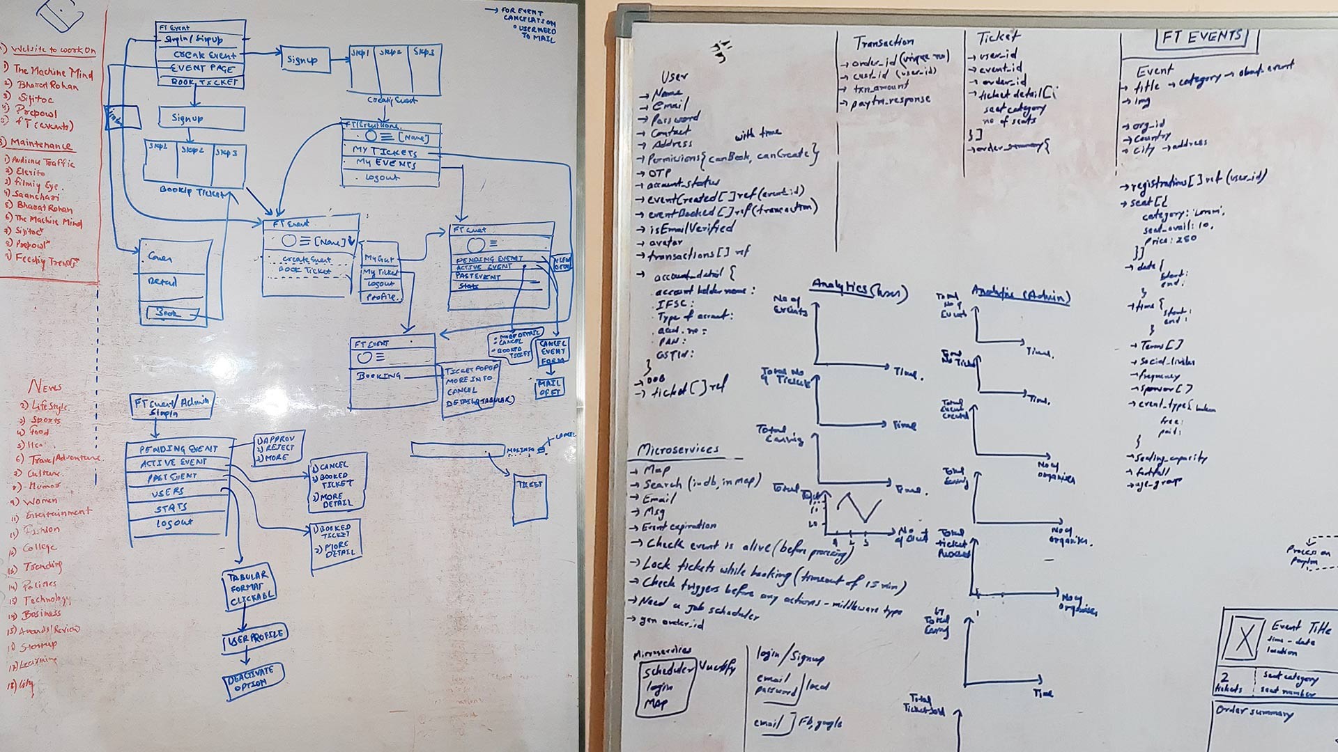
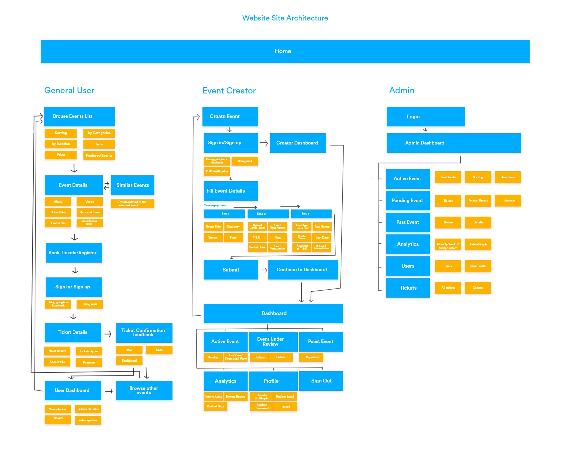
Site Architecture
The platform was designed with a clear and intuitive structure to ensure a smooth experience for
all user types, Attendees, Event Organizers, and Admins.
Attendees can browse, book, and manage their tickets seamlessly.
Organizers have a dedicated dashboard to create, promote, and track event performance.
Admins get a powerful control panel to approve events, monitor transactions, and manage platform policies.
With this way each user type can navigate effortlessly while keeping the platform scalable and efficient.
Site architecture
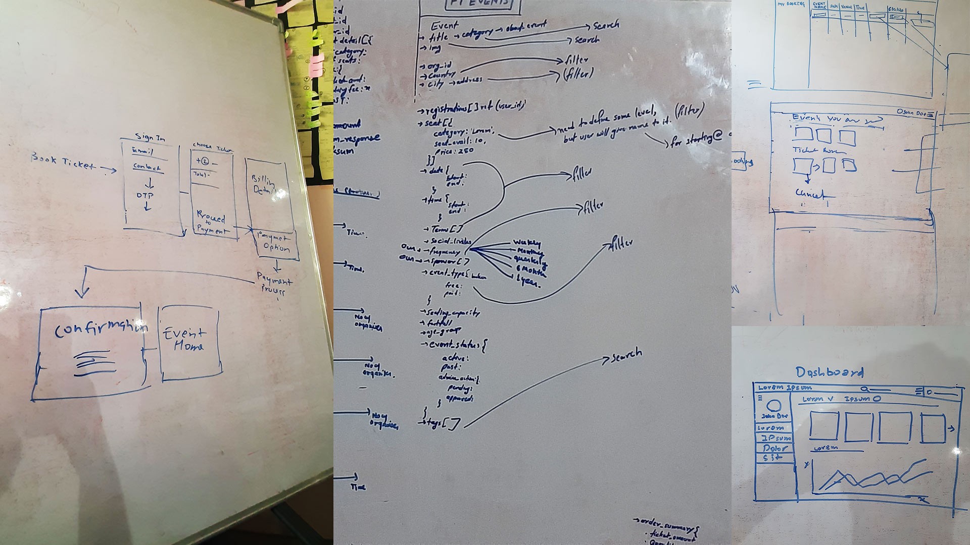
User Interface Design
After finalizing research, user personas, and wireframes, I started designing key UI elements
like tabs, search, and content layouts.
My goal was to make the experience smooth and intuitive, guiding users naturally without confusion.
The best design is the one users don’t have to think about—it just works.
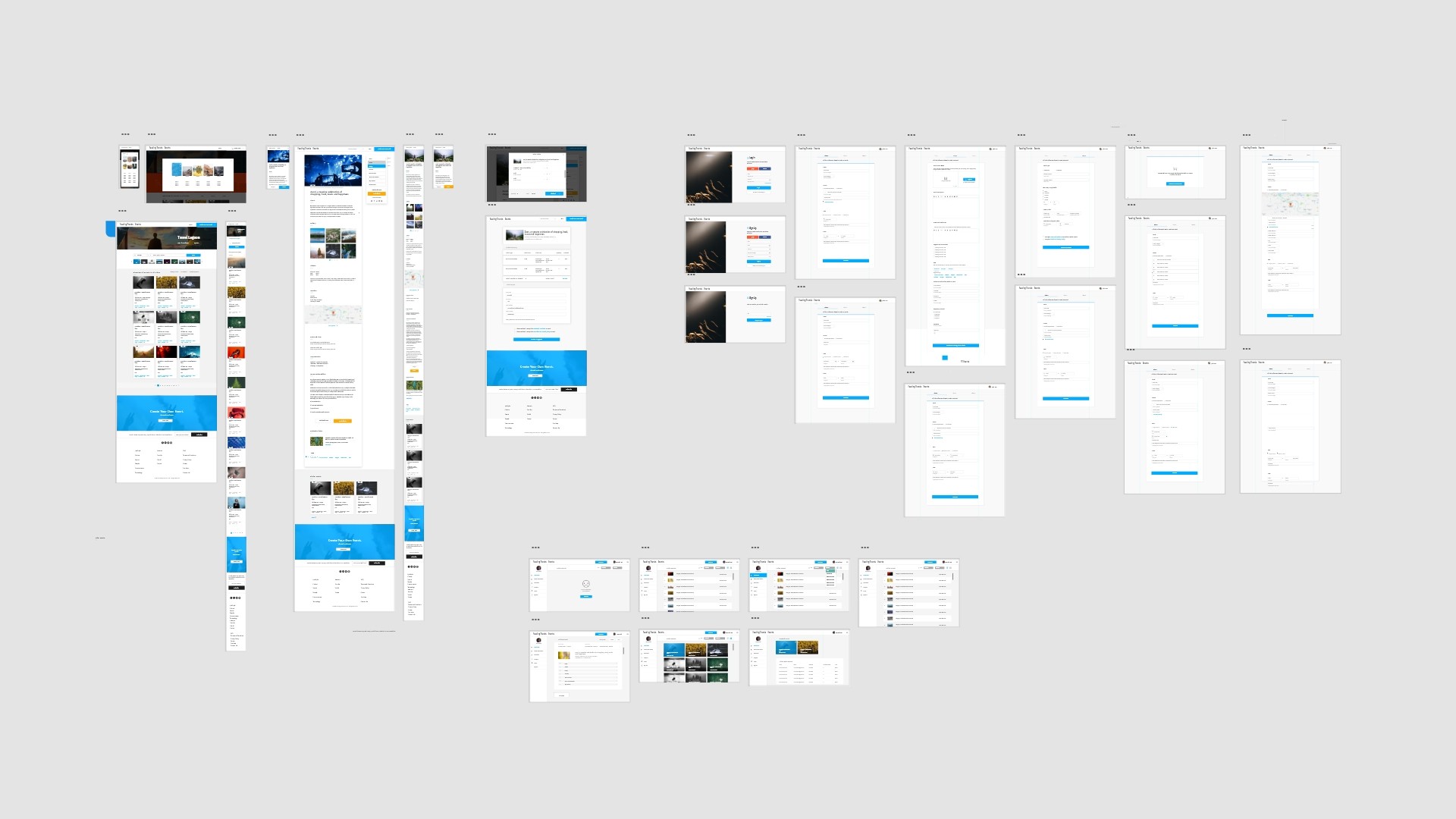
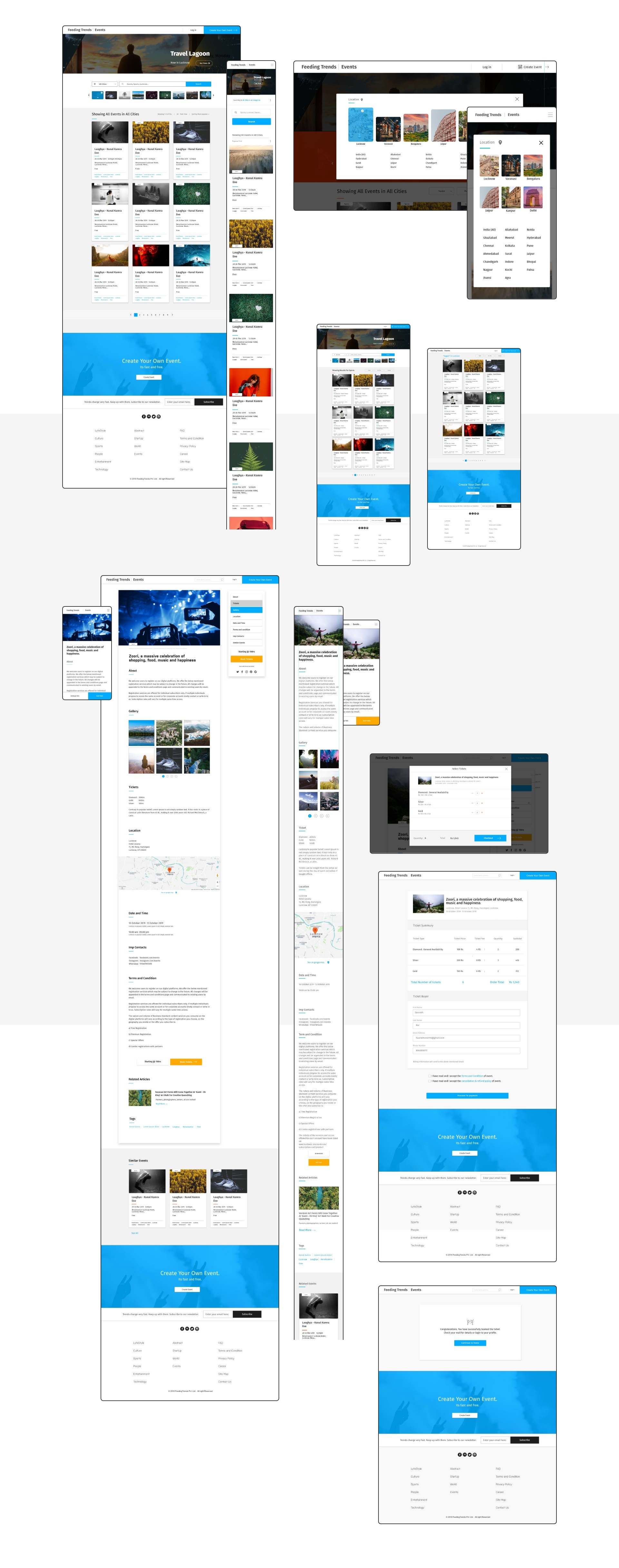
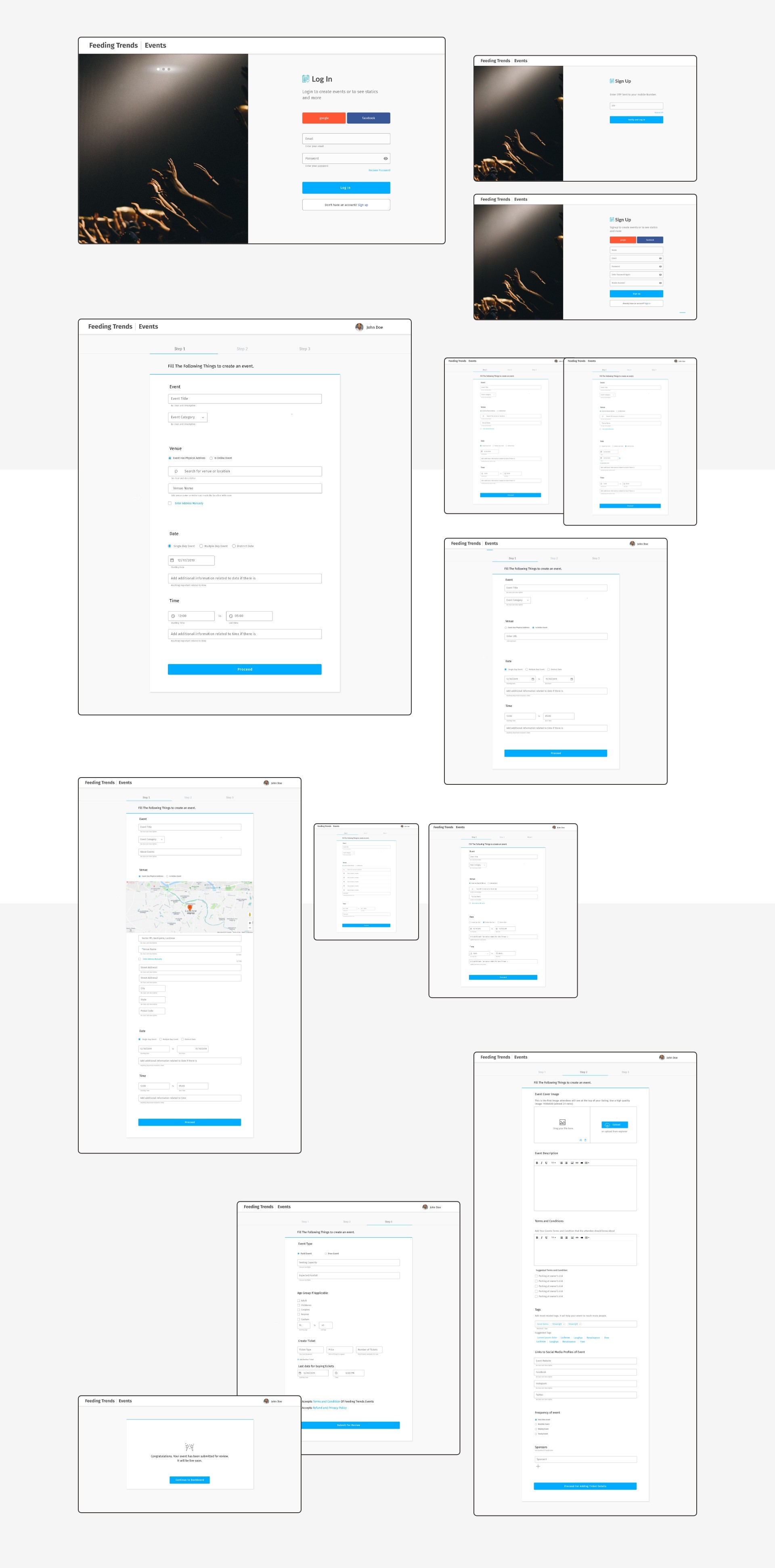
All Screens
Attendee Experience
Attendees come to the platform to find and book events. The process is simple, browse events,
buy tickets, and get updates.
Event Creator Experience
Event creators plan and host events. They can list events, reach their audience,
and track performance and ticket sales, all in one place.
The Admin Experience
Admins keep everything running smoothly. They approve events, manage ticket
sales, and track which types of events are performing well.
The Analytics Dashboard helps them see trends, audience engagement,
and what’s working best on the platform.
Constantly Learning and Evolving
Working in a small, agile team meant we could quickly adapt to feedback. We consistently gathered
insights from users through interviews, usability tests, and real-world observations. Every iteration
was an opportunity to refine the platform—making event discovery, creation, and management smoother
for all user types. The learning never stopped, and neither did our commitment to building a seamless
experience.
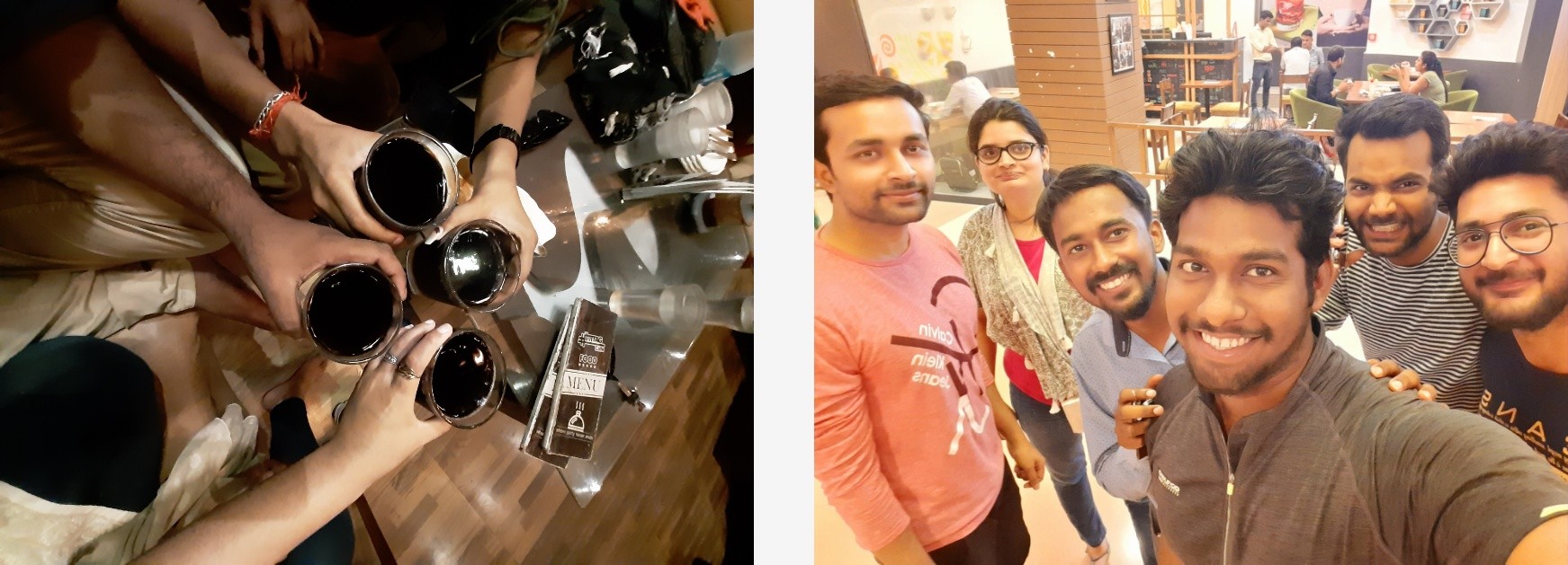
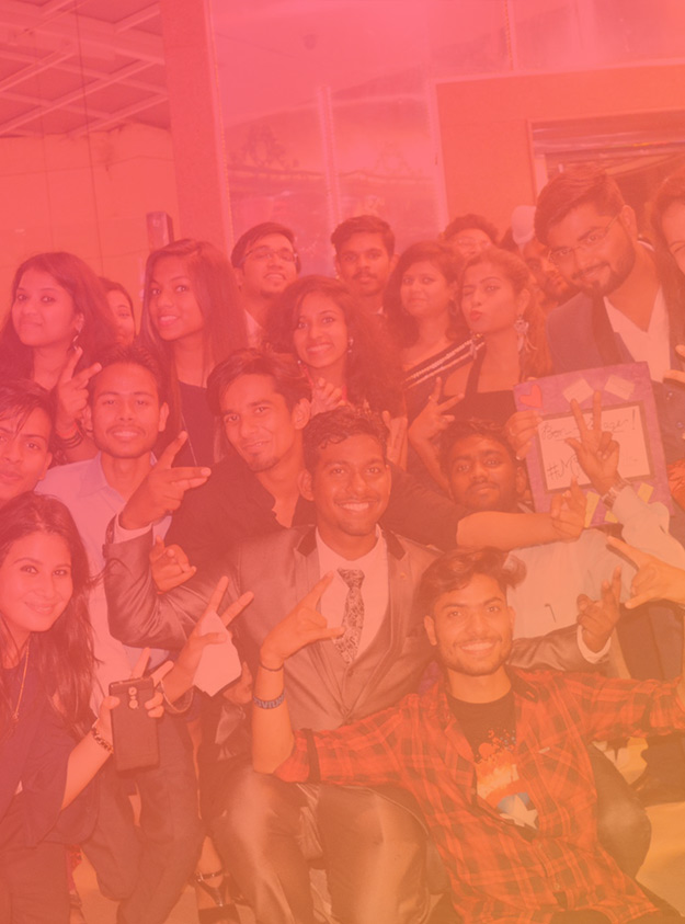
FT Event Team
Stuff I did
✔ Research✔ Ideation✔ Taking Design Meetings✔ Collaborating with Content writers✔ User personas✔ Drank Lots of Coffee✔ Taken Stress✔ Made Wireframe✔ Structured User Journey✔ Worked in nights✔ Branding✔ UI Design✔ Defending UX Decisions✔ Pop and un-pop things
A Journey of Challenges and Growth
This project was a long and challenging ride filled with high-pressure moments,
unexpected roadblocks, and countless refinements. Designing wasn’t just about creating interfaces;
it was about solving real problems and anticipating user needs. Every decision had a ripple effect
on development, making clear communication with developers crucial. Learning basic HTML and CSS
helped me bridge the gap between design and implementation, allowing for a smoother workflow.
Despite the challenges, we stayed focused, adapted, and pushed forward. Seeing the final product
come to life, knowing it would make event planning and discovery effortless, was the most rewarding
part of the journey. The experience reinforced a key lesson: every challenge is an opportunity to
learn, grow, and create something meaningful.
Every decision has a ripple effect on development, making clear communication
with developers is crucial.