Designing Web Experience for a film production studio
Creating web identity from scratch
Timeframe
April 2018- May 2018
2 Month
Tools
Adobe XD, Illustrator, Photoshop, Zeplin,
Pen-Paper and lots of Ice-Tea
Role
Art direction,
Visual Design, UX
Team
Dev: Shekhar, Boss: Yash Srivastava, Content
Writer: Zainab Siddique, designer- of course me
Preface
Filming eye is a film production studio based in Lucknow. They do photography, short films, music
videos, advertisements shoots. Basically things that can be captured with camera and of course there
existing team skills. Filming eye have got some headlines in news in the past about their commendable
work and nominations of their videos in different film competitions. The team comprised of talented who
with their camera and skills was able to produce breathtaking works. People knew me already. So they
kind of wanted me to work on their website.
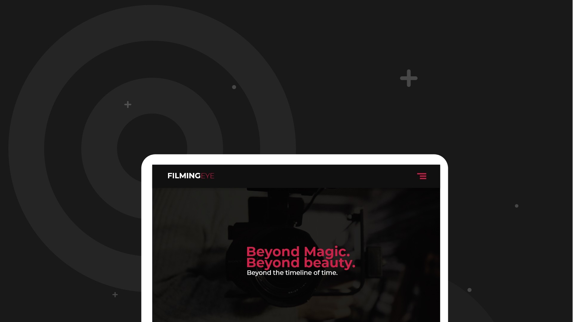
Basically the brief was clear: design a simple, clean and elegant showcase website. But also an especially recognizable
and branded ‘Easy Tiger’ website with key values like boldness and modernity.
Brief: design a simple, clean and elegant single page website. But also an especially recognizable and branded ‘Filming Eye’ website with key values like boldness and modernity.
Challenges
1. The first thing that I came around was that there was no existing branding.
2. They did have and existing logo but that cant be used on the web. It was raster, big, not cool. No way
it was possible to use that on web.
3. No copywriter, no information architecture.
Designing grid for project section
previously, Filming Eye had had very little digital presence,
so everything had to be created from scratch. Nice for me but it meant a
large amount of strategic and graphic work. I had a very small amount of
brand assets and communication materials around the products.
Ideation and Research
A lot of things got cleared what we wanted and what we don't. After sticking to things we liked and deleting things what we do not need on the website.
Branding
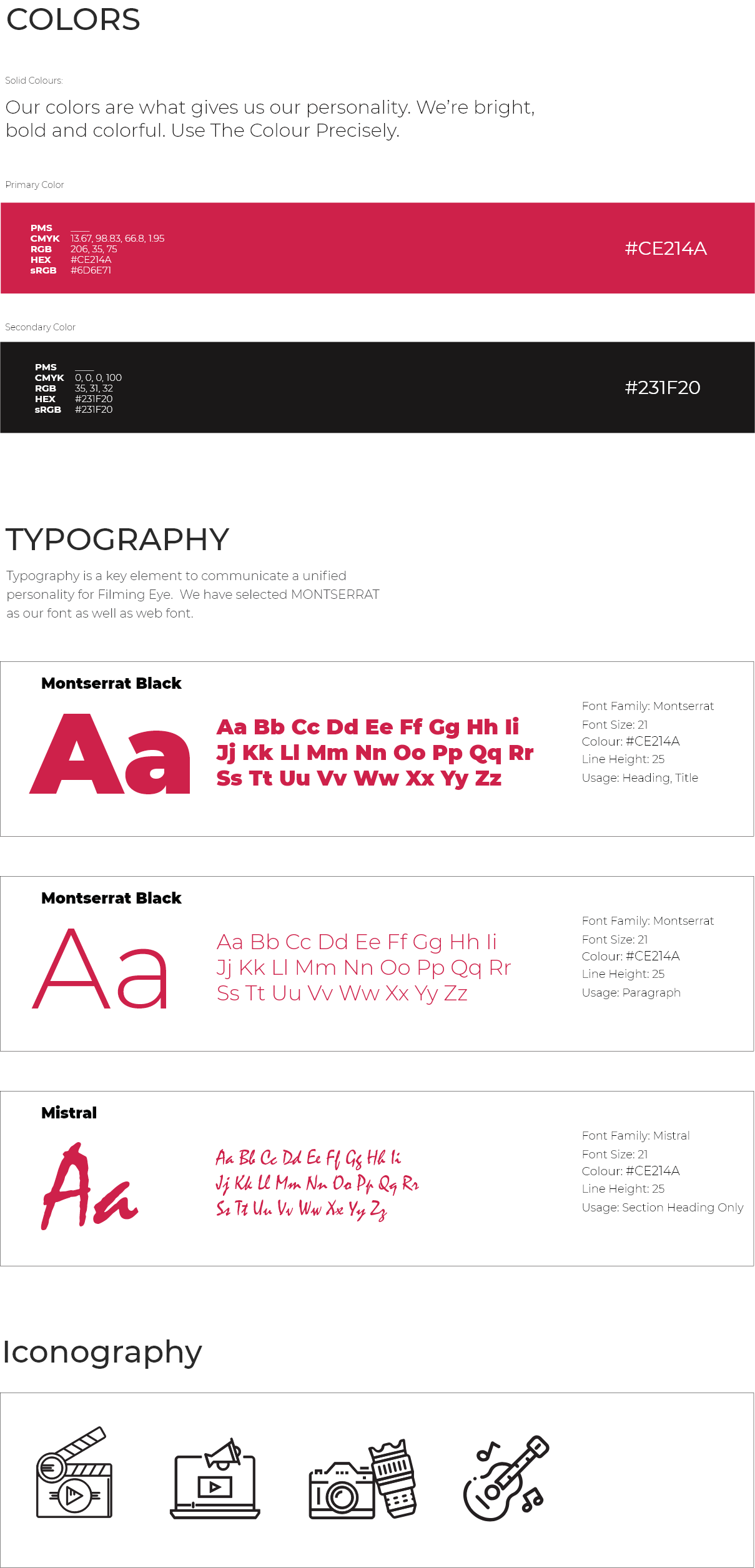
From the very beginning of the design process, it was our goal to work on dark mode website. It contains a lot of red.
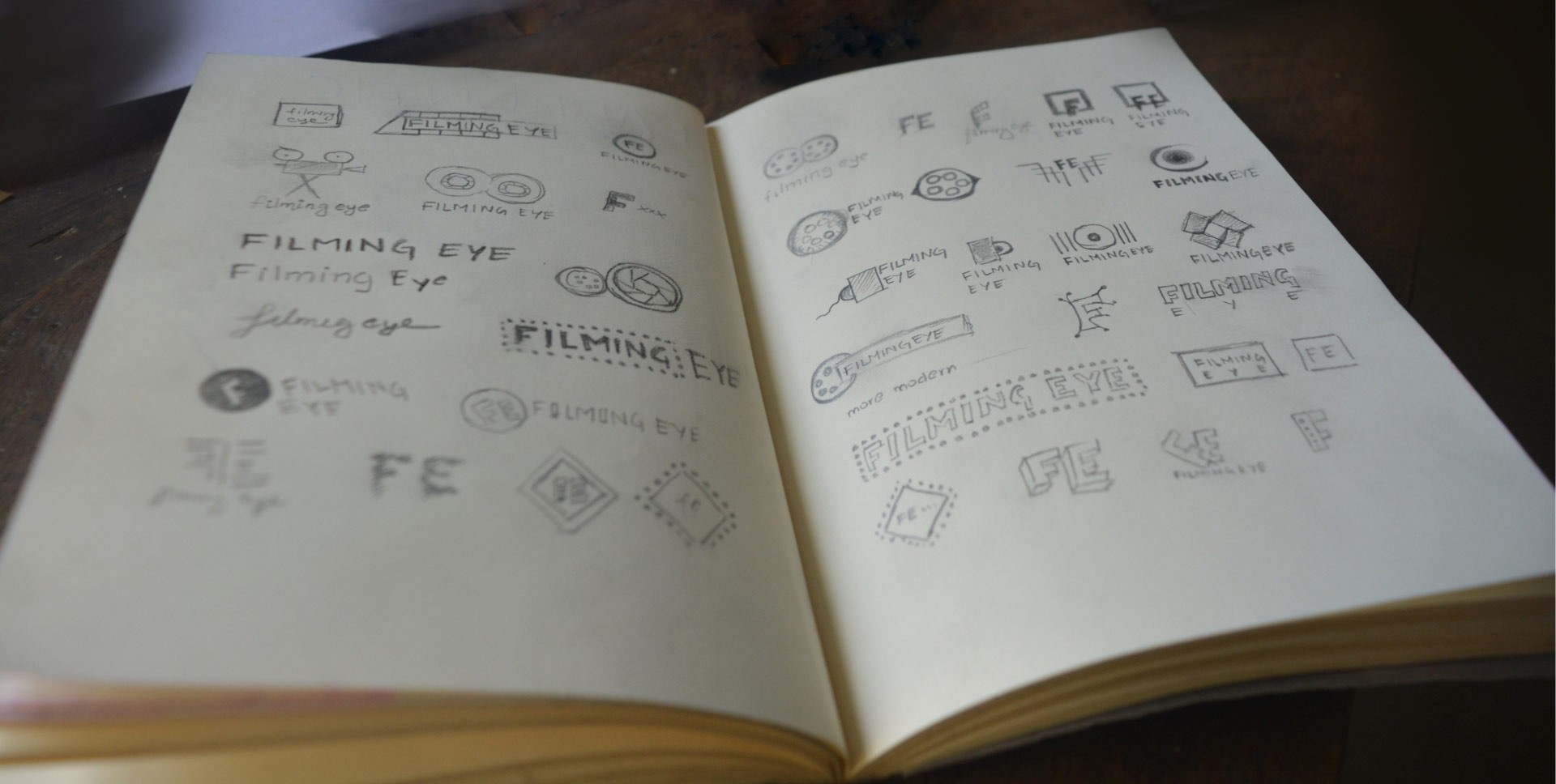
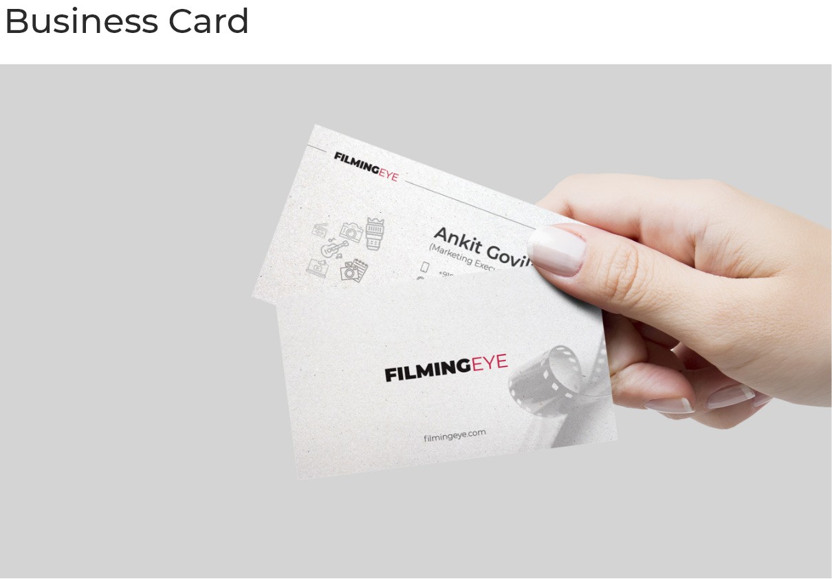
Logo ideation
Photography/Imagery
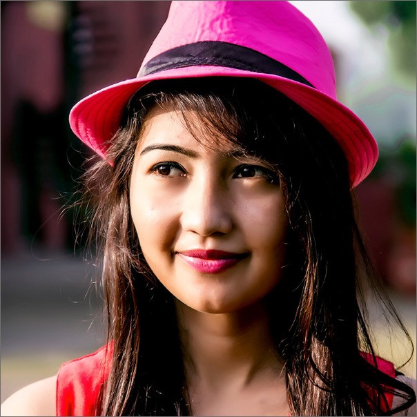
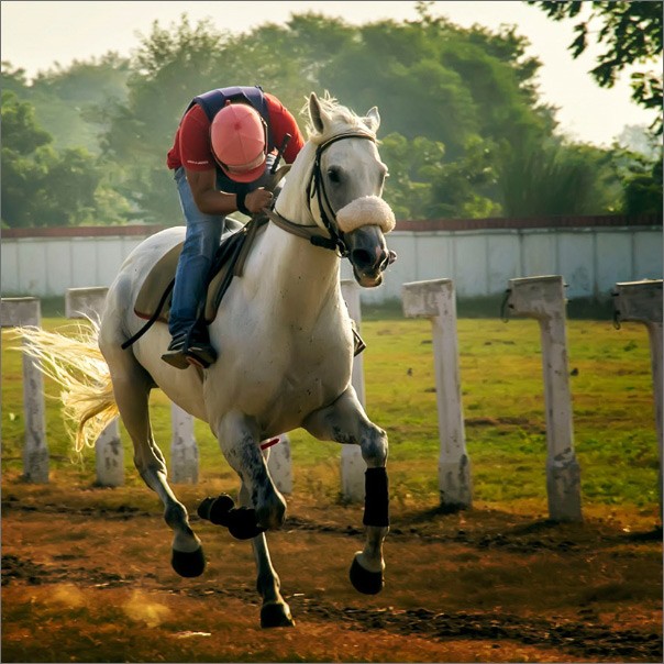
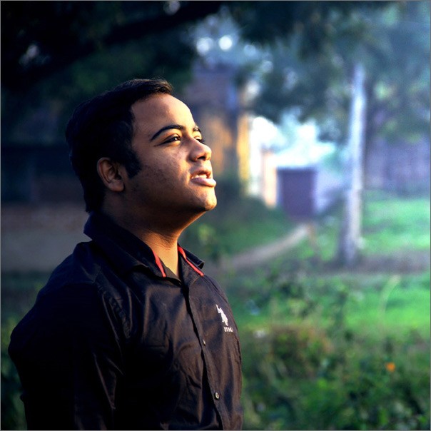
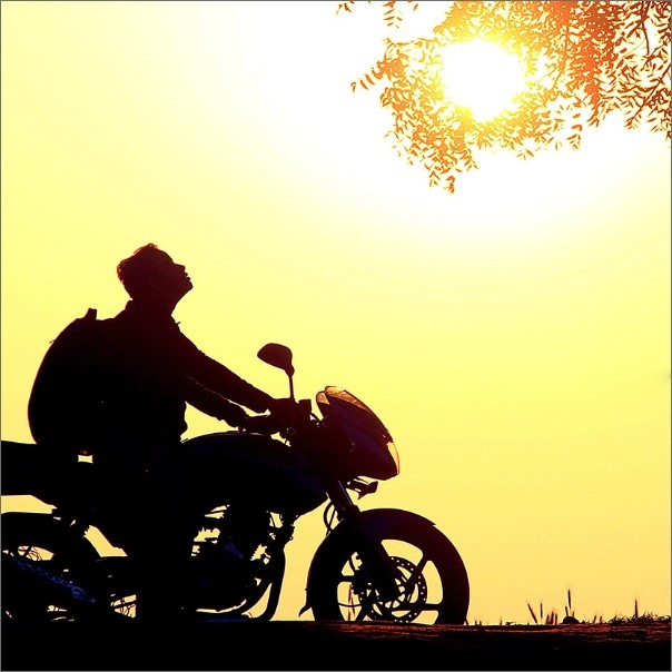
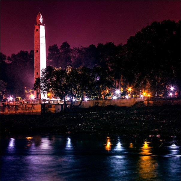
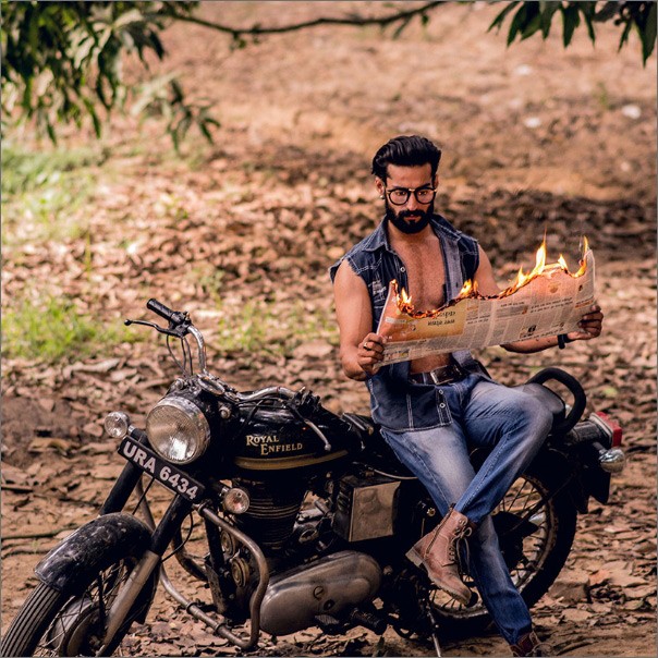
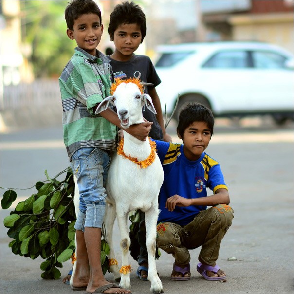
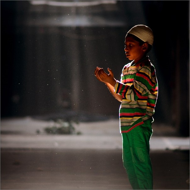
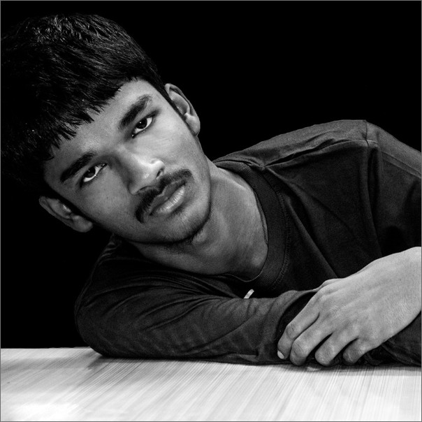
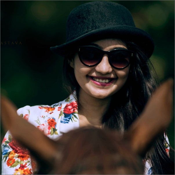
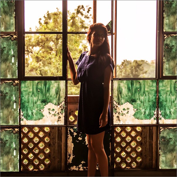
I worked closely with Filming Eye Team to create and short out photos from photoshoots. Photos that showcases the meticulous detail and design of their work across all photography style to showcase the photos in a way that truly reflects their talents and make wow effect on website visitor.

Web Design
Putting all these things into website
First Iteration
The first iteration was designed by my junior designer. He worked really hard and came up with a
great layout and which made almost most of the things we needed in and that we don't needed.
Before being given into development there was this huge gap of like 6 months. After this long time
when I looked with back and and with my fellow designer Aakash. We didn't like it much. A lot of
thing needed to retouch. The works seems sloppy. So all the things needed retouch. In a way I
changed almost everything expect the dark theme and colour and content architecture.
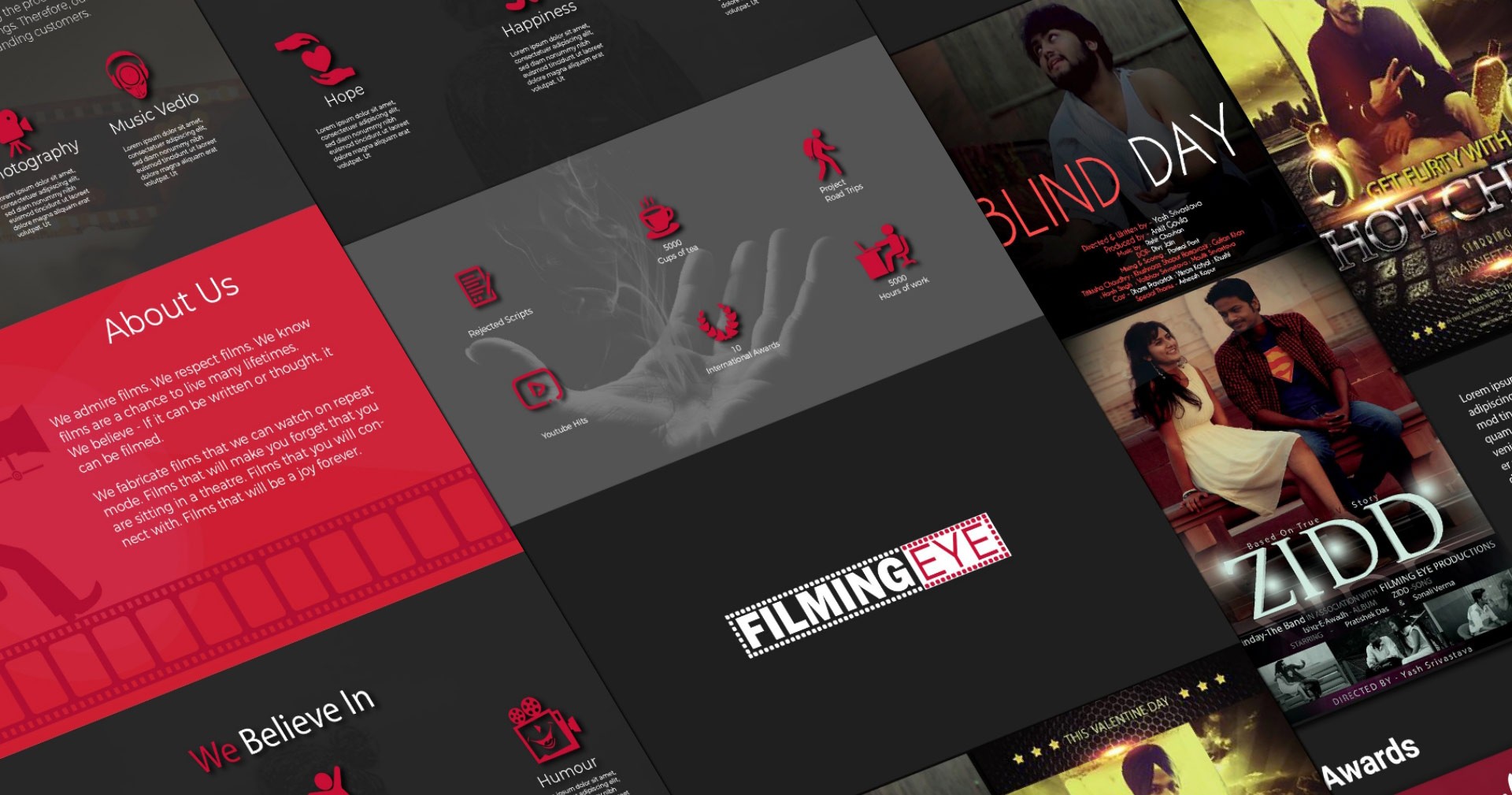
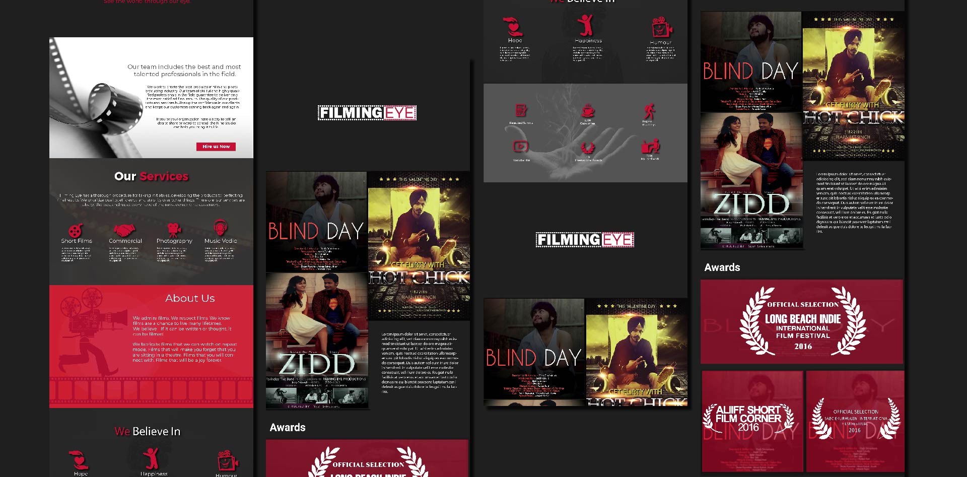
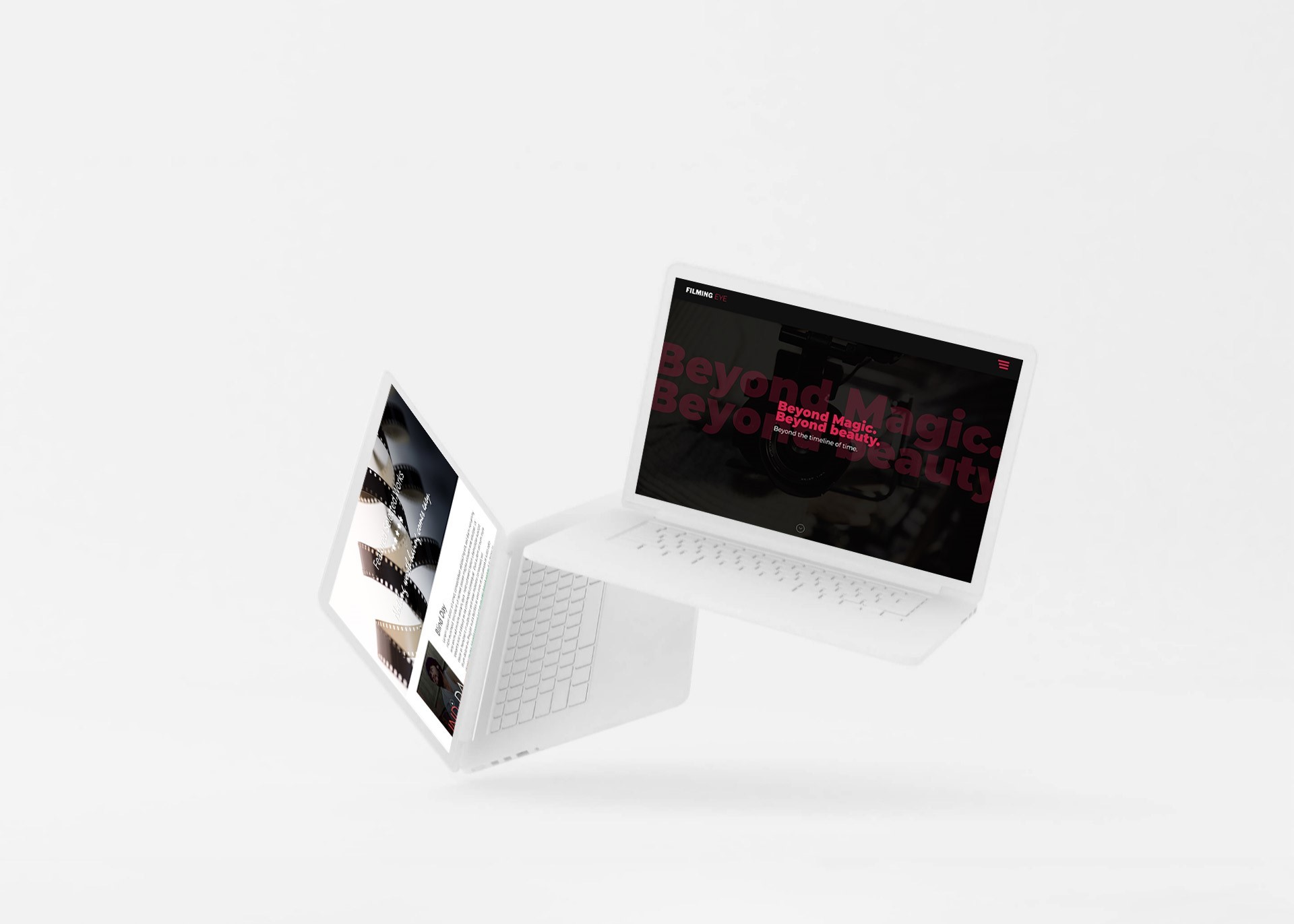
Here we go! Final final design.
The first iteration was designed by my junior designer. Hw worked really hard and came up with a great
layout and which made almost most of the things we needed in and that we don't needed.
Before being given into development there was this huge gap of like 6 months. After this long time when
I looked with back and and with my fellow designer Aakash. We didn't like it much. A lot of thing needed
to retouch. The works seems sloppy. So all the things needed retouch. In a way I changed almost
everything expect the dark theme and colour and content architecture.
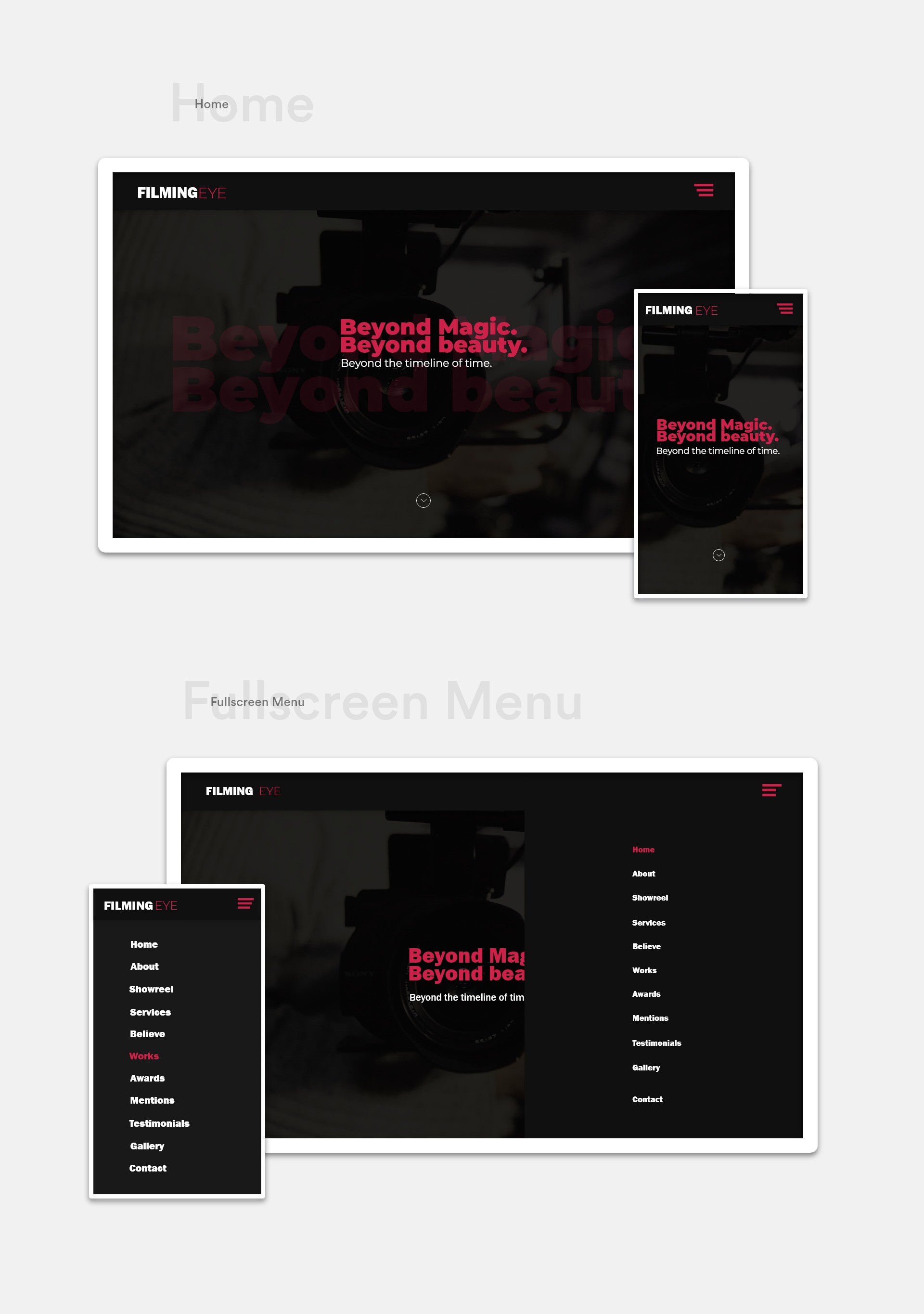
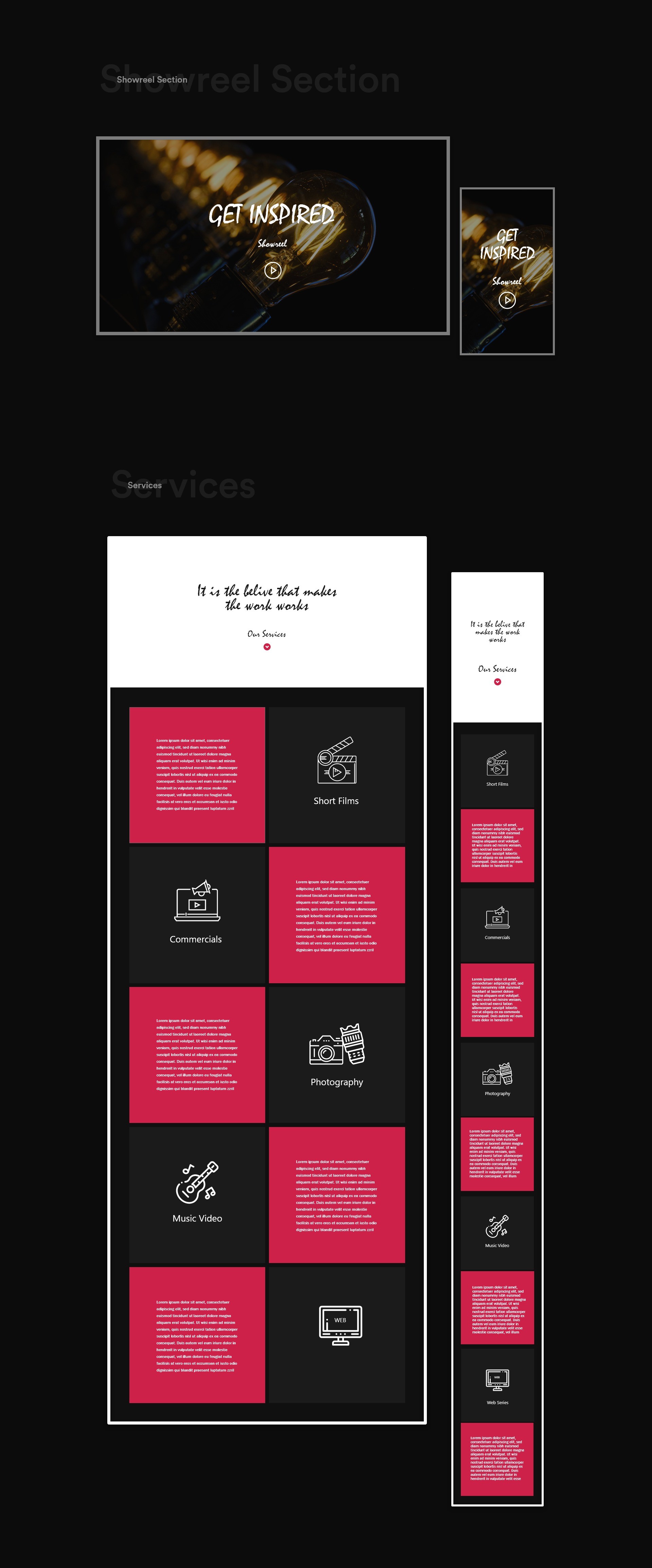
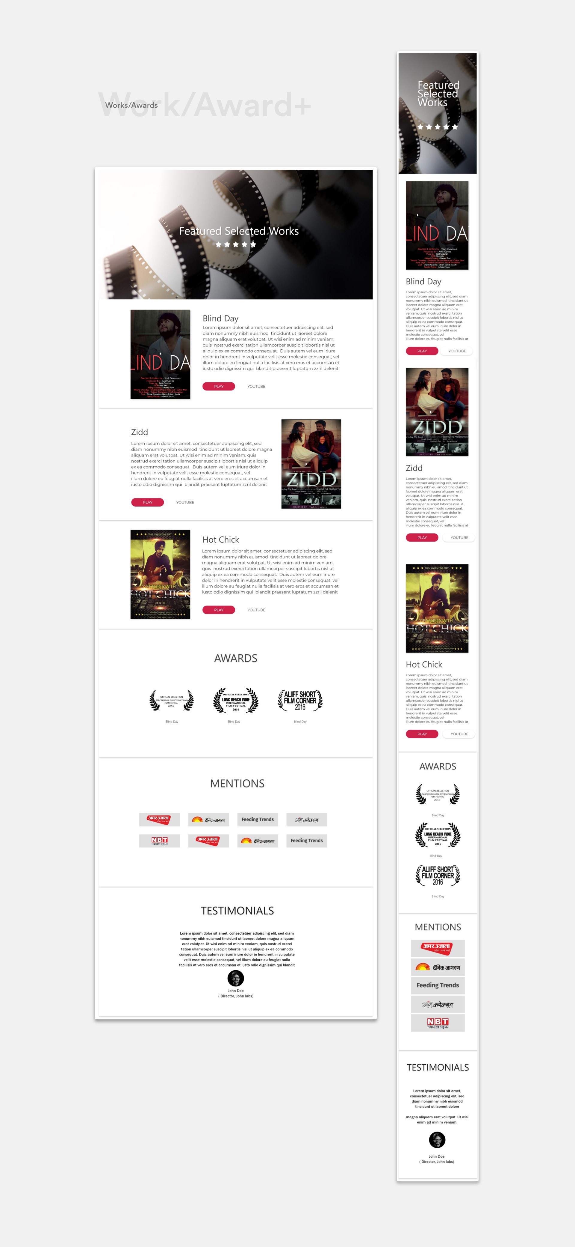
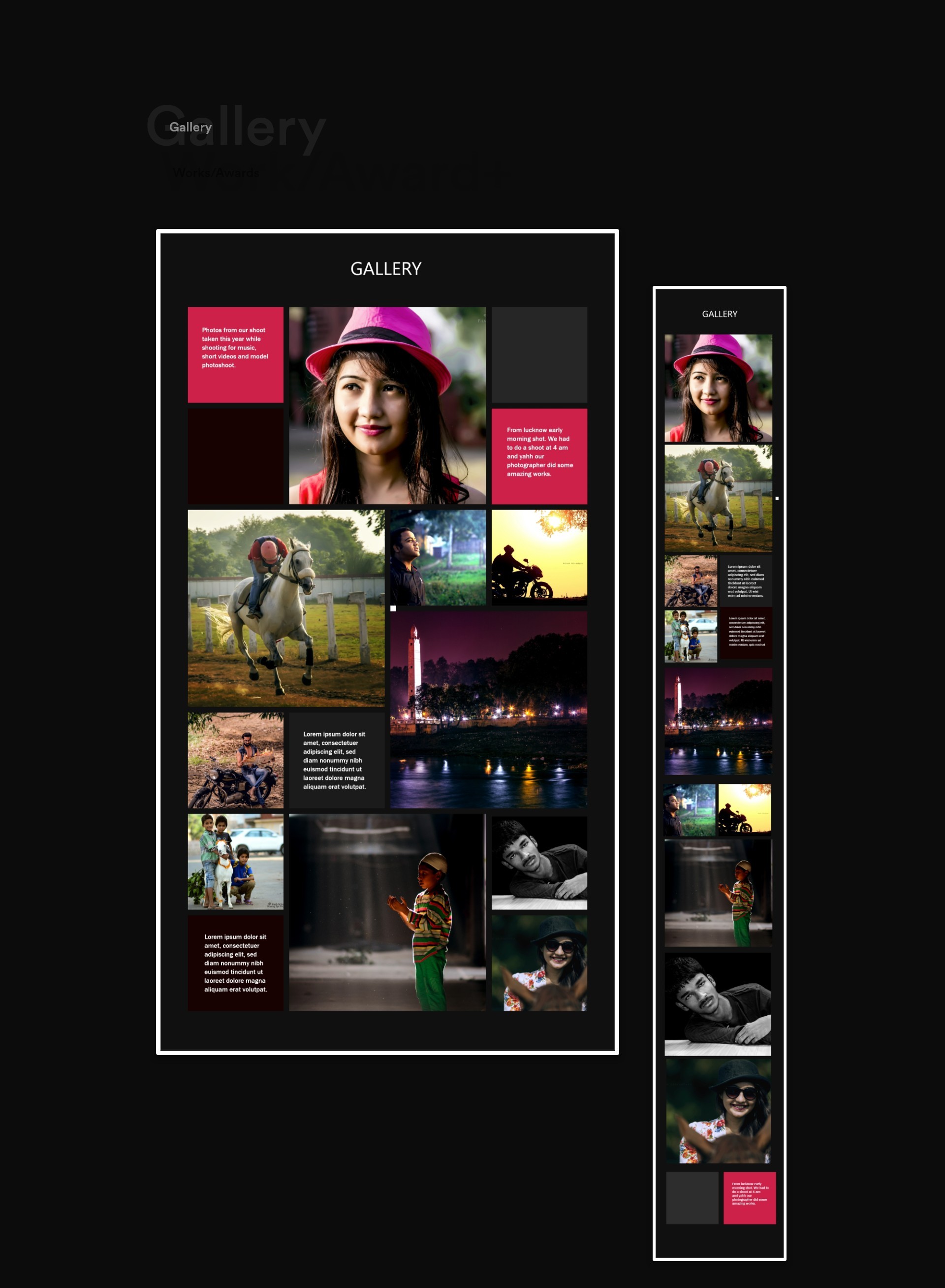
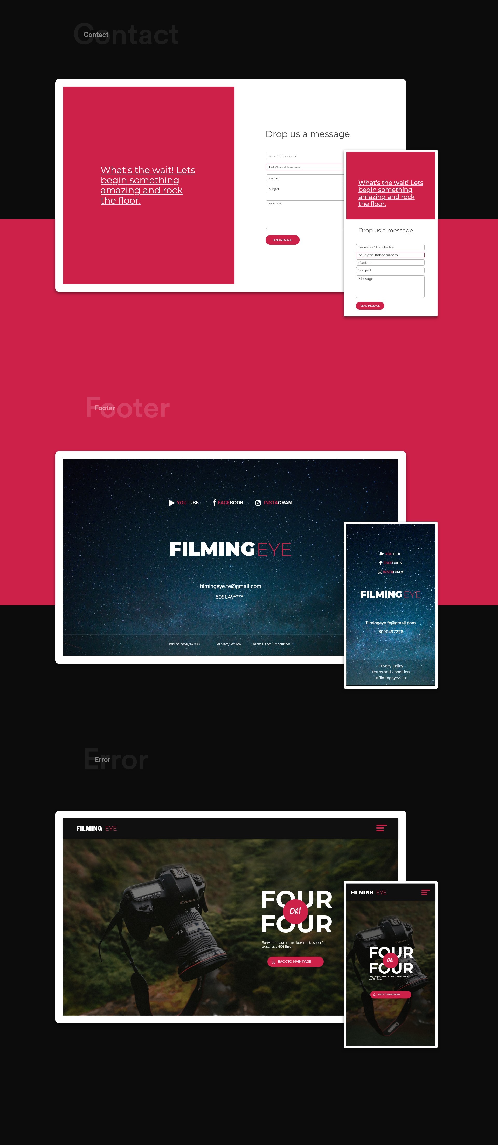
We started this project with the ambition to create a different experience, something meaningful and timeless. To achieve this, it was important to focus on a strong concept around nature and all it has to offer. The idea of the
Final output
The website is no more online. Here is the video of the website after final deployment.
Technology
There was this one evening, When shekhar send me test link for the website.
When I visited the website i couldn't believe myself. I just felt so proud and amazing. The parallax effect, smooth transition
Smooth mouse wheel scroll. and Fade effect. It was just amazing. To see your design into reality is so satisfying.
I was actively collaborated in the development process, didn't code any line of code.
Though I was able to know how and what language and plugins were used to create such a awesome single page website.
The technologies used to make this little magic happen-
1. CSS3
2. HTML 5
3. jQuery
4. Larawel (backend)
5. AOS.js (For scroll transitions)
6. Parallax.js (Image parallax effect)
7. easescroll.js (Smooth mouse wheel scrolling)
8. Actual Humans
Learnings
During My work on filmingeye, It happens many time when I asked for certain things, assets, photographs, on which my further design depends. I really really got feedback very late at time of meltdown. When these things happen, Patience is key. Stay Patient and trust the process.
Don’t be afraid to show your vulnerability. Be transparent with your team. Trust your Developer.
Thanks for scrolling
Don't forget to appreciate.
