December 2017 feedingtrends.com Product Design
Stories that make you think and rethink.
Creating a digital experience for budding writers and readers.
Timeframe
April 2018- May 2018
2 Month
Tools
Adobe Creative Suite
Sketch, Flinto
Role
UI/UX Designer
Graphic Designer
Team
UI/UX Designer
Marketing
Feeding Trends is an online media company organizing literary styles for interactive journalism. They publish
global trends, which are important, relevant and interesting. Their prime focus lies in the curation of highly engrossing content.
Working diligently to convince people into spending time with content, through effective imagination, creation and presentation.
And in a way wishing for is to uplift the notion that ‘media is dead’. Wanting to do wonders with their content, with people talking about them, anywhere and everywhere
- night outs, road trips, birthdays parties, conferences, and even family functions! All through
feedingtrends.com
Back in 2017, Yash Srivastava and Zainab Siddique,
my seniors, co-founded feeding trends. I was in 6th semester, enjoying some home time during summer vacation, got a call from
Yash sir and I was asked to do a logo design for Feeding Trends. I remember it was a long call. Moving forward, logo designing
is tough, I took my time and did textual logo, used a Sans font, outlined it, played around arrow, to make it feel like
trendy stuff and yeah Finished. We moved forward with the logo design and updated the logo on Facebook, Instagram etc.
FT got recognized and people started sharing our stuff and yeah it was great start.
Later on after 2 month I joined FeedingTrends while still managing my time around
college and working at feeding Trends Office. Bunking classes just to work on outgoing
projects at FT office or from my flat. It was Beginnings of something great.
Bunking clsses to work on outgoing projects while still managing college
assignments and all. It was beginning of something great.
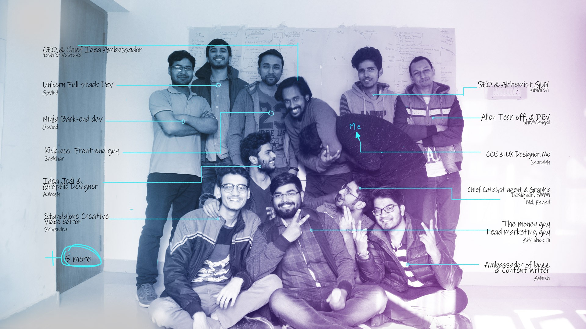
Feeding Trends Team: 2017
Back to design: Project Brief
Feeding Trends initial website was already up and running, After our initial success with the website, acquiring some user base
we started getting feedback from users about technical problems, readability issue, and many more problems.
Then, people around the team felt a need
of redesigning the website from scratch. This is were I came. We began pinpointing the areas where we need to start, discussing technical constraints,
and possible approach to design. The objective was set to improving the overall UX, Create a positive user journey that aligns also with marketing strategy.
Problems to be Solved and Considerations
1. Clear structure and navigation flows
2. Compelling visual design
3. Great copy and tone of voice
4. Thoughtful transitions and animations
5. The website's performance and speed
6. Responsive website performance
7. Enrich User reading experience
8. Mobile first approach
9. Article suggestion
9. Good design aesthetics
After gaining some user insights from our initial observation and research. We all came together,
to discuss the website priorities, whats to focus most, how to implement best practices, technical constraints.
We focused on asking the right question
and we with our diverse background, traits and characteristics able to produce results
that helped us with our initial strategy. It's challenging to gain the perspective to find design solutions.
Many meeting were held to discuss the same with all the team, designers and developers,
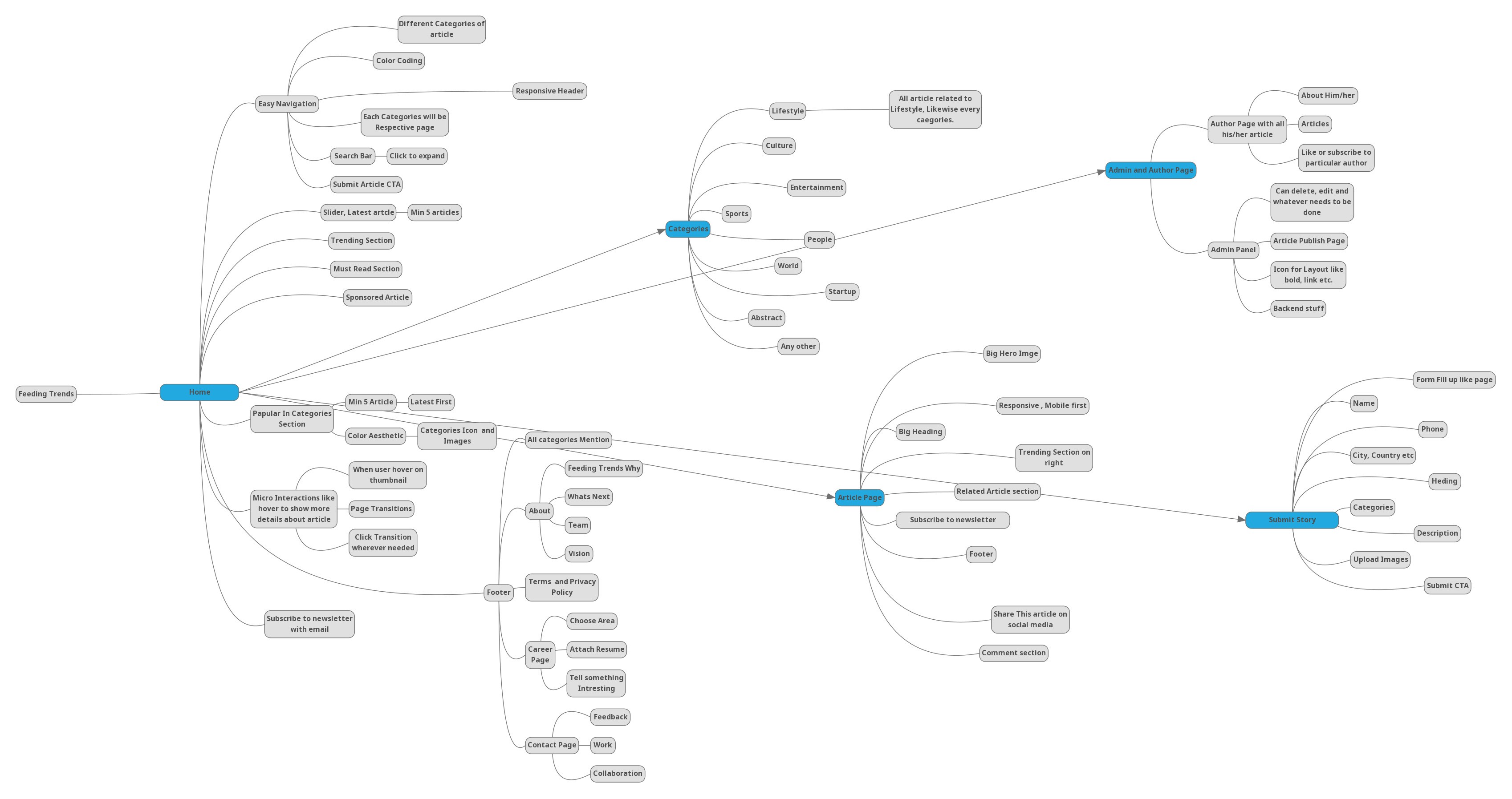
we decided to go with making a mvp. Ideated mind maps and wireframes.
-- Feeding Trends Mind map--
Making mind map helped the team materialize the concepts and make their
characteristics more explicit: it revealed hidden clusters, patterns and
entities, it made them more clear and more understandable.
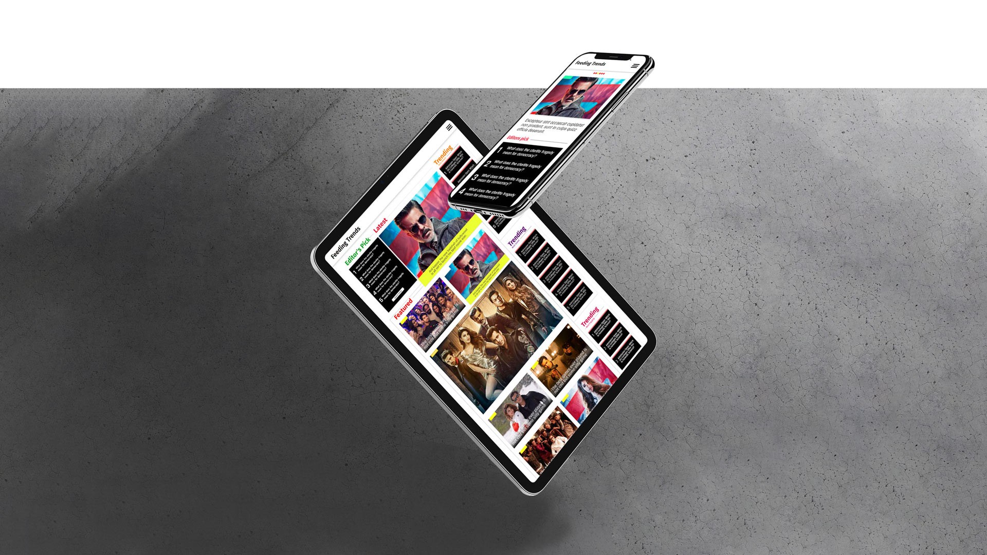
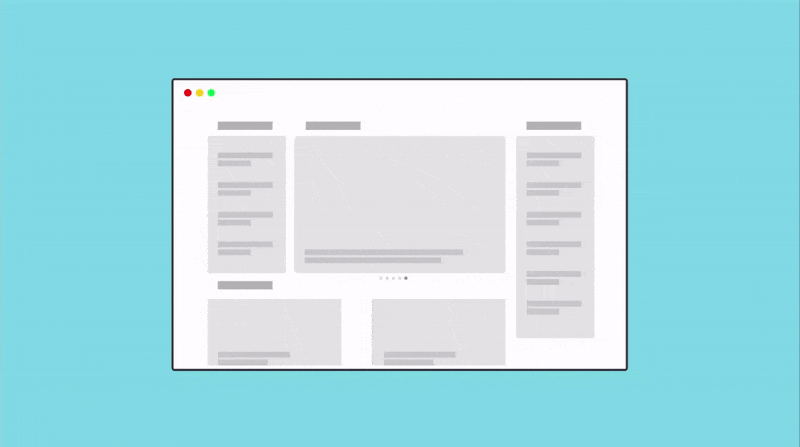
Open> XD> Design. The first thing I designed was the content page. This page laid the foundation for the overall page.
So it was very important for me to get it right. This page is first thing any user visits
whenever he/she follow a journey of coming to website thorough the link shared to them on WhatsApp, Facebook etc.
So, It got my first priority. After going through some similar websites, Behance and doing a heuristic analysis of them, I developed my initial
insights and findings. I shared those with the team to discuss and set priorities, I began with some initial
layout focused to enrich user reading experience, experimenting with font size, colour, contrast till getting it
right.
I experimented with different layouts to put everything together, got feedback from team and designed
som high feudality mockup and test it through Adobe XD prototyping, Made prototype, tested it and finally
we got to the points where me and team agreed to stick to one layout and moved forward to design further pages and adding
required details.
Putting all the research and I started making high feudality design for the website starting with its
content page then moving forward from there to Home page and every other page. I did a simple prototype connecting
all the pages navigation.
When web design was done and I handover everything to developer from design assets to documentation of it.
I started working on its brand identity to be used for business proposes of the company. Designed Letterhead, Visiting card, Id card, made mockups and everything in between.
Stuff I did
✔ Research ✔ Ideation ✔ Taking Design Meetings ✔ Collaborating with developer ✔ Making Post for social Media ✔ Lots of IceTea ✔ Exporting Assets ✔ Wireframe ✔ Testing with users ✔ Creating A design System ✔ Branding ✔ Identity Design ✔ Defending UX Decisions ✔ Pop and un-pop things
Learnings
This project was very long, there was so many changes done one after
one. So many iteration. Well after the development the website
traffic increased. We reached to more and more people with time. The
problem that was there before redesign was solved. The development
team did a great job and took design even further and better with
all the tweaking done from time to time.
It is the people that makes everything worthwhile. I happen to work with
some great people during design phase and later on during development
phase as an audience. It was awesome.
Share Your thoughts
Damn you really like to scroll. Click Me.