Elevito: The Making of a Design Company, from college dreams to a real-world creative agency.
Building a design-driven brand from scratch while learning, experimenting, and pushing creative boundaries.
Timeframe
October 2018- March 2019
5 Month
Tools
Adobe Creative Suite, Zeplin,
Pen-Paper and lots of Ice-Tea
Role
Art direction, Research,
Content Strategy, UX, Order Pizza
Team
Shekhar, Govind, Fahad, Abhishek
Saurabh, Yash, Zainab and Me
Preface
Elevito is a digital design agency based in India, founded by some of my close friends, including Yash Srivastava and me. Digital design was the primary motivation behind its creation. So we hapen to have some skills and passion for digital products design and developement. With little knowledge but a lot of enthusiasm for learning, we aimed to create a small agency where we could work together on digital products for the clients we onboarded.
The Making of Elevito
The idea of Elevito started in around 2017 while I was still pursuing Computer Science
Engineering in Lucknow. Some of my friends were highly skilled in web development, and we all
wanted to work on something meaningful together. One night, an opportunity came my way under
the guidance of a senior, and we grabbed it.
Coming up with the name Elevito was a challenge in itself. It was envisioned as a design
company based in India, dedicated to delivering high-quality content that brands truly deserve.
The journey began in my 7th semester of engineering when my friends and I decided to build something
of our own.
So we started to envision how the Elevito brand would look. The first step as a designer was to create
its brand identity and start working on the website design. I spent days exploring Pinterest, Awwwards,
analyzing design agency websites, and searching for inspiration. After multiple iterations and creative
explorations, a split-layout visual caught my attention, forming the foundation of Elevito’s design concept.
It was an opportunity for us to challenge our creativity, without fixing
any constraint or barrier.
The goal was to create a showcase website where we could present our work to potential clients, demonstrating that we were the right team for their needs.
Website Ideation and Research
After initial paper wireframe sketches, running it past some UX friends and juniors for feedback and tweaks, we kicked around some ideas for a theme. Coming up with layout and working on it. We discussed from development perspective if the layout we have ideated will be feasible or not. After getting go ahead and technical feedback, we iterated and tweaked until we had something that was fun and as fluid as possible.
Art Direction + Design
Once the layout and content strategy were in place, it was time to define a theme and color palette. Initially, I chose a dark moderate cyan as the accent color. However, as the project evolved, I switched to a gradient theme to add contrast and a modern touch. A shade of Red was finalized as the primary theme color.
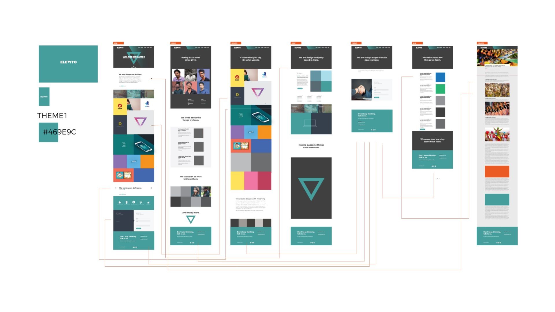
Initial layout and website theme.
Go Beyond
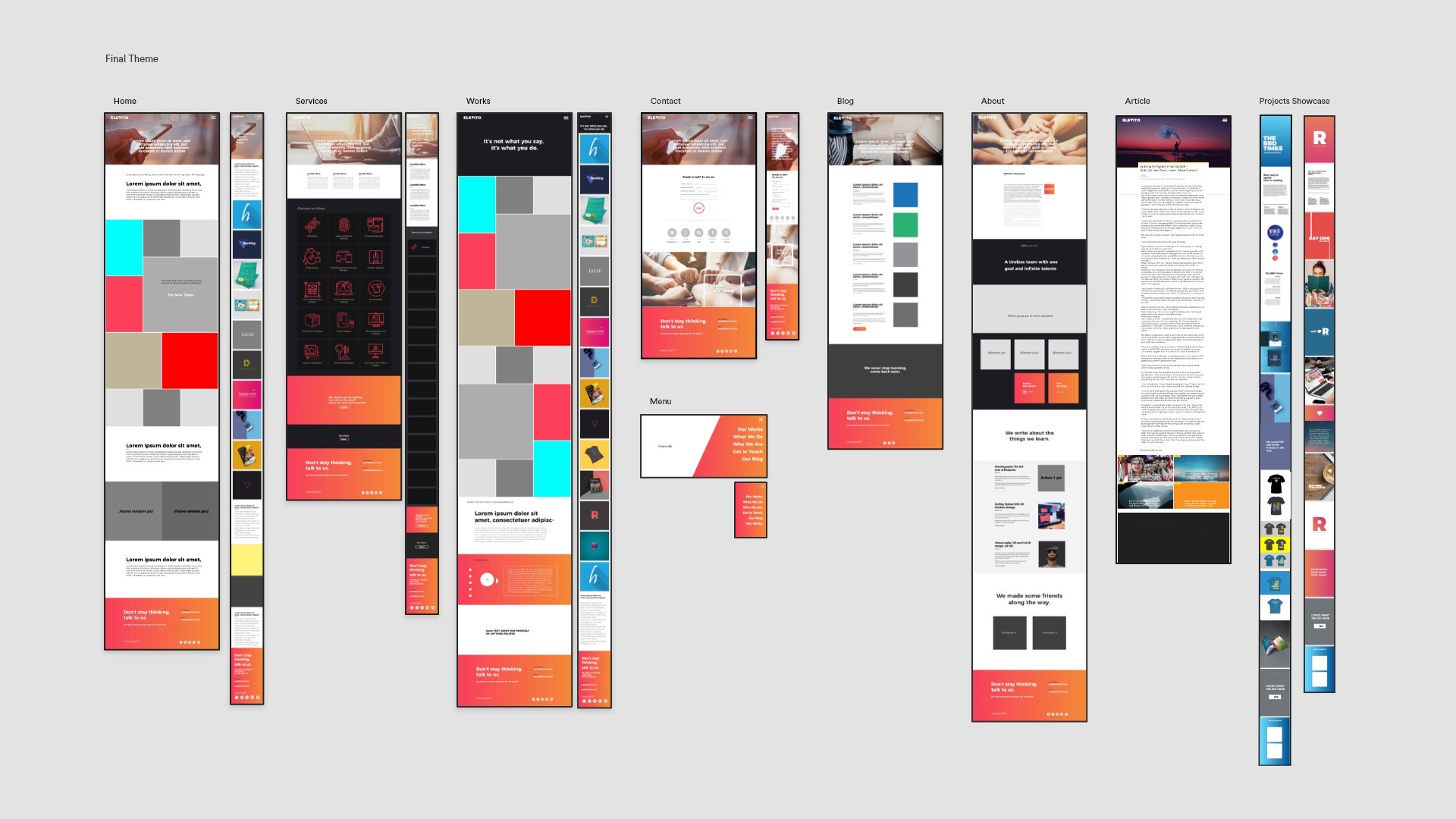
Final Layout: Updated hero image and thumbnail later on.
Think Deeper
Visual Design
After multiple iterations and refinements, we finalized a structured layout for the pages. Step by step, I incorporated details to enhance the design. Collaborating closely with developers and content writers, we crafted a compelling narrative that shaped the overall experience. The final design was well-received by everyone involved.
Reimagine
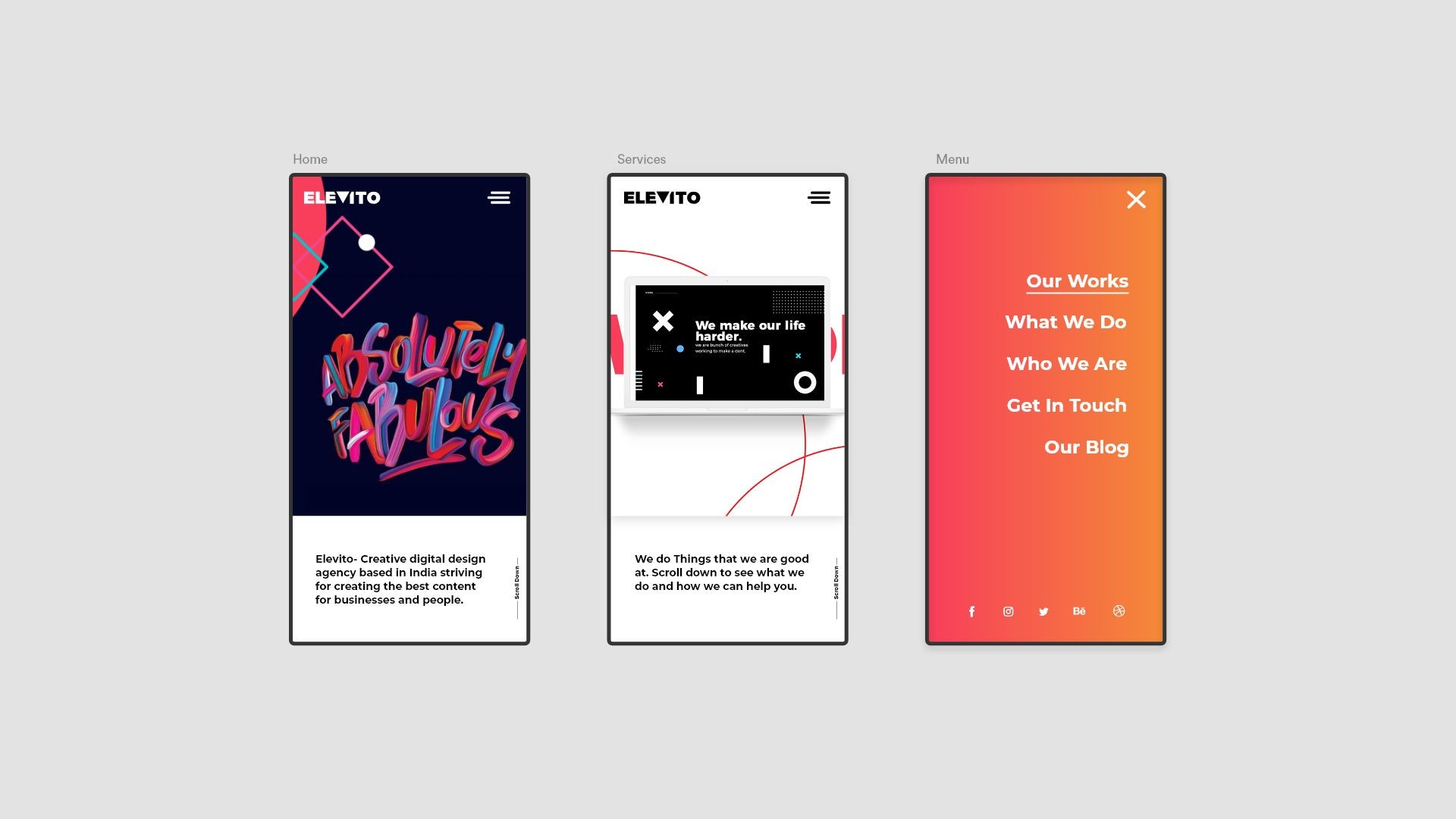
Elevito: Mobile Hero Screen Set 1.
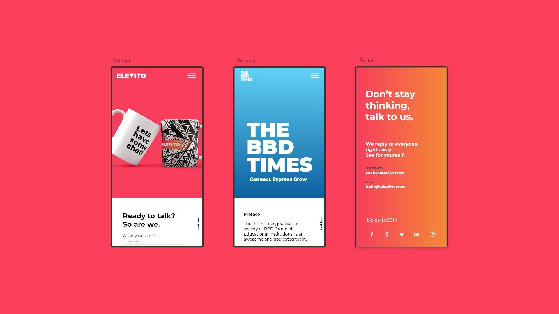
Elevito: Mobile Hero Screen Set 2.
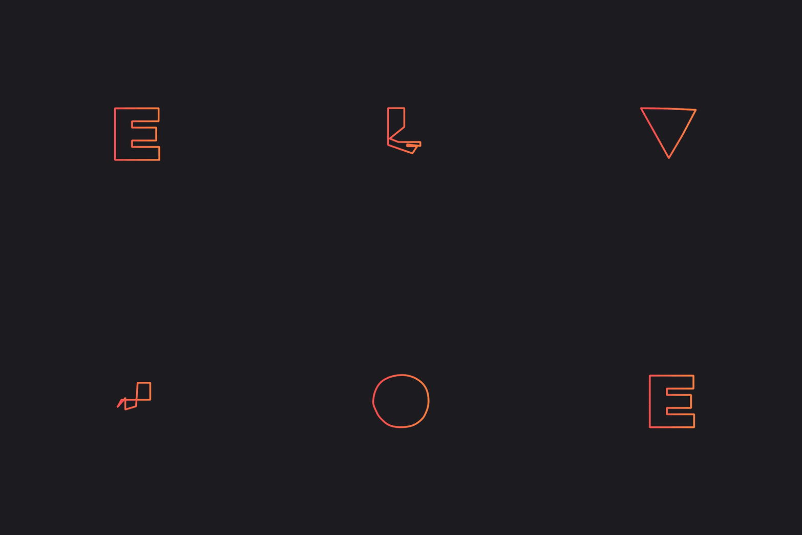
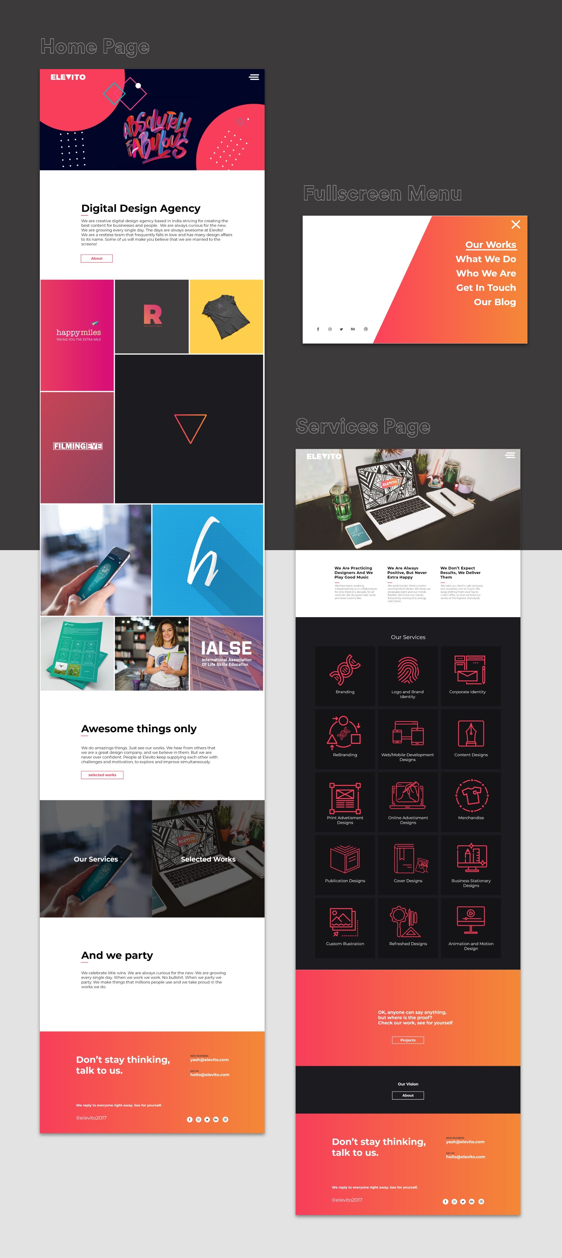
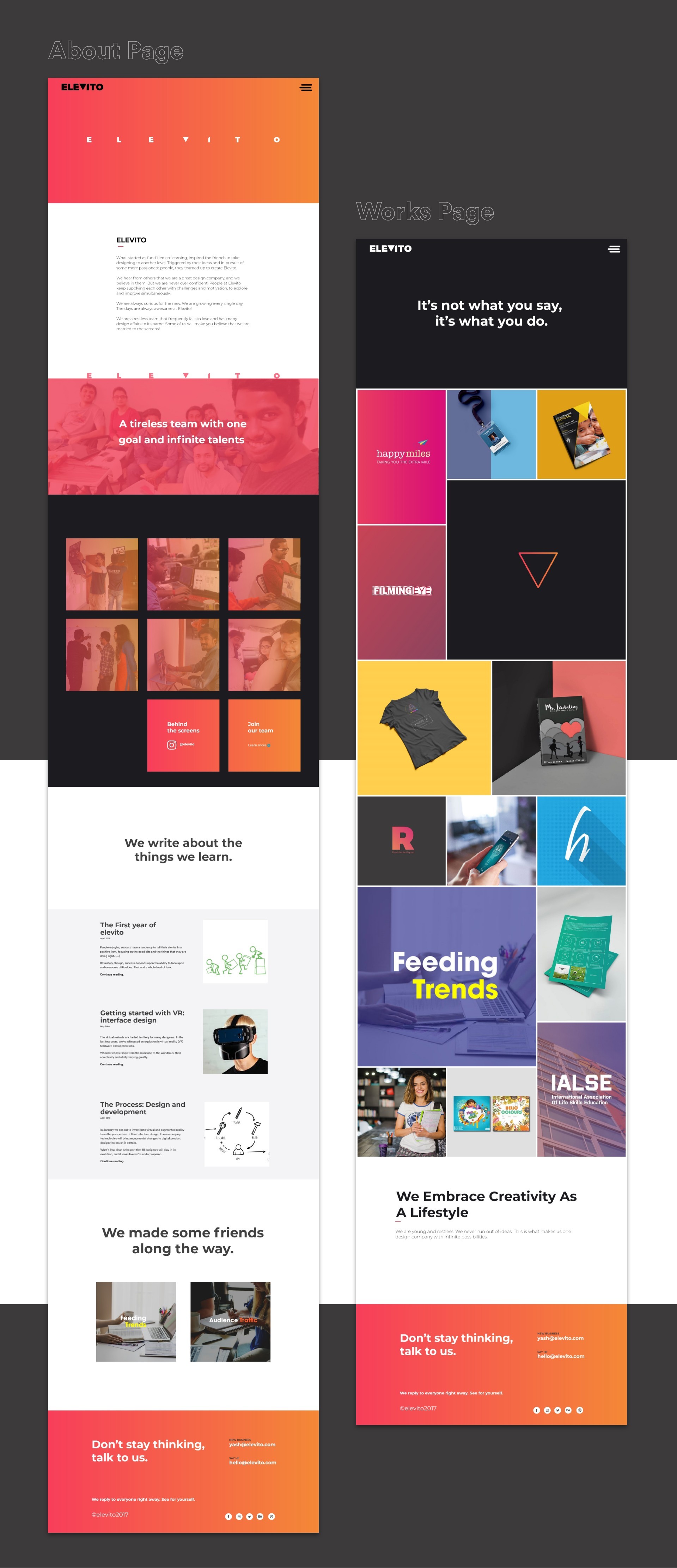
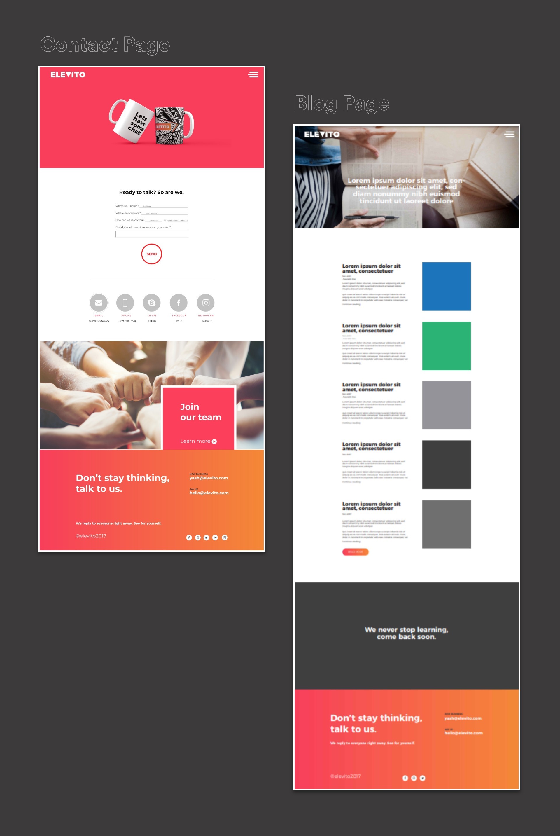
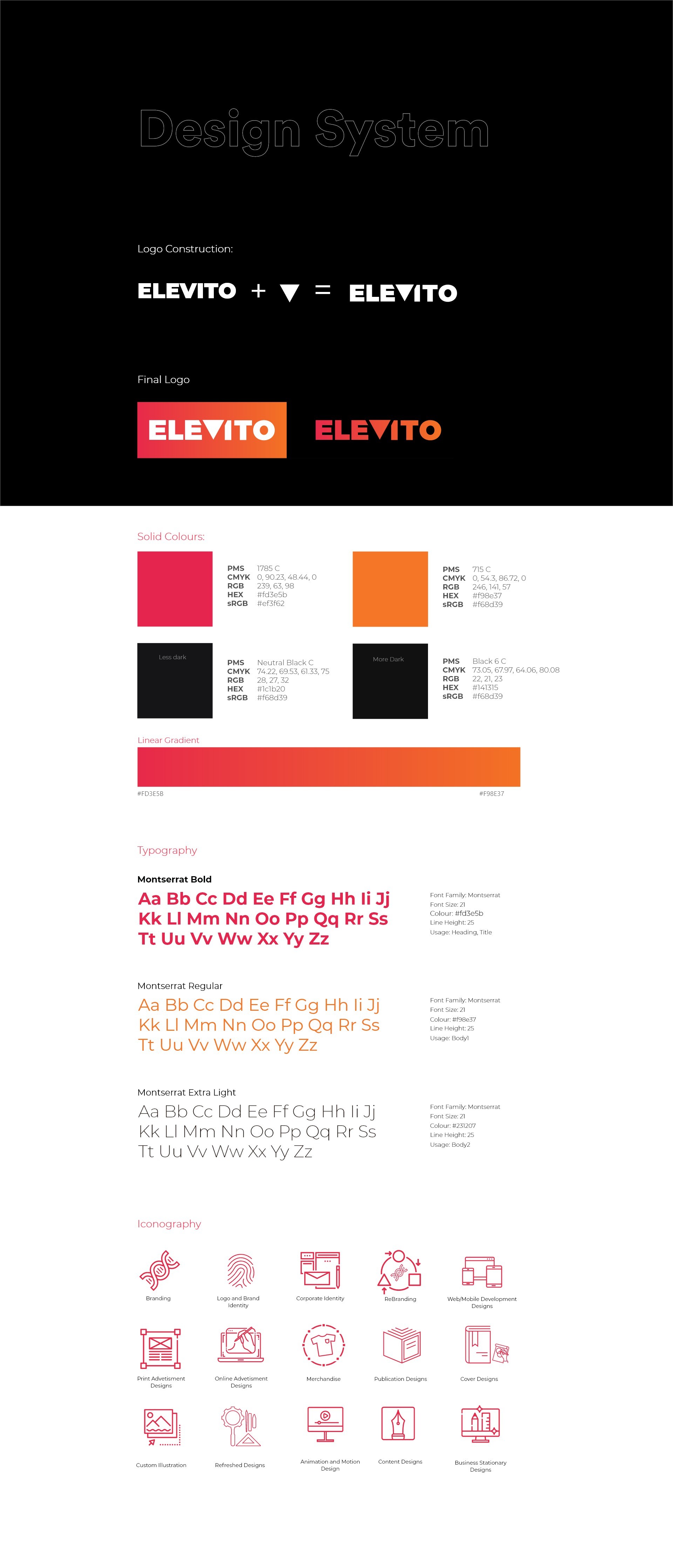
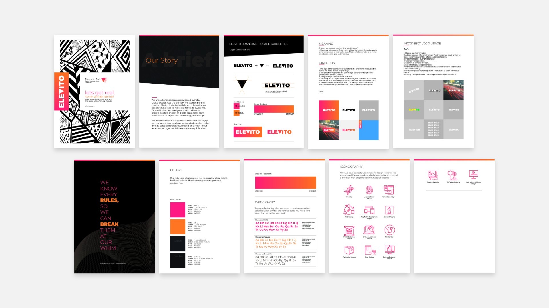
Elevito Branding Guide
Learnings
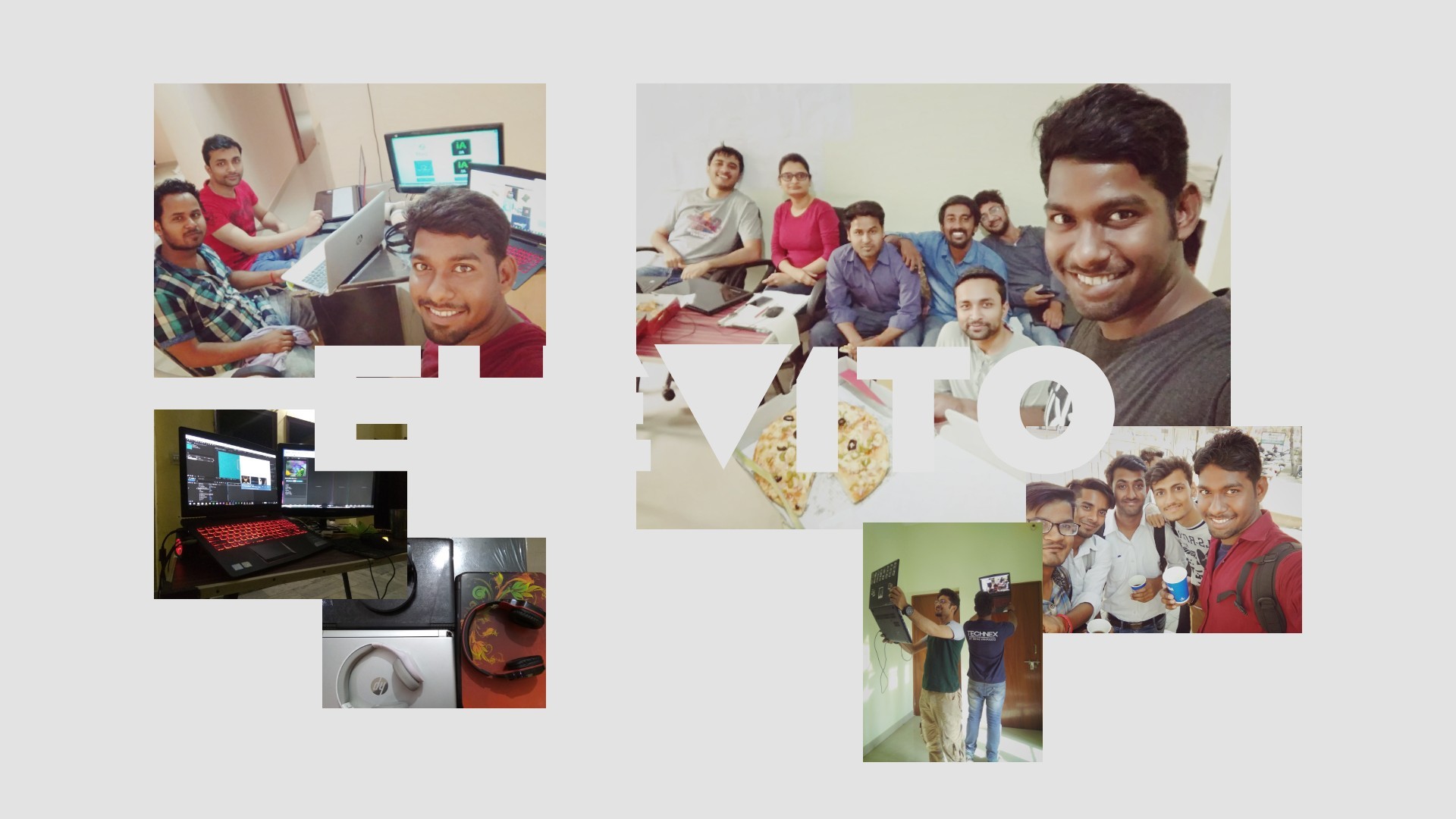
Elevito happen during my college time. It was my greatest learning curve. At the start, we didn’t have many projects to showcase, still somehow we managed to show 15 Projects, out of which 2 projects was fictional. It took two months just to curate and present them properly. There were times when the process felt monotonous, there were times when it became very boring, couldn't give the best, but with all support and love, I never lost enthusiasm and maintained the excitement. Whenever challenge arrived, there were people whom I could lean on. This was all possible because each and everyone came together even in their busiest of time, even when exams were near.
Ideas don't come out fully formed. They only become clear as you work on them. You just have to get started.
Thanks for scrolling 3400 PX
Click or tap to appreciate.
