Fulfilling those little dreams you got
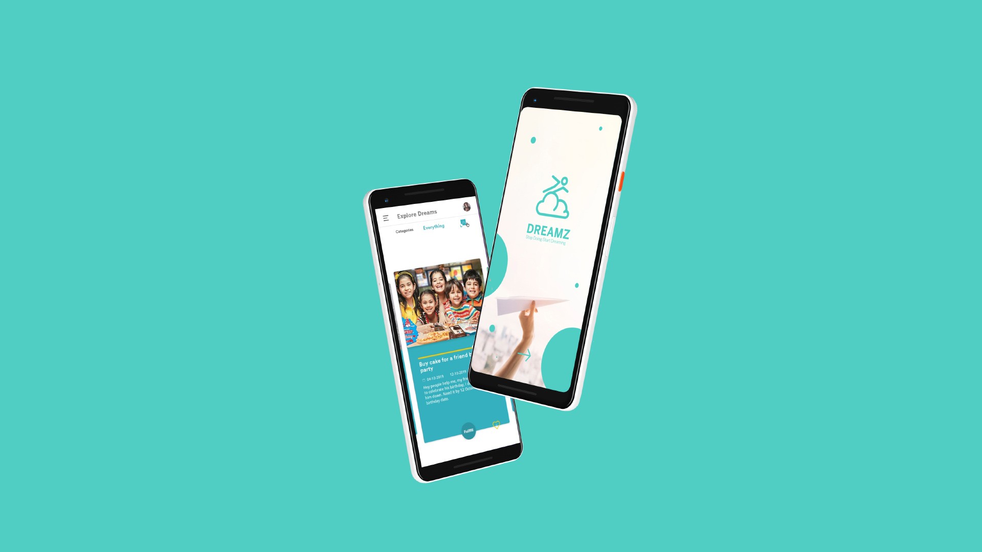
App that helps to fulfill your dreams and other dreams by crowdfunding.
Timeframe
January
10 Days
Tools
Every F thing I know
Adobe XD, From A to Z
Role
UI/UX Design
UX Strategist
Team
Lone Wolf
Me
Preface
All about Dreamz is a startup from Lucknow IIM Faculty and students. Their idea was simple to invest money in a way that everyone get something out of it and target audience were teens. They approached Feeding Trends for the app design. The brief was simple. Make a high feudality prototype in just 10 days.
A crowdfunding App to design and build for Android Ecosystem.
Before Going into research
I prepared a list of questions to be asked and discussed with dev teams and clients.
1. Define Idea in 5 sentence.
2. Vision of the product
3. What will success will look like after product design.
4. Technical constraint
Question related to user as in App
1. Who can view user profile
5. Who can view user profile
3. Money Earned
4. Who can view money earned
and many more cross questioning in meetings, slack chat...
Feels
1. Whenever a user donates amount he should feel some sense of accomplishment
and make him feel good about a dream he just fulfills. So,
how it can be done. One way is to make it personal.
2. Why should I feel some sense of accomplishment? What drives a person? So how can we make it personal?
3. What is Really Happening in this app? Why someone even uses this app? There is just
so much app already? People are getting so particular about what they want on their phone,
and what they don't want in their phone. So, It comes to just one thing that is a need.
4.
The Idea
Ok, so how I say it. I am creating a dream Say it. I wanna buy a Gaming Mouse: For which I need 1000rs. So how I am getting it.
I am investing 500rs and getting back 1000rs so in a sense I am earning 500rs. Really ? is this really happening?
There are 100 users:
Each creates their dream
I donate 5rs
Each donates me 5rs. SO 5x99=495.
But there is limitation set. You need to step up your level. Nice move. So you got to invest to get more so to get more earning.
Challenge
Fist of all inspite of all meetings understanding the idea was in itself a challenge. It was totally something
brilliant and implementing the design it deserves was a great challenge for me. I got into app design by starting from
base level of app design and going through the why and how again and again. Watching hours of video on youtube to reading articles on medium about
process, principles and anything related.
Deadline was just 10 days.
Problem Definition
Fist of all inspite of all meetings understanding the idea was in itself a challenge. It was totally something
brilliant and implementing the design it deserves was a great challenge for me. I got into app design by starting from
base level of app design and going through the why and how again and again. Watching hours of video on youtube to reading articles on medium about
process, principles and anything related.
Deadline was just 10 days.
Not just high feudality
Target Audience
- School Children:
- College Student
- Who has access to a smartphone
- Age Group: 15–23
- Android User
- Who want to buy things for which they can't get their need fulfilled by their parents
What will be possible dreams
- buy a smartphone
- buy a book
- Buy something that they wanna give it to their loved ones
- Buy Laptop
- Just wanna have fun
- Earn money, and party
- Buy cake for a friend birthday party
- Travel somewhere
- Buy accessories
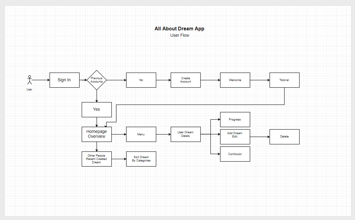
Dreamz User Flow
UX Design Principles
Before going into UI Design researched about the design principles that should be considered and implemented 'into design. Going through google and websites I found a video by Johnny vivo. And it was awesome. I followed him, his direction toward naturally designing app and many more video, articles that I come across three days of beginning. And noted them down for future reference on medium draft. Yah I document on medium.
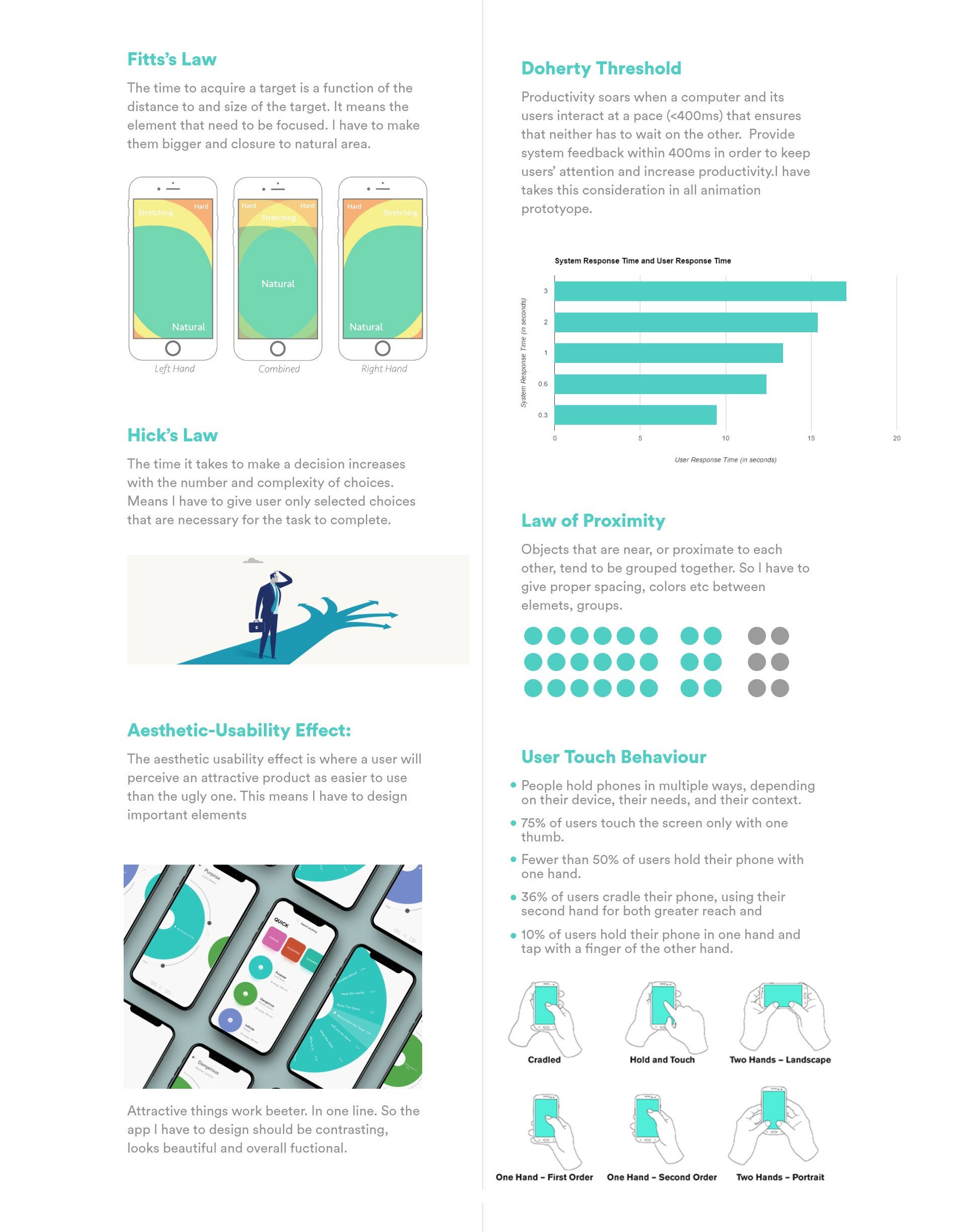
Dreamz User Flow
UI Design
Choosing colors for designs in general is not easy. So why can’t we just choose
colors for our projects based on how we feel about them or based on the trends? I’ve become
more aware that knowing color theory, preferences and background of the client,
culture of users and comprehension of your audience and competitors is the best way
to choose right color for your project.
Researching the competition is the best way to avoid unintentional plagiarism. It will give you an idea of common color
threads that run through the other companies (whether they’re using correct colors or not) and it will show you what kind of
direction to avoid to ensure that you don’t create something identical.
Then I did analysis of colors, their perception and influence. Blue is one of the most commonly used colors when coming to product design. People use blue things so much they get a sense of familiarity already when its blue. The blue color is considered to give emotions such as trust, safe and relaxation. As their is money involved in app user should trust the app to do so. The light blue color creates the emotions such as calm and makes the user feels refreshed. The blue color is also associated with happiness. I added some green tone the blue to also standout among all those so many blue products. This is how I came up with the mood board.
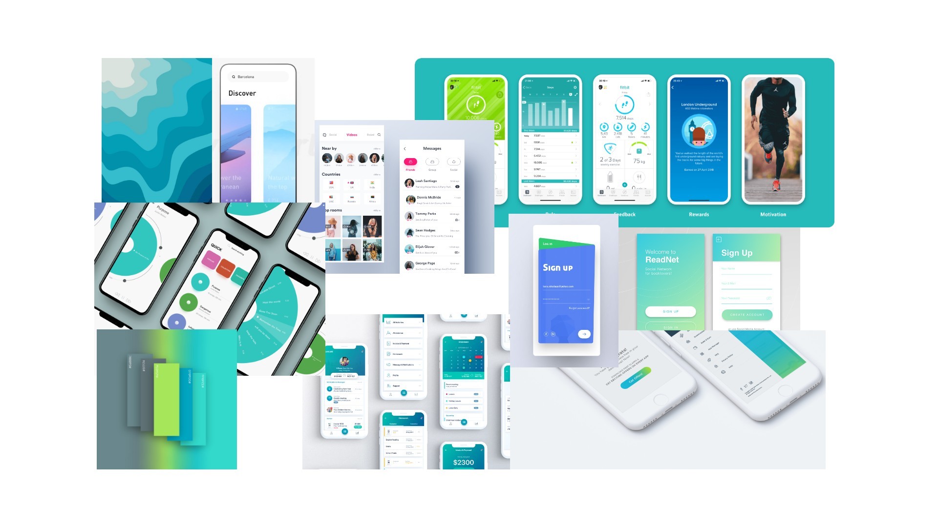
Inspiration & moodboard
Finally, after all researches and analysis were done I focused on designing all the screens through which a user will move, and created the visual elements — and their interactive properties — that facilitate this movement. I used things like patterns, spacing and color to guide the user and designed visual, interactive elements that respond in a way that feels natural to the user.
App Onboarding Experience
Considering all the information I got from the research I step into Adobe XD and started my layout.The user that comes for the first time. Just a gist into what they are getting into. A three-screen using Adobe xd auto animate feature. Also this laid a basic foundation of the my design structure and design system like Font, font size, it colour, Primary color, secondary color, animation style, design elements etc. It was very important to make the onboarding experience as good as possible.
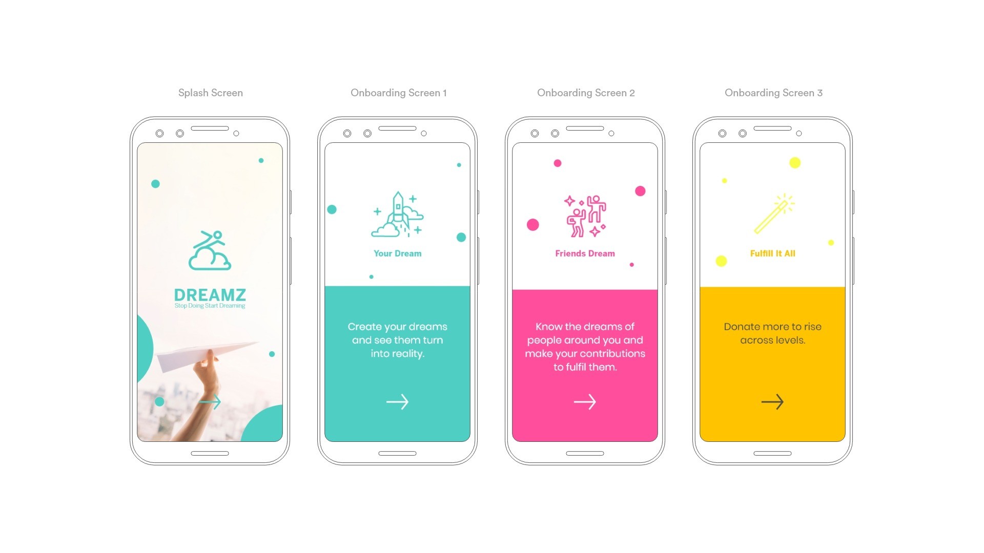
onboarding experience screens
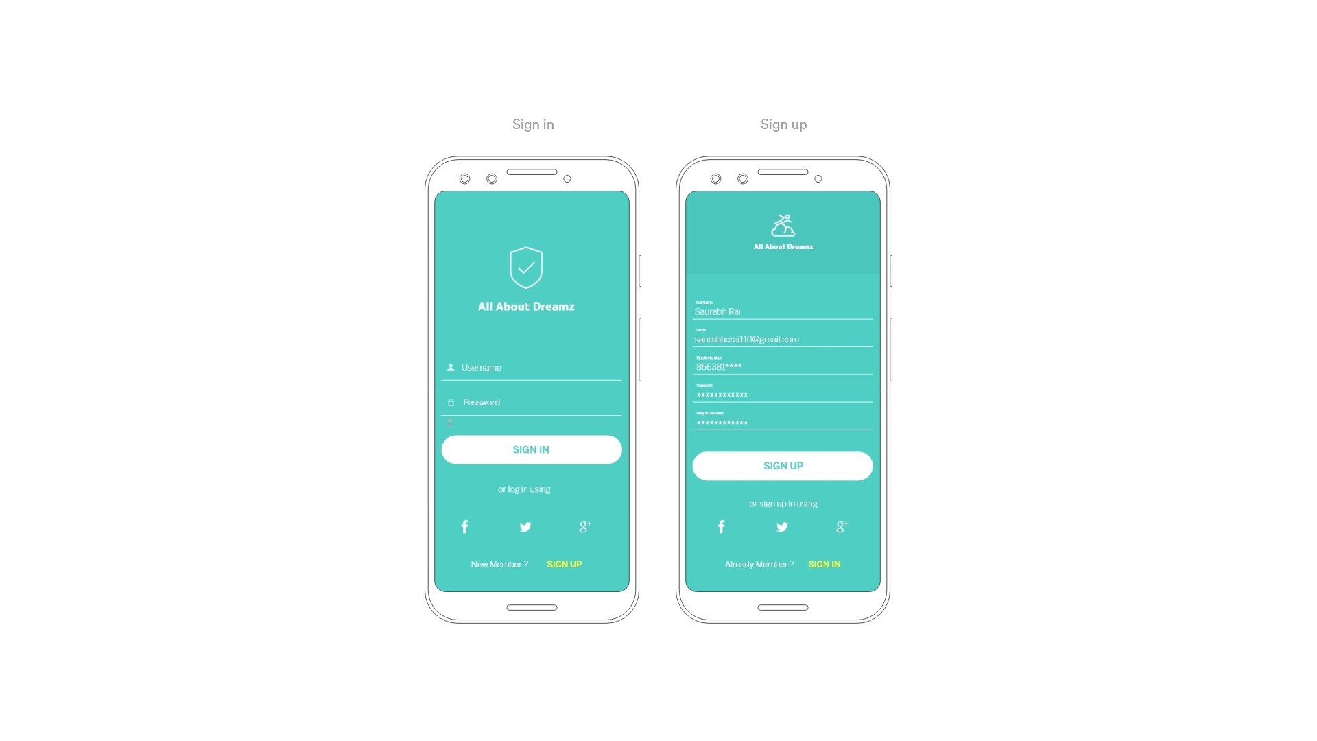
sign in/sign up
Interactive Prototype
During all my Design process. I kept my focus to make highly interactive prototype. Just few days ago Adobe XD had already released upgrade to it. And the new feature include Automate in prototype. It became my playground and using all the features of Adobe XD I created a Interactive prototype. and It turned to be awesome. Shared with all my teammates and client.
Reflection
Working on this project helped me learn that user research is crucial for the whole process
of design application. Responsiveness is another important point in the UI/UX design.
When the app shows the user immediate consequences of their action, there is a more personal connection.
There are many people who support the idea that digital products of today should be minimalist
and purely functional. However, my experience and practice shows that people want to both solve
the problems and feel aesthetic satisfaction using apps. The balance of these things was my
responsibility as UI/UX designer on this project.
After i finished and look back again after someday felt proud of myself. Loved everything I did with it
and the pressure in completing all these in just 10 days was immense. When I am given a challenge in
situation similar I discovered myself I perform well.
“To be a great designer, you need to look a little deeper into how people think and act.”
Share Your thoughts
Damn you really like to scroll. Click Me.
