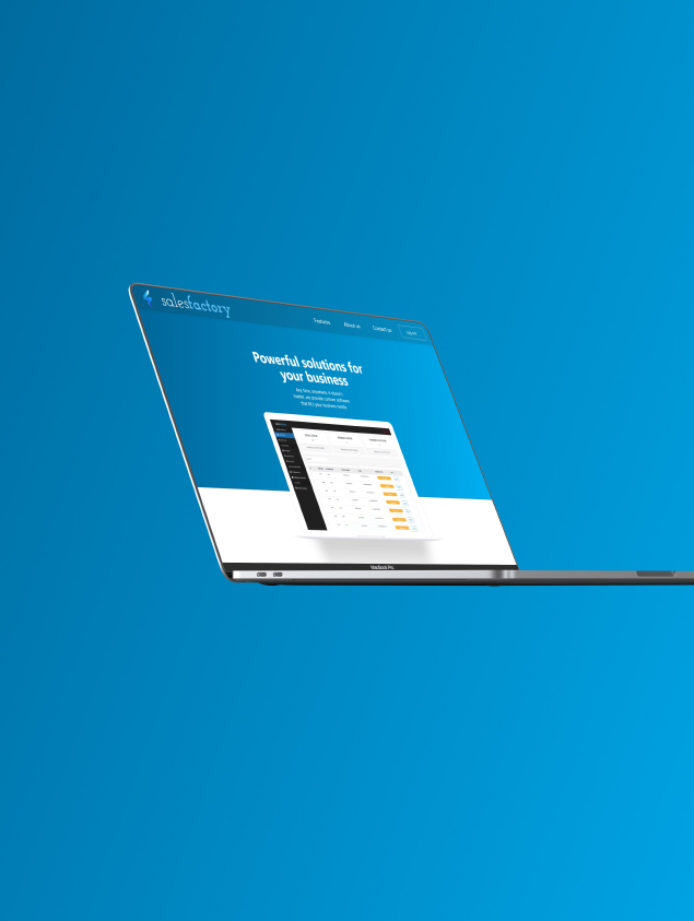
Institutes portal for conducting exams and mock tests
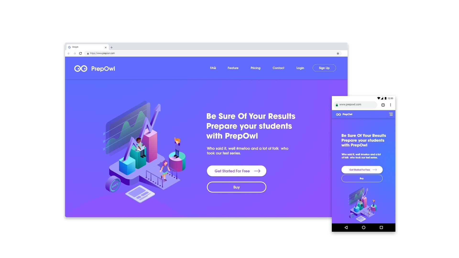
Prepwol Software showcase website design for clients.

Timeframe
November 2018
1 Month
Tools
Adobe Creative Suite
Role
UI/UX Desiner
Marketing
Team
UI/UX Desiner
Marketing
Preface
Prepowl is web product intended for students who are preparing for certain exams in India. Prepowl says and I quote 'We are on a mission to reshape the process of how students prepare online for competitive exams', and I totally agree.
Research
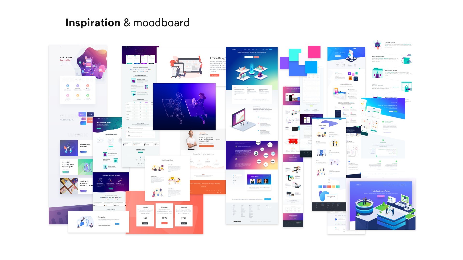
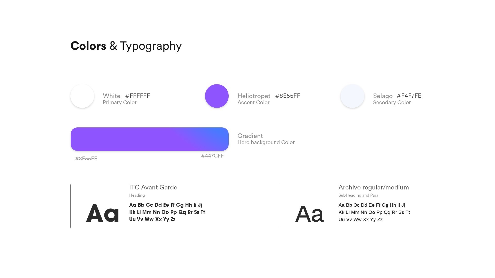
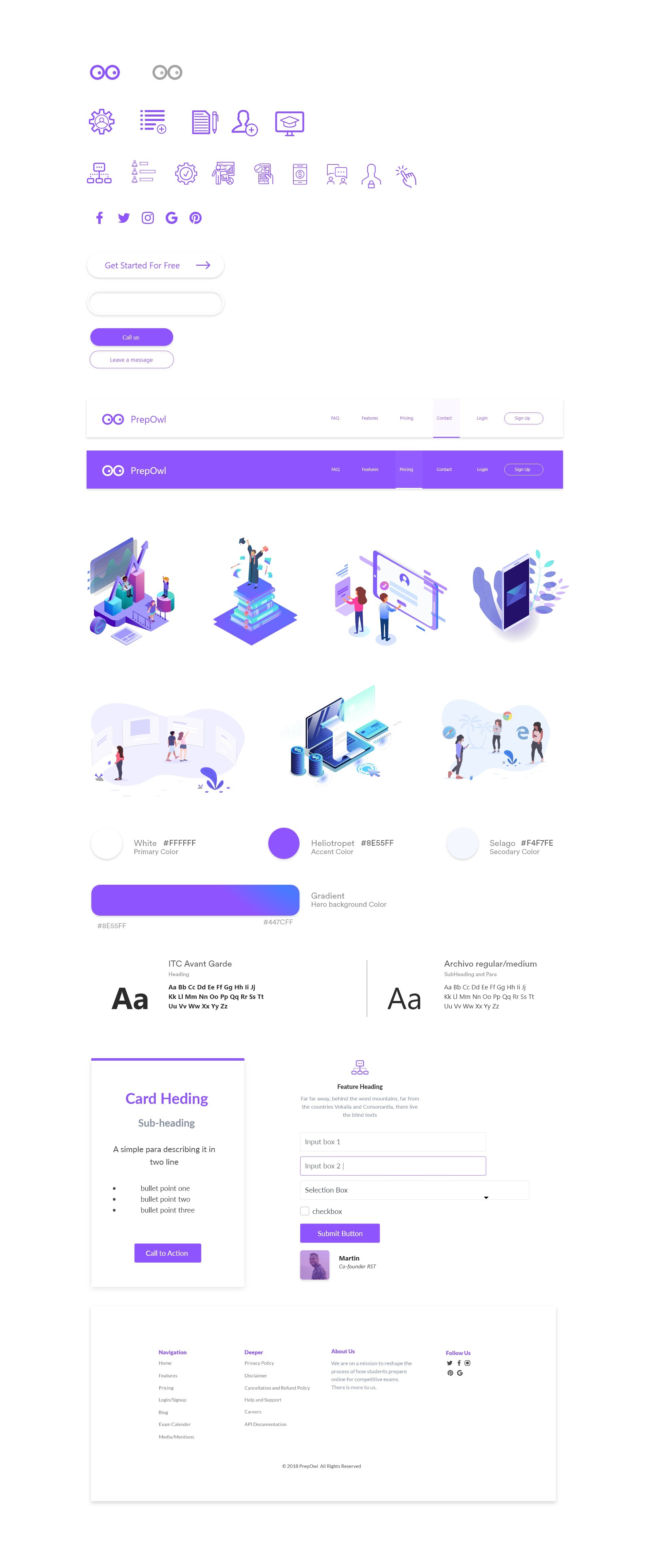
After layout and content strategy, It was time to set a theme and colour palette It was time to design a simple, clean and elegant showcase website. The accent colour I choose was Dark moderate cyan.. Later on while project was in design phase I changed the theme from Cyan to Gradient feel, to make it more contrast and modern feel. I decided to use red as theme colour
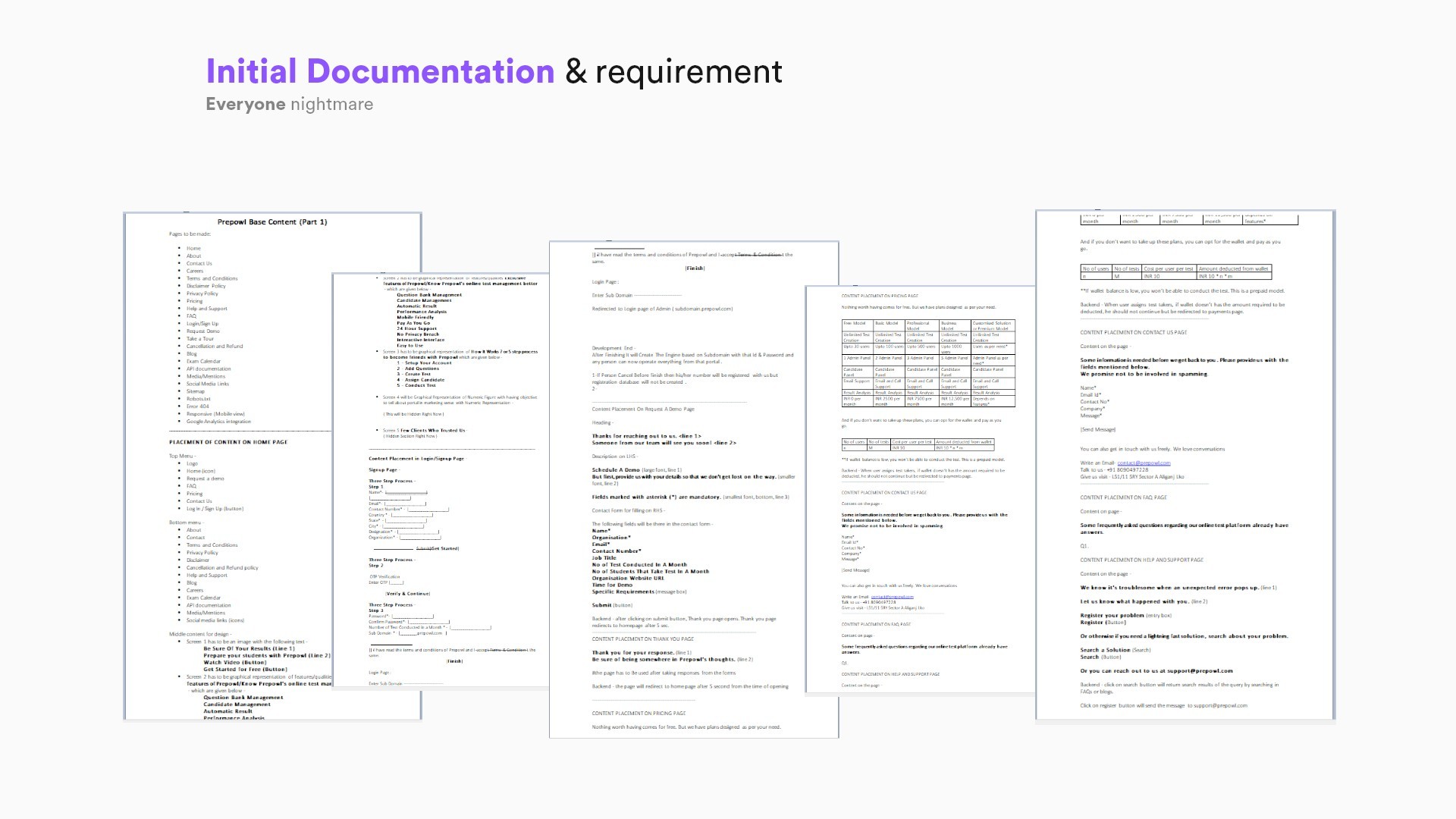
Things got better and easy after applying a Content first strategy for the website.

Learnings
This project is still in Development phase. Applying Content First strategy and collaborating with Content Writer and Strategist gave a very satisfying result and I totally had very good in overall design process.
Making hypothesis is awesome but at the end of the day that hypothesis better turn for the better of the project.
Share Your thoughts
Damn you really like to scroll. Click Me.


