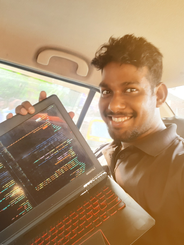
Stuff I did
✔ Research ✔ Ideation ✔ Downloaded Apps ✔ Taken screenshots ✔ User Interface ✔ User Experience ✔ Basic Wireframe ✔ Interactive Prototype ✔ Made a simple logo ✔ Rapid Prototyping ✔ Made Mockups ✔ Pop and un-pop things


01 / 20
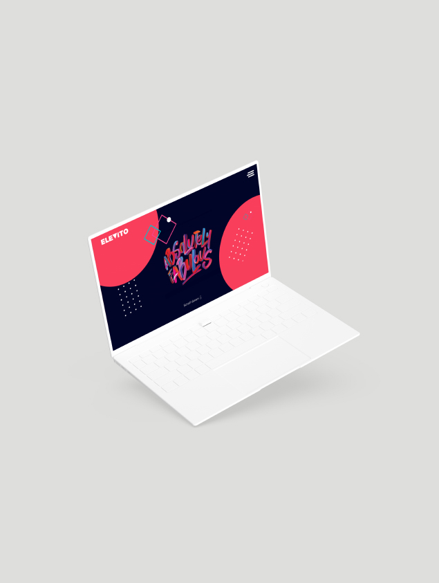
An app redesign already used by millions.

November 2019
2 Days
Adobe XD
Adobe Photoshop
UX/UI Design
Content Strategist
Me and few of my friends
who helped me understand some silly q.
Cricbuzz app is used by millions of user. To redesign something that that is already have a existing user base is itself is a challenge. I started with installing the app from play store and then carefully following each navigation. I personally used this app previously some years ago not now. So much has already been changed and improved from then.

1. Strict Deadline
2. Did it to learn
3. Only Two days to showcase UI/UX Process
4. Time constraint to do heuristic research
Cricbuzz app is used by millions of user. To redesign something that that is already have a existing user base is itself is a challenge.
With limited time following a typical design process was challenge. When it came to user research I could not do more.
But I did talk to some friends and asked their existing experience of
using Cricbuzz app and their pain-points.
I then began with careful observation of each screen, completing the desired task, going back and forward,
taking notes on my initial thoughts like what's missing and what can be
done to make user experience more intuitive.
One thing that really needed to be redesign was app navigation. Most of the action element was outside
natural area of the phone. This made it very difficult to perform even simple task with one hand held phone.
I really admire Samsung about what they did with their One UI making everything accessible from your thumb 🖐️.
Taking cues from it I began to restructure and redesign
cricbuzz app.

Some cricbuzz app screenshots
1. No clear structure and navigation flows
2. Cluttered UI with very less white space
3. Navigation problems
4. Not one handed friendly
5. Bad content architecture and readability issue can be seen here and there.
6. Very little visual feedback while going from one screen to another.
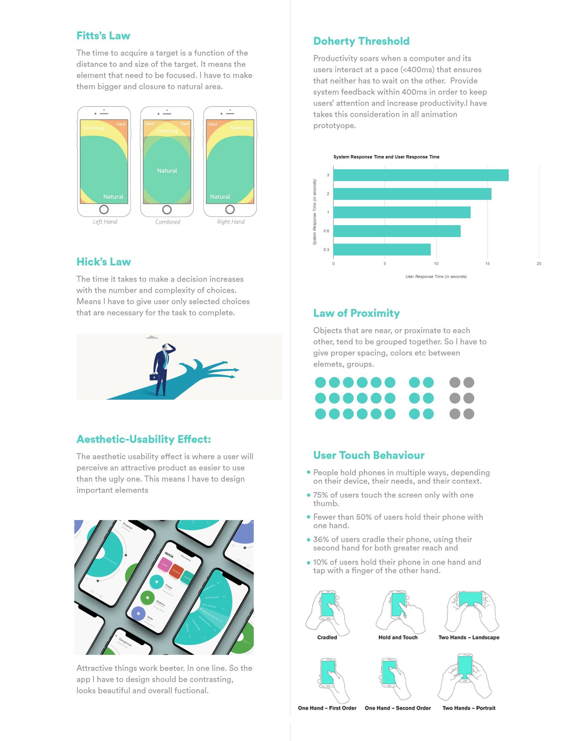
Through out designing the app I followed these UX Principles specially user touch behavior and Fitts's Law.
Applied UX Principles
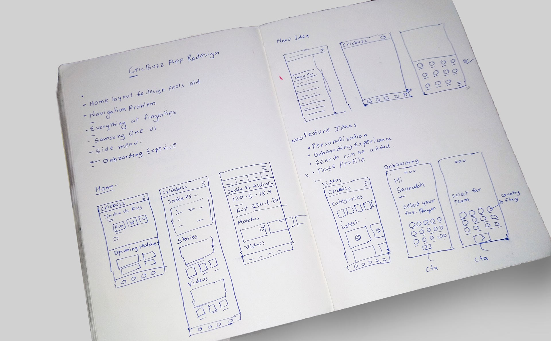
Focusing on findings and insights, I did some rough wireframe with just enough information to get started for few important screen including those features which I thought should be there. The feasibility of these features are debatable. Don't mind my handwriting. Its way better originally.
I began designing screens first for onboarding experience, highlighting some basic features. Worked on a minimalistic logo to give it a clean, bold, and simple compositions with only one or two colors. Existing logo works well though. Not spending much time on typography. Most times Montserrat is my default choice, it's pretty nice font with a nice large x-height and a lot more character than Arial or Helvetica. It has beautiful curves and well rounded corners which works well on most design. Also there is something me and my friends say, when in doubt use Montserrat.
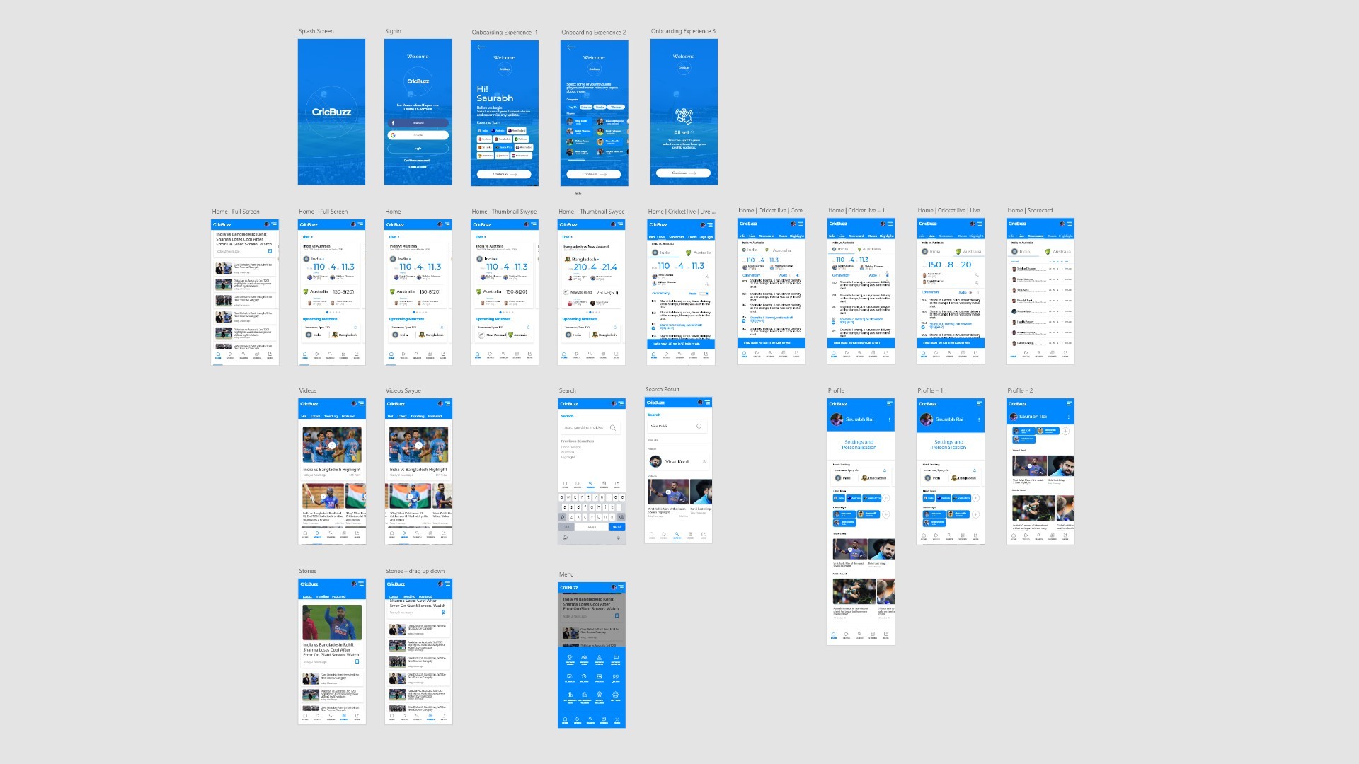
Adobe XD- App screens
In the existing app there was no onboarding experience and very little personalization. Personalization can be used for collecting data in terms of business and better user experience. It Can be used for push notification. Its application can include user to be notified of favorite matches, teams and stories from his/her favorite player etc.

App Onboarding experience
Home is now less cluttered with more white space and better readability. Often times we just wanted to see just the latest scores and so the first thing on home he will focus will be on bigger typos i.e. the score following player current run and related information.

App Home Screen Instances
Every Interactive elements is placed in the Active area of the mobile wherever possible so even a person who is holding phone in one hand can navigate with thumb easily just like in Samsung new one UI. With new search feature user can easily go through topics, related videos, player profile etc. All menu CTA is placed in active area so user can navigate very easily even on bigger screen.

App other screen UI
Made a rapid prototype showing interactions with elements, sleek animations using Adobe XD auto-animate feature. Here I have to say I totally love XD auto-animate feature. It does a lot with very little effort. Specially showing those micro-interactions. The app have a lot of areas where the user experience can be enriched more. These all took me two days. .
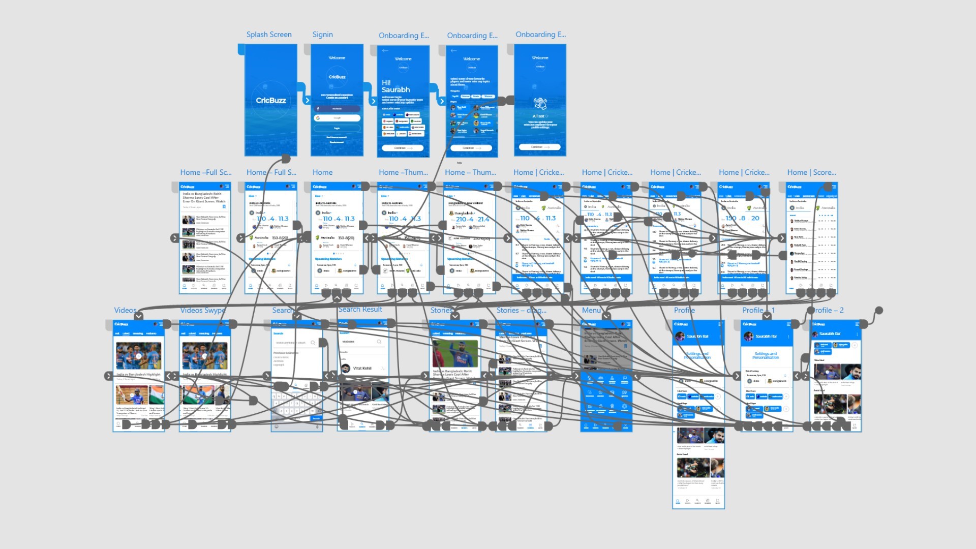
Adobe XD-Prototype
When it come to cricket app, theres a lot of data that goes into UI. There's just so many edge case scenario. There a lot of things and conditions that these design doesn't justify and have area where with good research and planning, app can be made even more awesome for all cricket lover.

The most challenging part of any project which I have experienced myself is even starting it. Once it get started, the next challenge is deciding which problem to solve. As a UX designer, we are driven by curiosity and a burning desire to solve problems. The more insights we uncover, the more problems we will identify — and the harder it becomes to settle on just one. During research and design phase I got into loop of deciding what to give more time and what not to. If I have focused on all parts of Cricbuzz app, it would not have been possible to finish it all in 2 days at all. Focus is key.
It’s inevitable that we uncover new pain-points along the way, but we can’t change track every time this occurs. The challenge lies in staying focused, staying on the track.
Damn you really like to scroll. Click Me.