Bringing Art Closer: Designing an Immersive Art Gallery App Experience
Artiso App Case Study: A Digital Space for Artists and Art Lovers
Timeframe
May 2021- July 2021
Tools
Adobe Creative Suite, Marvel, Invision
Pen, paper
Role
UX Researcher, UI/UX Designer
Designed the art gallery app from concept to delivery
Team
Me, Friends, and
a lot of shared creativity
Preface
Art is more than just visuals; it’s an experience. The idea behind this app was to create a digital space
where artists could showcase their work, and art lovers could explore, appreciate, and even purchase artwork without barriers.
Traditional art galleries have limitations—physical space, accessibility,
and engagement. This app aimed to break those barriers by offering an immersive,
user-friendly experience that brings the gallery to everyone, anywhere, anytime.
The problem
Visiting art galleries isn’t always convenient. Limited exhibitions, geographical constraints,
and a lack of accessibility to diverse art collections make it challenging for both artists and audiences.
Many online platforms that do exist feel cluttered, transactional, and lack the emotional engagement that a physical gallery provides.
We wanted to design an app that provides an immersive digital gallery
experience while keeping it simple and intuitive.
The Goal
The aim was to design an app that seamlessly bridges the gap between artists and art enthusiasts. It needed to feel like a real gallery—organized,
aesthetic, and easy to navigate. Key priorities included:
A clean and elegant UI that complements, not overshadows, the artwork.
An intuitive browsing experience with categorized collections and artist profiles.
PFeatures that allow users to interact with art, learn about pieces, and make purchases without feeling overwhelmed.
The aim was to design an app that seamlessly bridges
the gap between artists and art enthusiasts.
Understanding the user
To create an experience that feels natural, I conducted user research through interviews
with artists and casual art lovers. My goal was to deeply understand their needs and behaviors before shaping the design. To achieve this, I followed a structured design process that involved:.
User Research
Personas
Problem Statements
User Journey Maps
User Flow
User research: Summary
I conducted interviews with 5 participants and created empathy maps to understand the users I’m
designing for and their needs. The primary user group identified through research
was people aged between 18 to 65, people who are rts lovers and people who want to learn and explore arts.
This user group confirmed initial assumptions about art galley app customers, but research
also revealed that users wanted an interactive experience through storytelling and ability to search and sort thought different kind of artworks.
Other user problems included obligations, busy schedule, that make it
difficult to use app and explore their interest.
UX Interview Plan Document
Usability Study Painpoints
Personas
Problem statement:
Mudita is a busy working adult who needs easy and interactive app to explore arts so that she can
explore arts and fulfills her creative curiosity and apply her ideas, inspiration from these to her daily works.
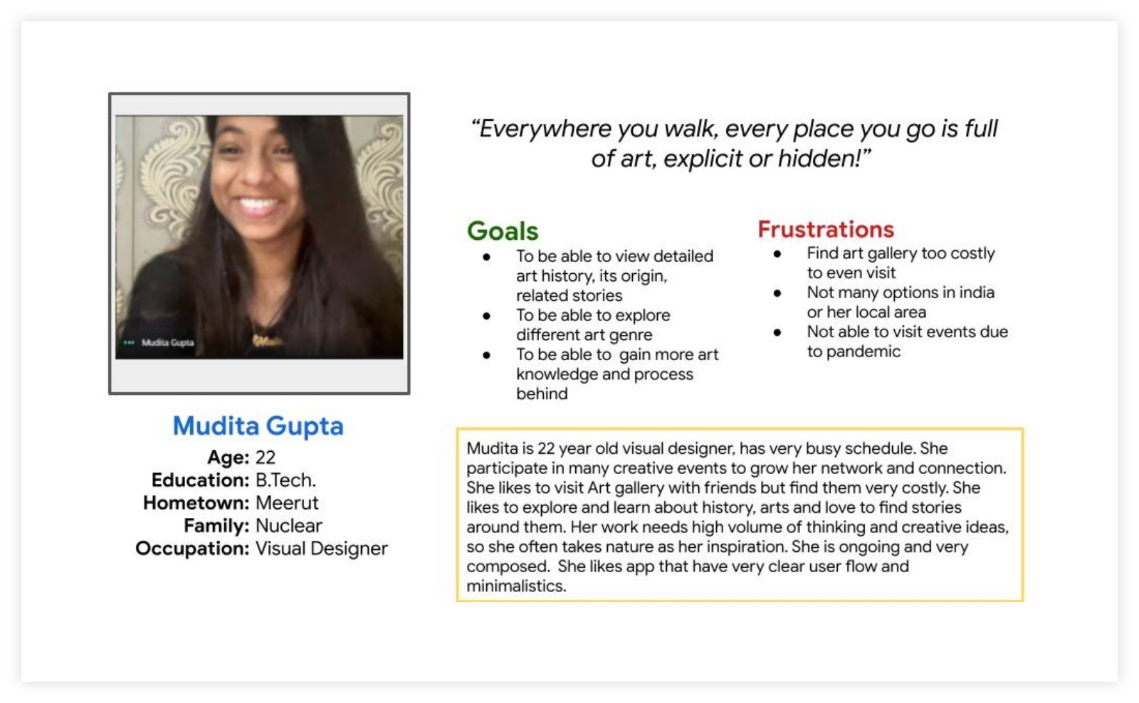
Persona [Mudita]
Problem statement:
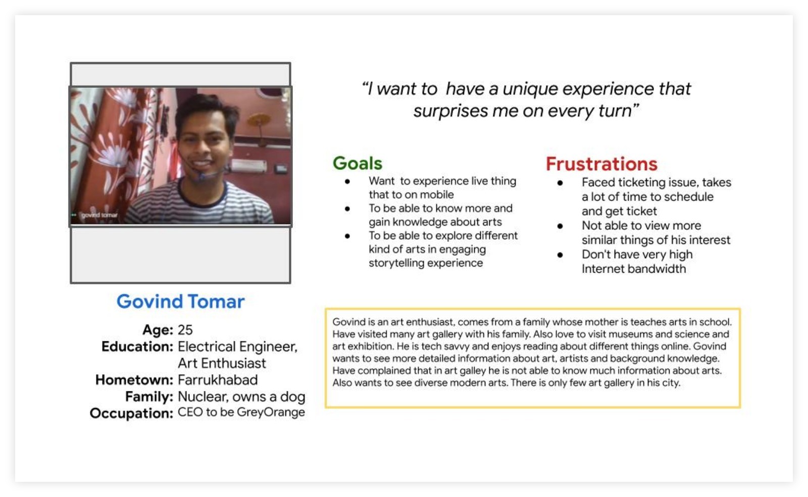
Govind is an art enthusiast who needs a platform where he can learn and explore all kind of arts because he
can't find much information about arts in art galleries he visits or any other source.
Persona [Govind]
I want to have unique experience that surprises me on every turn.
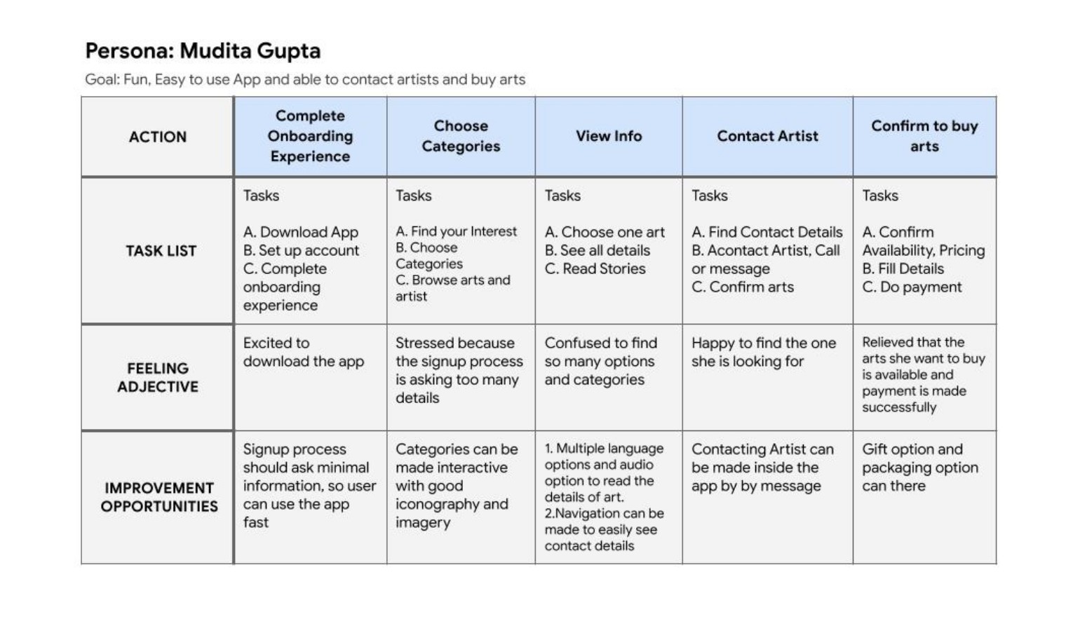
User journey map
Mapping Mudita’s journey revealed that an interactive art gallery
app would greatly enhance her experience..
User Journey Map
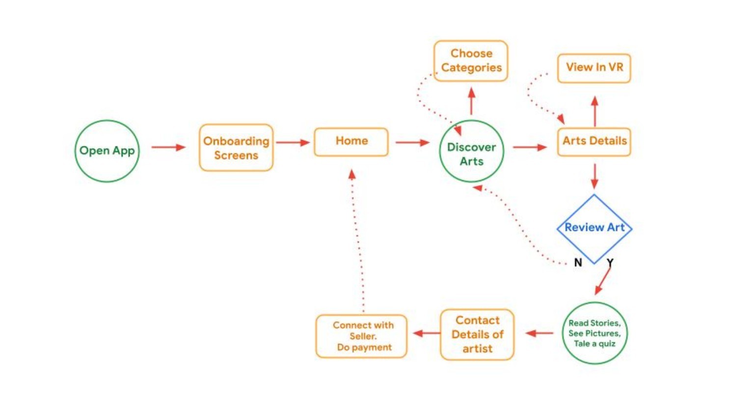
User Flow
User flow helped me to decide to flow of possible screens,
from entry point to the final step that is required for a successful outcome.
User Task Flow:
Open the app
Complete onboarding
Browse favorite artworks
Learn about their details and backstories
Contact sellers and make a purchase
User Journey Map
Starting the Design Process
Difficulty with website navigation was a primary pain point
for users, so I used that knowledge to create a sitemap.
My goal here was to make strategic information architecture decisions
that would improve overall website navigation. The structure I chose was
designed to make things simple and easy.
Paper Wireframes
Digital Wireframes
Low-fidelity Prototype
Usability Studies
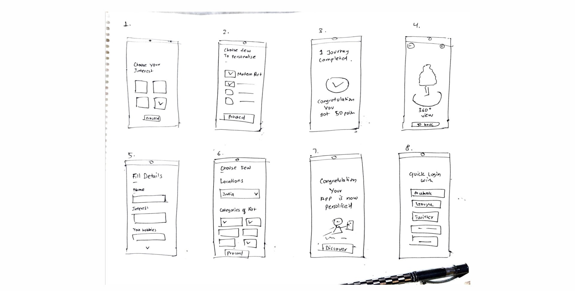
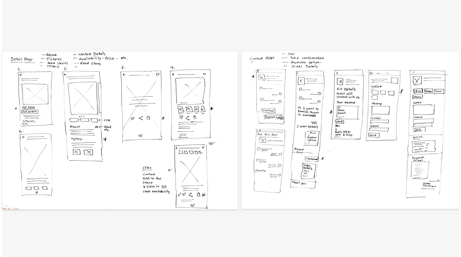
Paper wireframes
I used Crazy Eight technique to quickly generate multiple wireframe ideas for the app.
This method involves an intense 8-minute brainstorming session where I sketched out as many screen variations
as possible. The goal was to explore a wide range of design possibilities,
ensuring a creative and diverse approach to the app.
Taking the time to draft iterations of each screen of the app on paper ensured
that the elements that made it to digital wireframes would be well-suited to address
user pain points. For the home screen, I prioritized a quick and easy exploring of arts
with easy bottom navigation.
Paper wireframes and Crazy 8 activities served multiple purpose here, it helped me to connect the
app's information architecture to its visual design by showing
paths between screens. Genrate many Layout and go with the one that serves the purpose or combine from one to another.
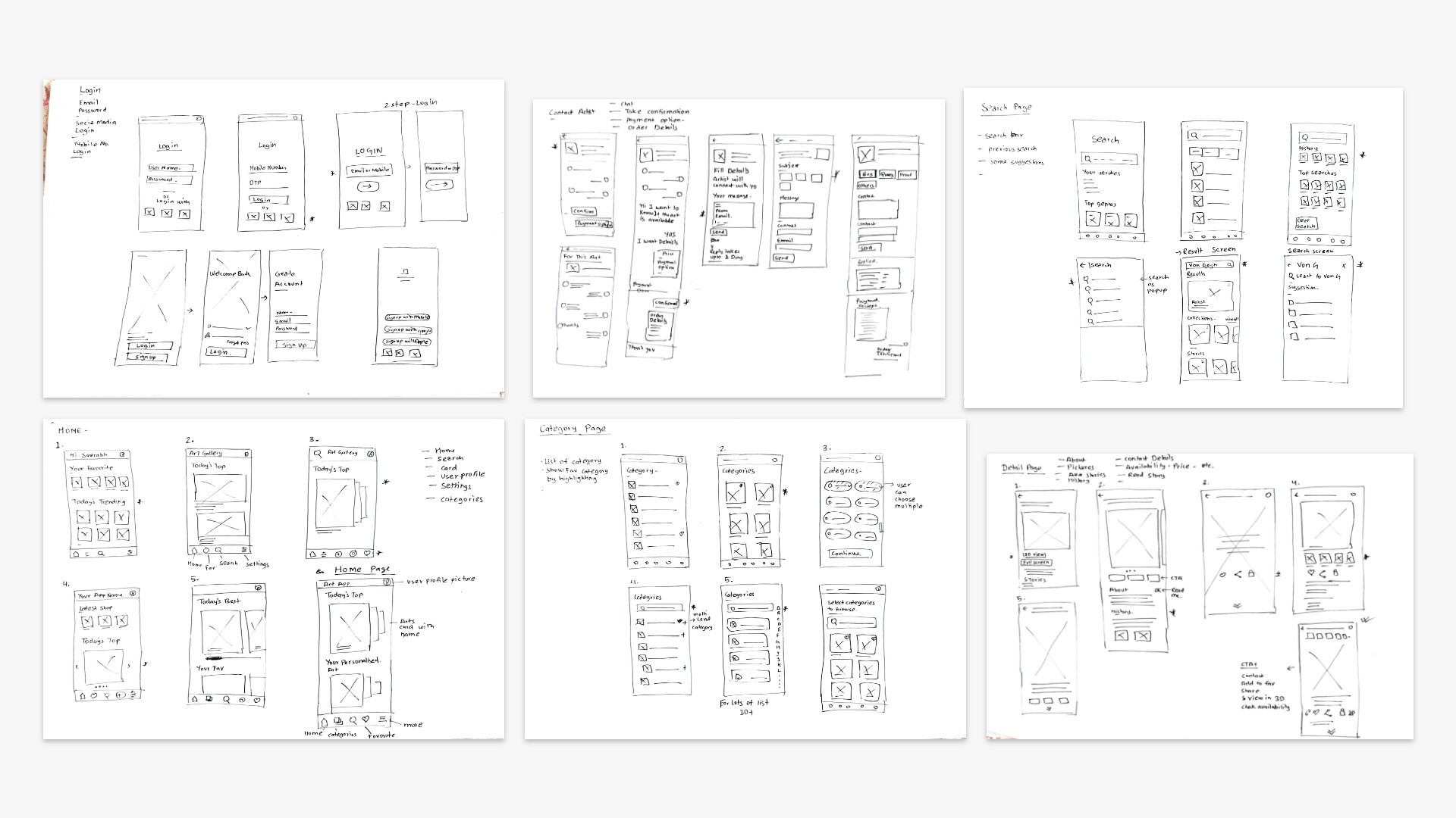
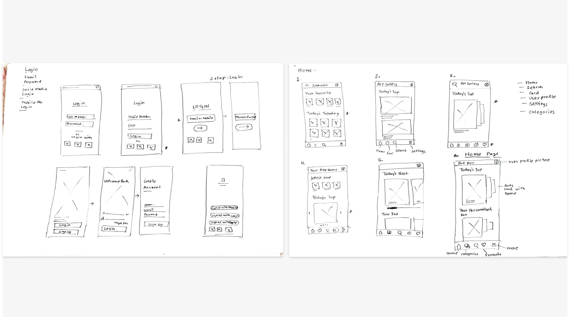
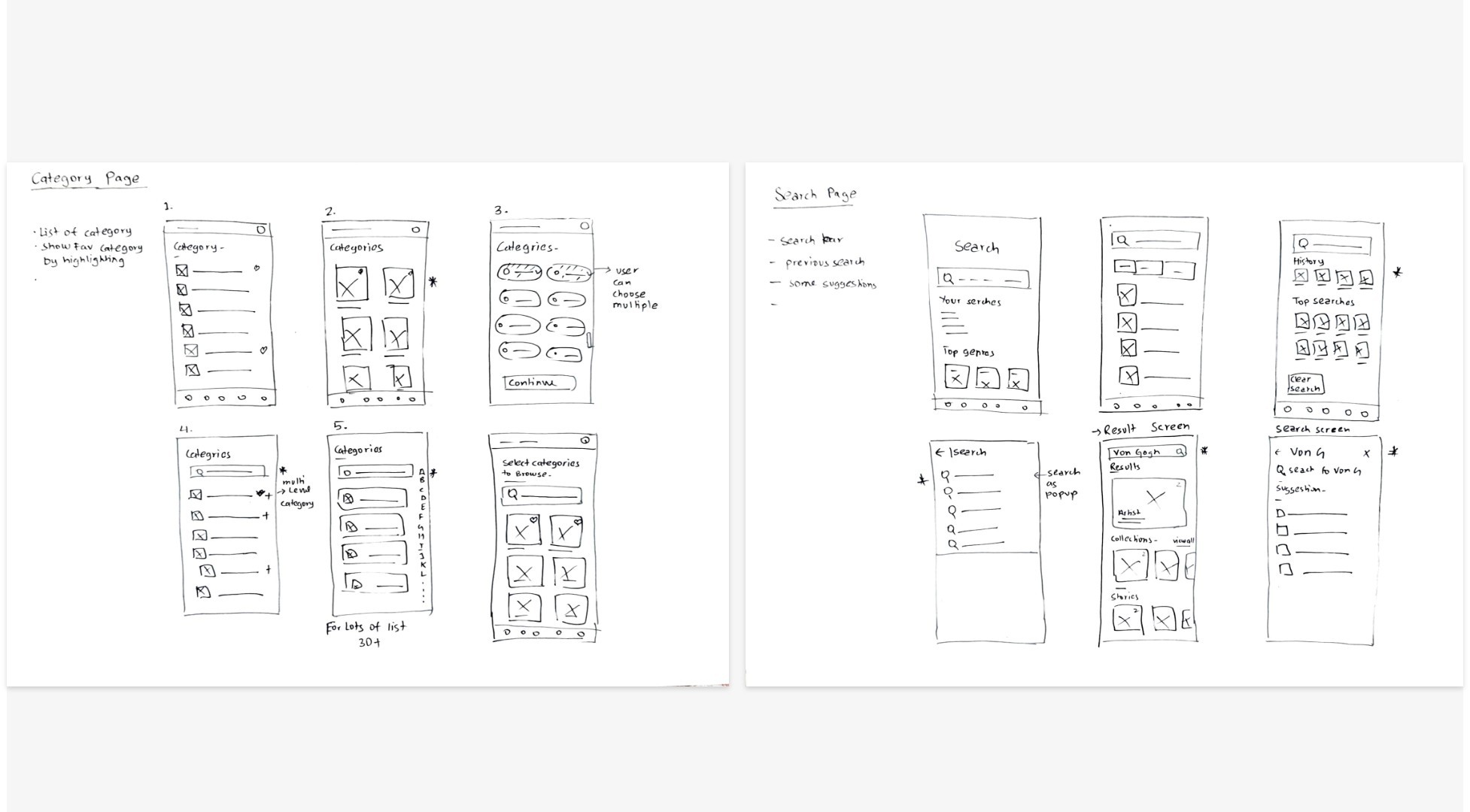
Digital wireframes
Moving from paper to digital wireframes made it easy
to understand how the redesign could help address user pain
points and improve the user experience. Prioritizing useful button
locations and visual element placement on the home page was a key part
of my strategy.
Easy navigation was a key user need to address in the designs
in addition to equipping the app to work with assistive technologies.
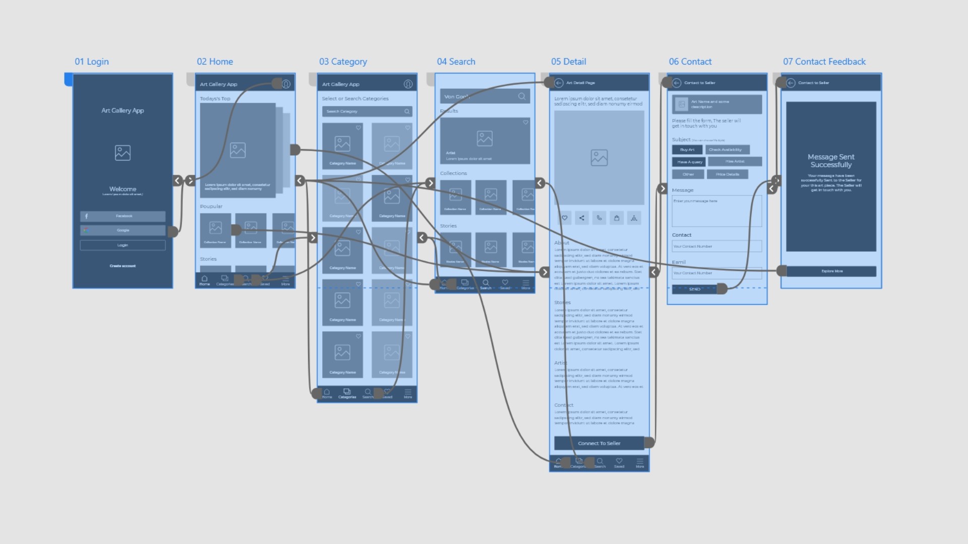
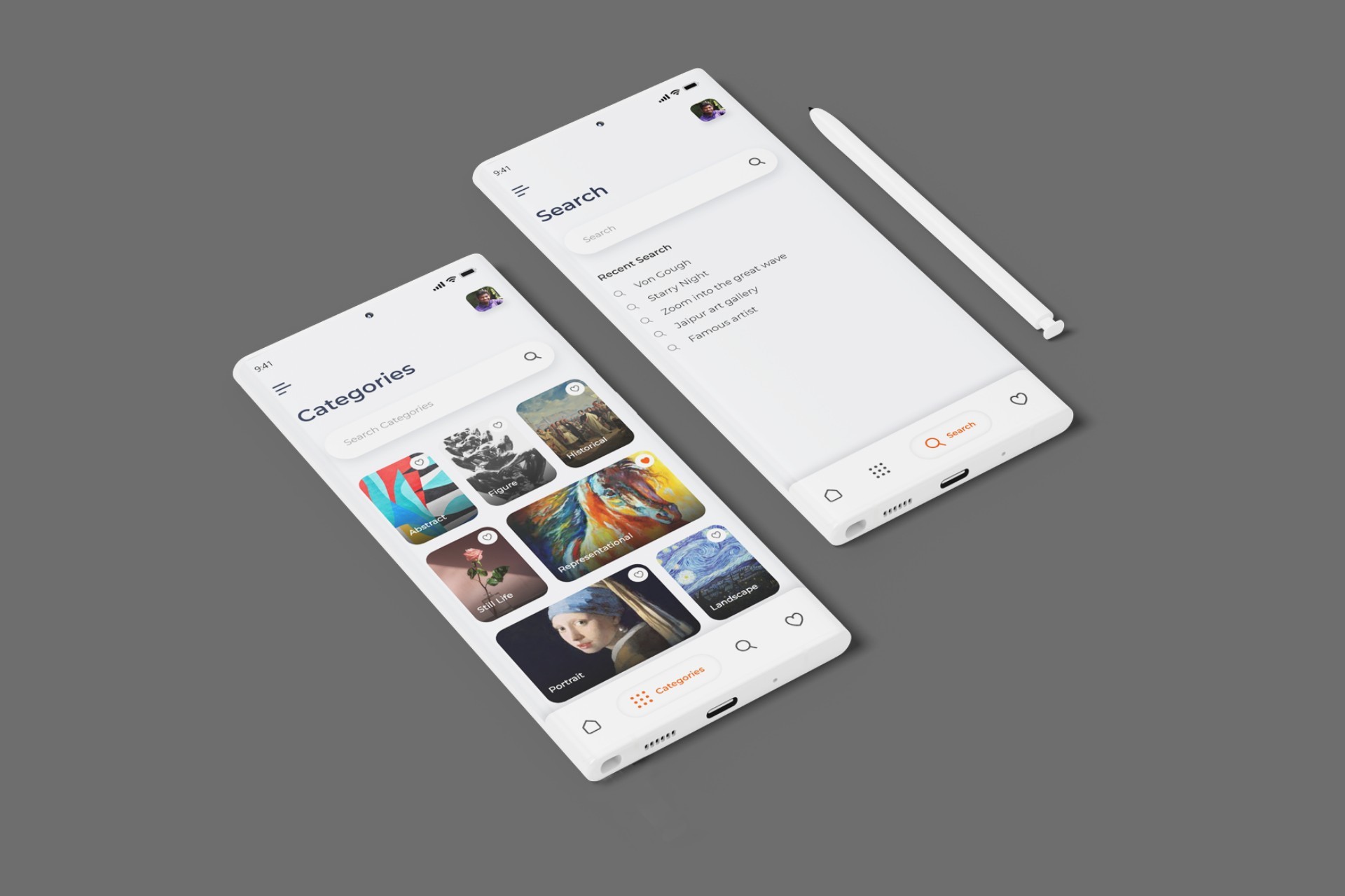
Low-fidelity prototype
Using the completed set of digital wireframes, I created a low-fidelity prototype. The primary user flow I
connected was Exploring Arts, Details and Contacting Seller.
View the Art Gallery App
low-fidelity prototype.
https://xd.adobe.com/view/0ddc5f3d-f89c-49fa-8ec5-d435564d5083-588f/?fullscreen
Low-fidelity prototype (Adobe XD)
Usability study
Using the completed set of digital wireframes, I created a low-fidelity prototype.
The primary user flow I connected was Exploring Arts, Details and Contacting Seller..
Usability study: findings
I conducted two rounds of usability studies. Findings from the first study
helped guide the designs from wireframes to mockups. The second study used a high-fidelity
prototype and revealed what aspects of the mockups needed refining.
Refining the Design
Early designs allowed for some customization,
but after the usability studies, I added additional options to choose pizza crust and sauce.
I also revised the design so users see all the customization options when they first land on the screen.
The second usability study revealed confusion with some user as Microcopy was inconsistent across screen
like same login and sign in were used for same purpose.
To Make it more consistent I used login Microscopy across all screen and for other such inconsistencies.
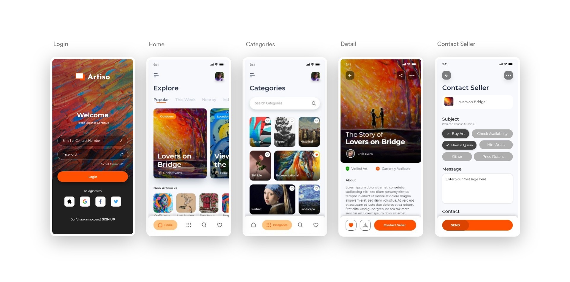
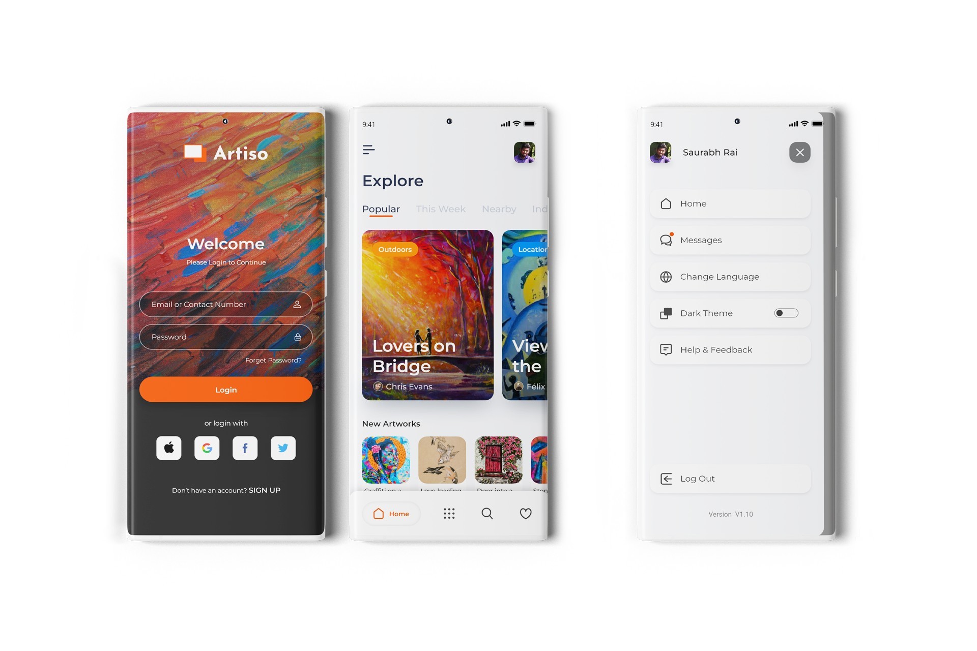
High Fidelity Mockups
I started by combining research, user personas, and wireframes. Then, I focused on
designing the home screen, establishing a visual theme for the art app. Once I was satisfied with
its look and feel, I applied the same approach to other screens, ensuring a consistent and intuitive user experience.
My goal was to provide clear navigation so users could explore the app naturally.
The best design feels effortless, allowing artists to focus on their creativity without distractions..
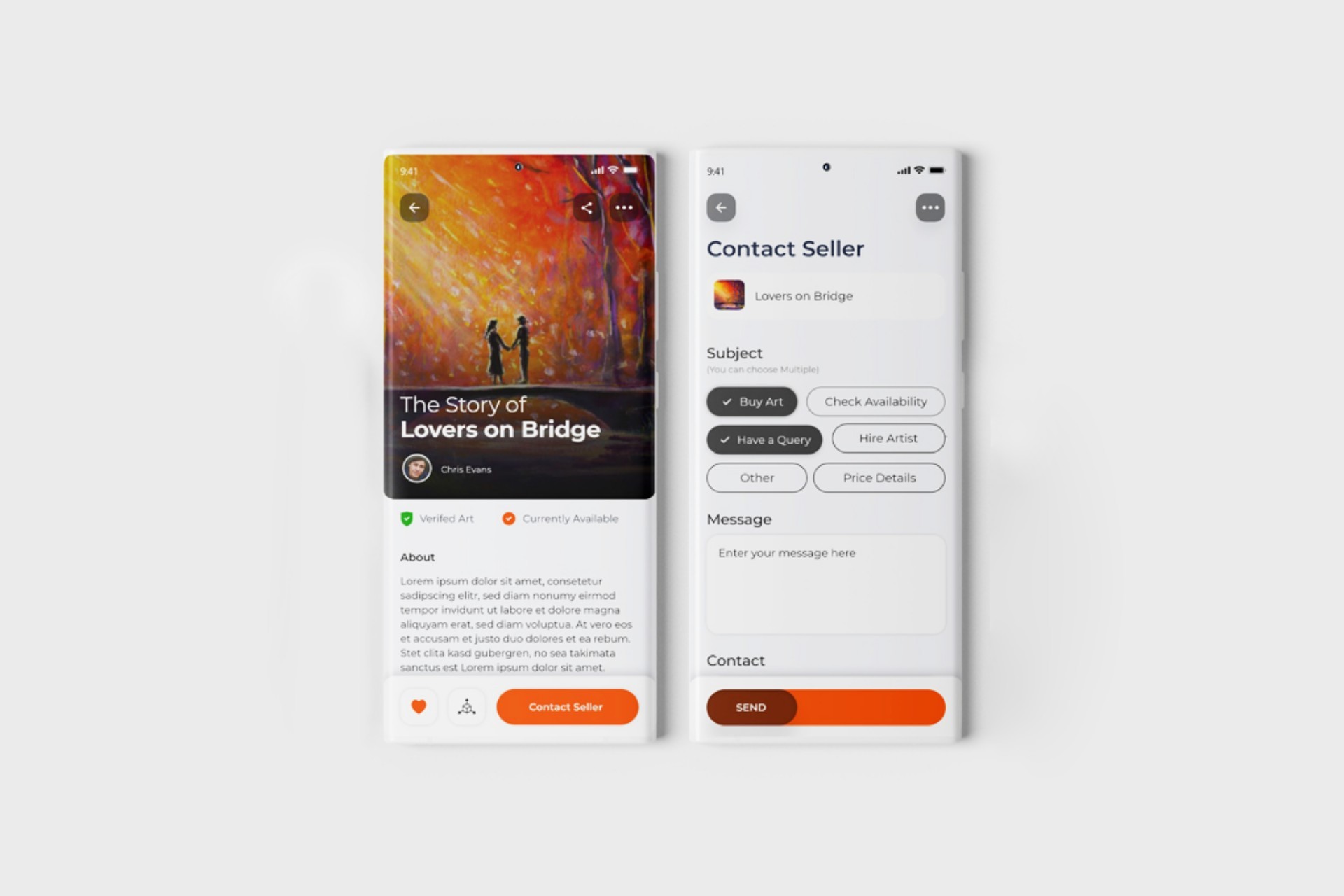
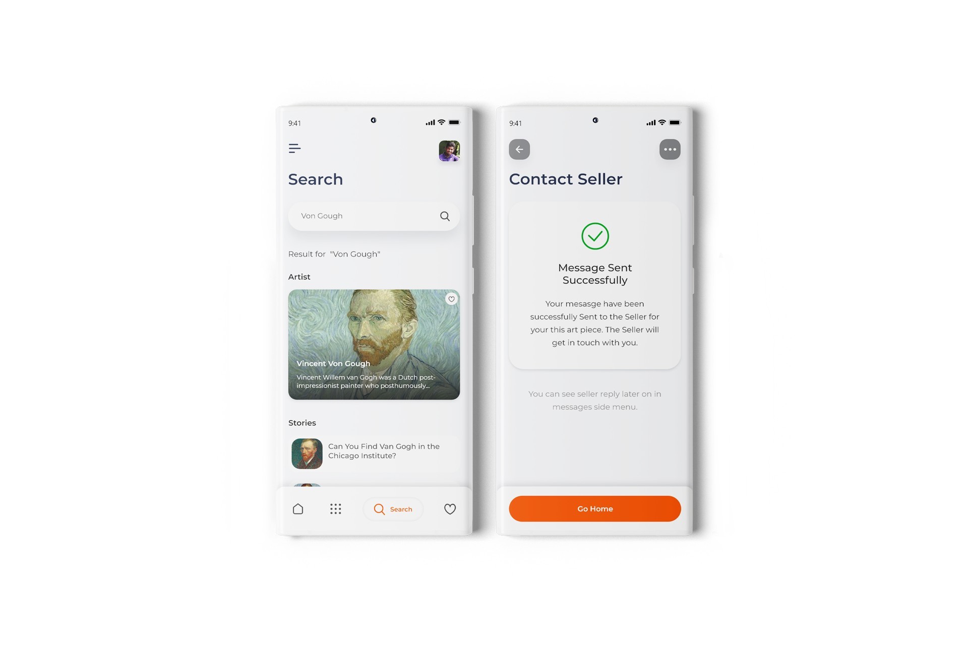
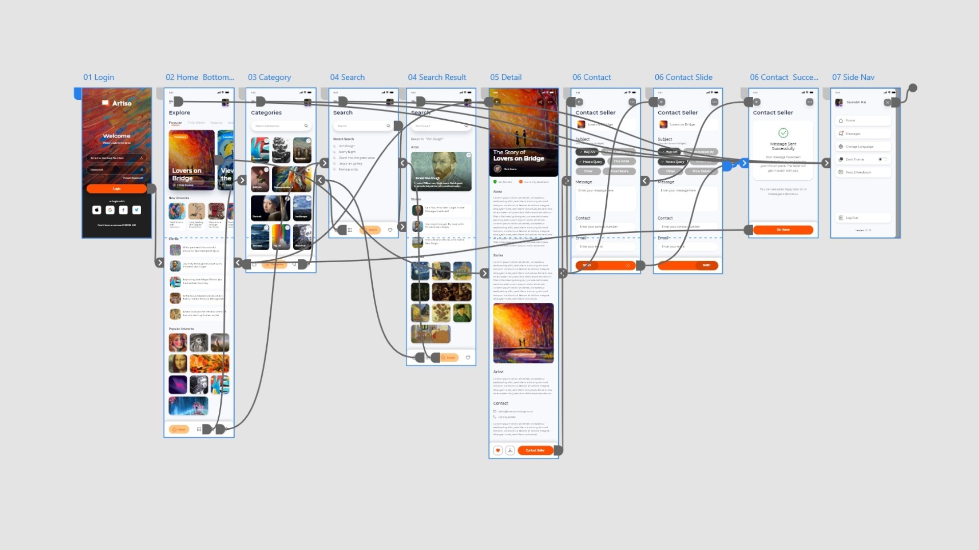
High-fidelity prototype
I used Mrvel and Adobe XD to create prototype to used for further user testing final high-fidelity prototype presented cleaner user flows for exploring
artworks with cool interactions, animations and transition. It also met user
needs for exploring different kinds of arts and simple layout form for contacting seller.
View the Art Gallery App high-fidelity prototype
Usability Testing
There were few scenarios which i prepared for user testing on the mockups. Below are what users responded. My Focus we mainly on:
If User able to complete the flow and perform required task in the prototype
Readability
Bottom Navigation of App (tested with Three different scenarios)
App Overall Experience
Feedback and Further Improvements
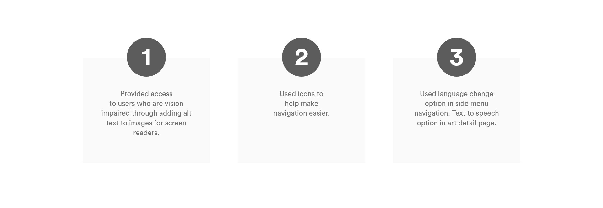
Accessibility Considerations
While designing I have kept an eye on the accessibility
consideration like color contrast, Hierarchy and Layout,
typography and all those design principles. It's always
easier to fix things that you uncover in the design process,
so it's best to consider accessibility upfront in the design process.
Takeaways
Impact:
The app makes users feel engaged with lots of content to explore with modern and simple design.
One quote from peer feedback:
“The app made it so easy and fun to explore arts. I love how interactive the app is.
I would definitely use this app as go-to for keeping with my desire to explore all kinds of arts”
What I learned:
While designing the Art Gallery app, I learned that the first ideas for the app are only the
beginning of the process. How much it is important to follow the design process. Usability studies
and peer feedback influenced each iteration of the app’s designs.
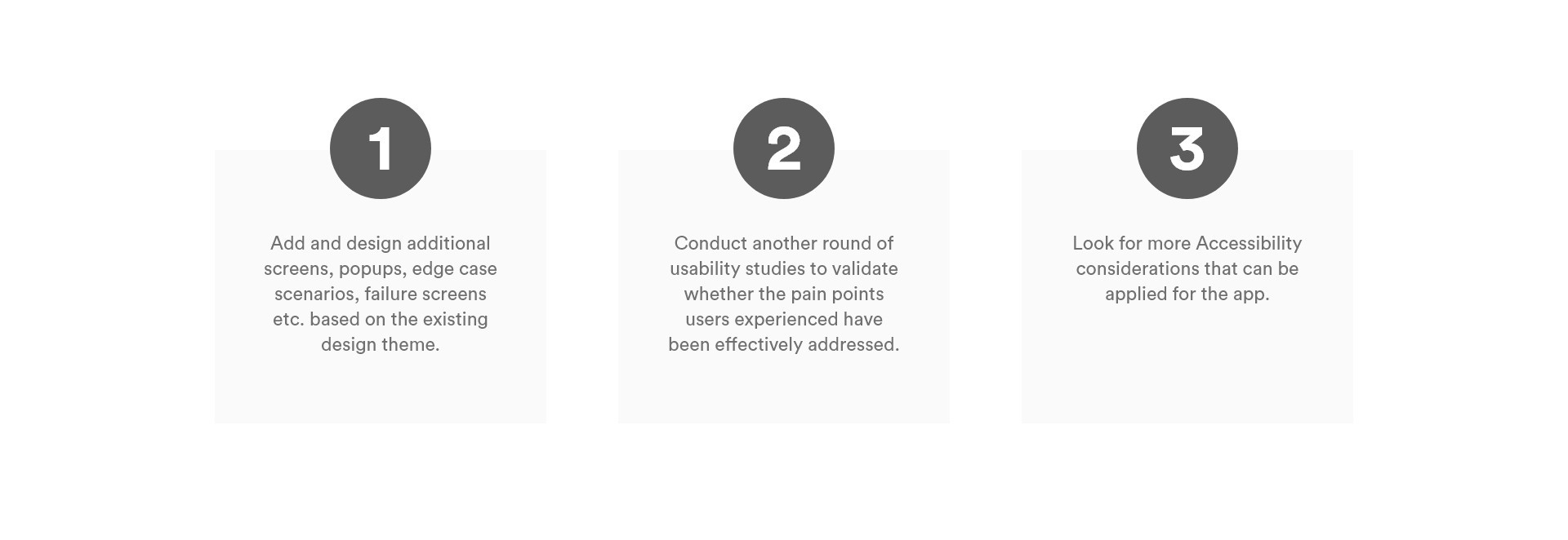
Going forward
Usability Stry in Different part of the process helped me to really understand the user and design for intended user taking their feedbacks and improving on it on each step.
Prioritizing useful button locations and visual element placement on the
home page was a key part of my strategy.
Next Step
Usability Study in Different part of the process helped me to really understand the user
and design for intended user taking their feedbacks and improving on it on each step.
Stuff I did
✔ Research✔ Ideation✔ Planning indepth for UX Research✔ Conducting User Interviews✔ User personas✔ Drank Lots of Coffee✔ Explored Different Kind of Arts✔ Made Wireframe✔ Structured User Journey✔ Worked in nights✔ Branding✔ UI Design✔ Leanrned New Tools✔ Pop and un-pop things
Its tough to not enter yourself in the design process but staying true to user is itslef a challenge.