Redefining Toy Shopping: For Every Kid’s Joy and the Parents
From Empathy to Execution – How Research, Ideation, and Iteration Shaped a Seamless Shopping Experience
Timeframe
April 2022- June 2022
Tools
Figma, Adobe Creative Suite, Marvel,
Lots of Notes
Role
UX Researcher, UI/UX Designer
Designing toy shopping app from concept to delivery
Team
Anu, Sushant
Saurabh.
Preface
Toy shopping, especially online, can be overwhelming due to endless choices,
uncertainty about age-appropriateness, and slow delivery times. Parents and gift-givers often
struggle to find the perfect toy quickly and confidently. WonderWares is designed to bridge this
gap by offering a good, AI-powered shopping experience that personalizes recommendations
and provides fast delivery options. This case study outlines the design thinking process used
to create an intuitive and efficient toy shopping app.
The problem
Many users find online toy shopping frustrating because:
Too many options make it hard to decide.
Age-appropriateness is unclear, leading to uncertainty.
Last-minute shopping is stressful due to long delivery times.
Navigation on existing platforms is cluttered and inefficient.
The Goal
WonderWares app goal is to simplify toy shopping by:
Offering an AI-powered Smart Finder Quiz for quick and accurate recommendations.
Providing multiple delivery options, including same-day and curbside pickup.
Designing a clean, intuitive UI that enhances user experience.
Ensuring a fast, hassle-free checkout process for busy users.
This case study explores how user research, ideation, prototyping, and usability
testing shaped WonderWares into an innovative and user-friendly toy shopping solution.
Empathise: Understanding the user
I conducted user interviews with users who can be categarised as parents, gift-givers, who frequently shop for toys.
The goal was to uncover pain points, shopping behaviors, and expectations when searching for the
perfect toy. Through these conversations, several recurring challenges emerged: overwhelming
choices, difficulty finding age-appropriate toys, and long delivery times. Users also expressed a
need for personalized recommendations rather than manually filtering through endless options.
User Interveiws
Competitive Analysis
Desk Research
From the interviews, it became clear that users value speed, convenience, and guidance in their shopping experience. Many preferred a
smart recommendation system that could quickly suggest the best toys based on the child’s age,
interests, and occasion. These insights directly influenced the app’s features, such as the AI-powered
Smart Finder Quiz, which simplifies decision-making. Additionally, the demand for same-day and express
delivery reinforced the importance of fast fulfillment options, a key differentiator for Wonderwares.
UX Research Study Plan
Competitive Audit & Analysis
To better understand the landscape of toy shopping apps, I conducted a competitive audit by
analyzing both direct and indirect competitors in the market. The goal was to identify strengths,
weaknesses, and opportunities to differentiate our app. This analysis focused on key aspects such
as website performance, usability, user experience, typography, imagery, efficiency in
task completion, responsiveness, and unique features.
To visualize the findings effectively, I created a Spider Chart, mapping out how each competitor performed
across various parameters. This helped pinpoint areas where competitors excel and where they fall short.
For instance, while some apps had an extensive toy catalog, they lacked personalized recommendations
and struggled with delivery speed, a gap WonderWares aimed to bridge with AI-powered smart recommendations
and same-day delivery options. This audit provided valuable insights into how we could position WonderWares as a
superior solution in the market.
Competitive Audit
Competitive Analysis - Spider Chart
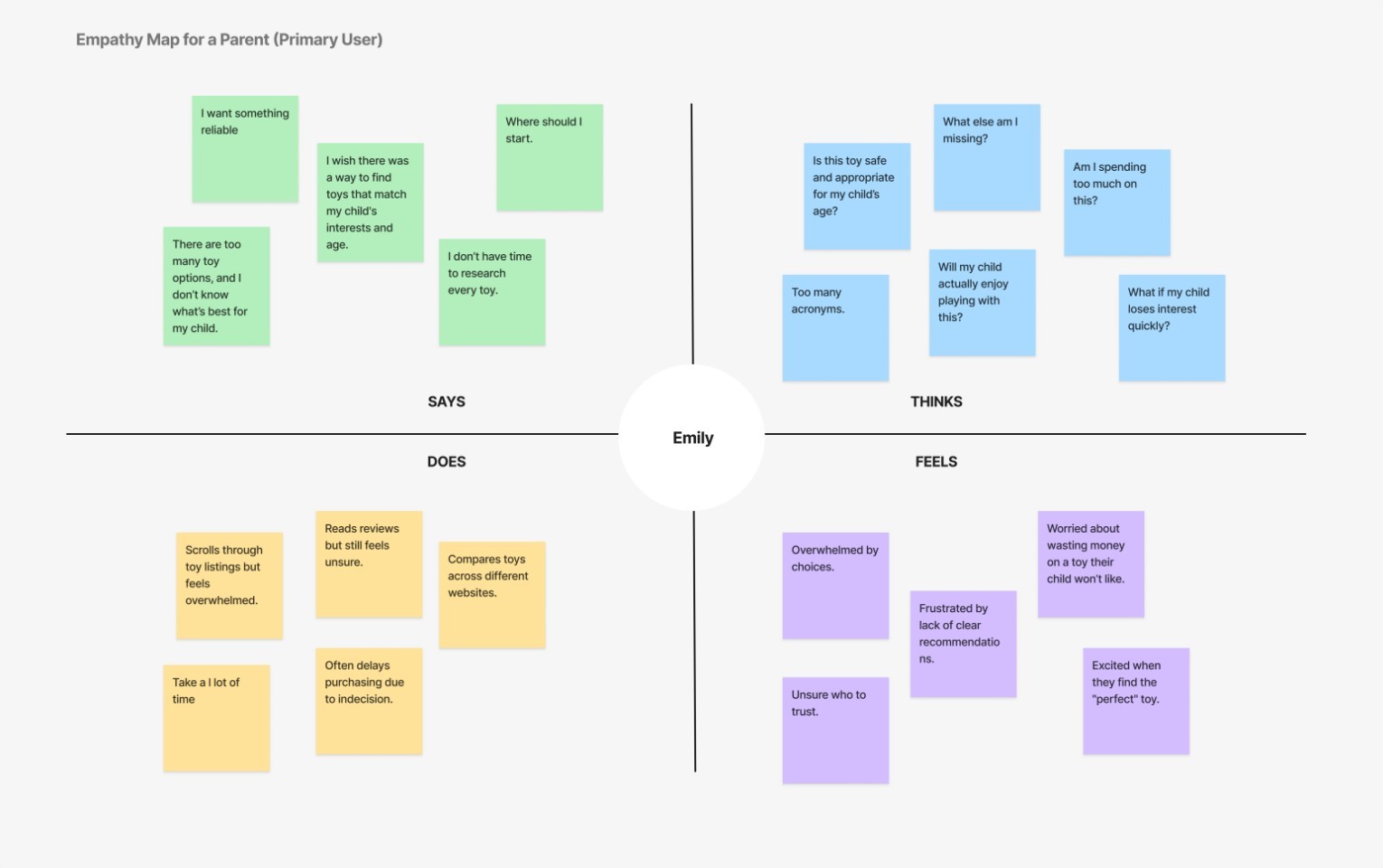
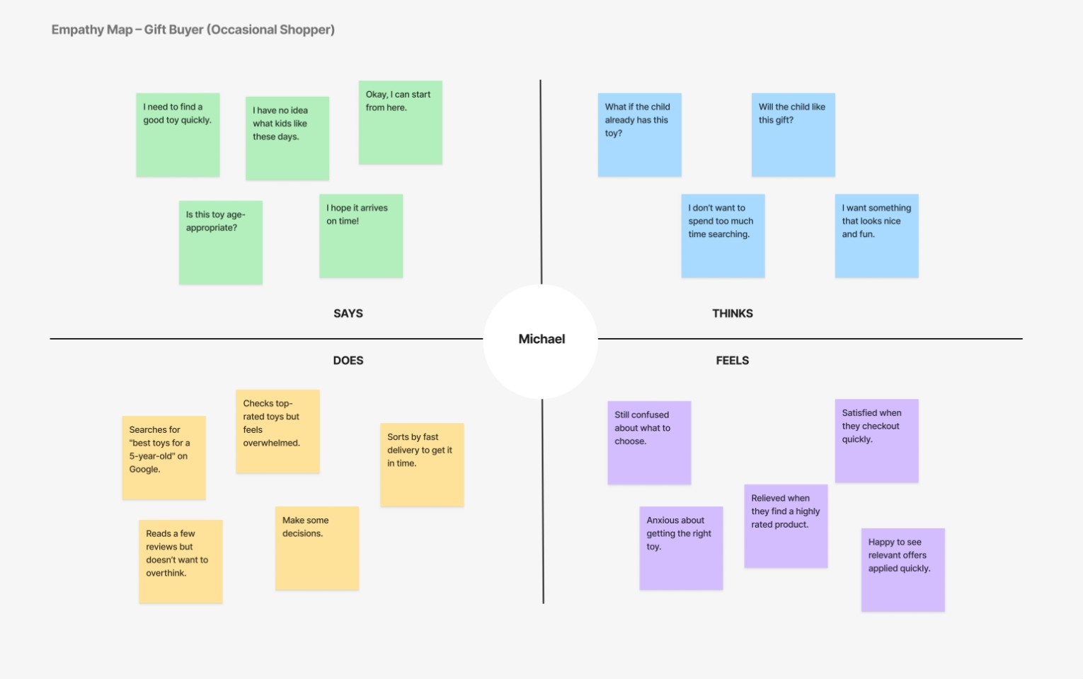
Empathy Map
To gain deeper insights into how users think, feel, and behave during the toy shopping experience,
I created an Empathy Map based on research findings. This helped visualize user pain points,
motivations, and decision-making patterns. By categorizing what users say, think, do, and feel,
I was able to uncover key frustrations—such as feeling overwhelmed by choices, struggling to
find age-appropriate toys, or worrying about delivery delays.
The empathy map also highlighted positive experiences users seek, like personalized recommendations,
fast and hassle-free purchasing, and trust in product quality. These insights played a crucial role
in shaping the app’s design direction, ensuring that it not only meets functional needs but also
resonates with users emotionally.
Define – Framing the Problem Statement
After gathering insights from user research, the next step was to clearly define the core problems and user needs.
This phase helped frame the design challenges and set a strong foundation for the ideation and solution-building process.
By creating personas, user stories, and a well-defined problem statement, I ensured that every design
decision was driven by real user behaviors, frustrations, and goals.
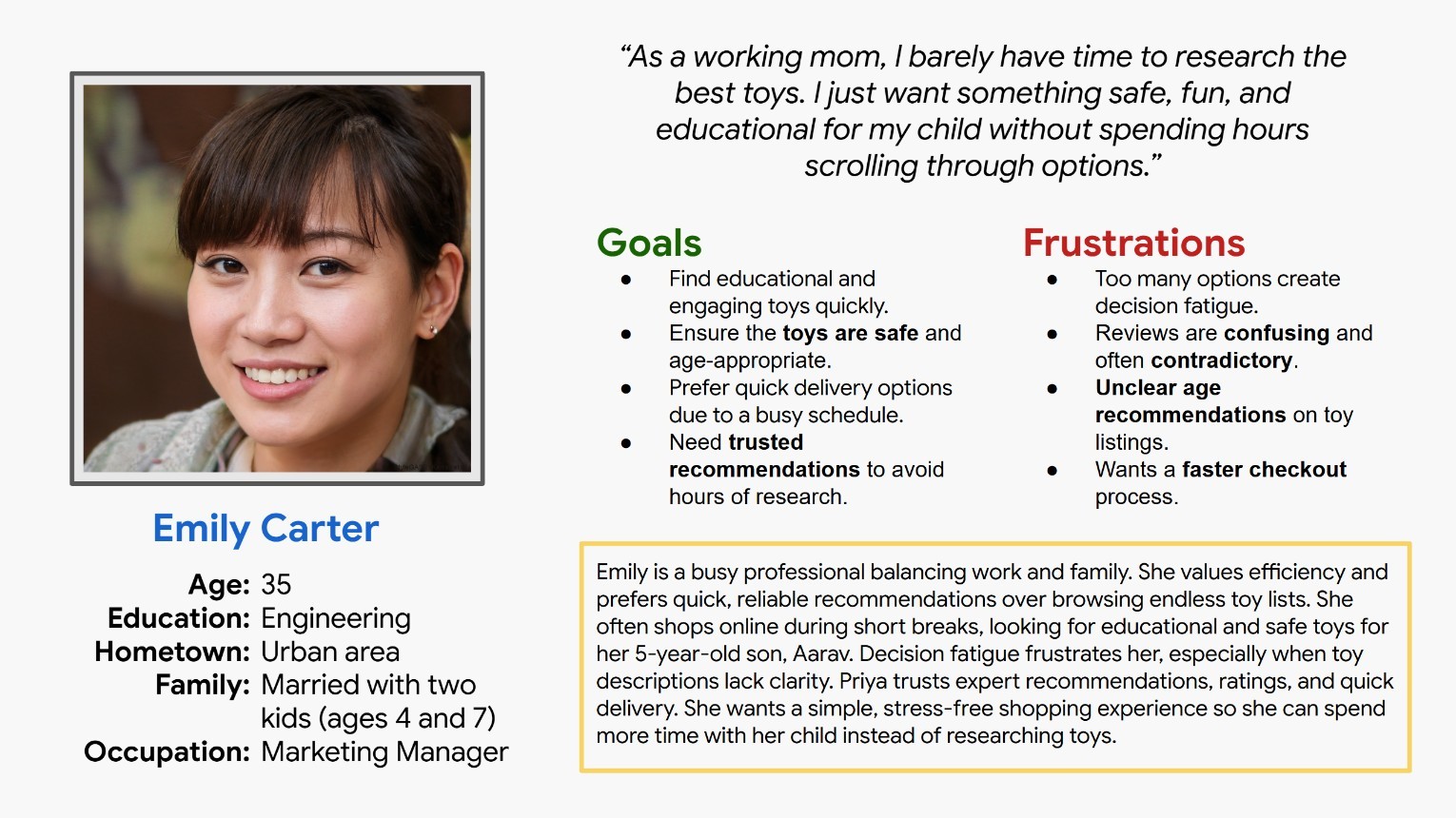
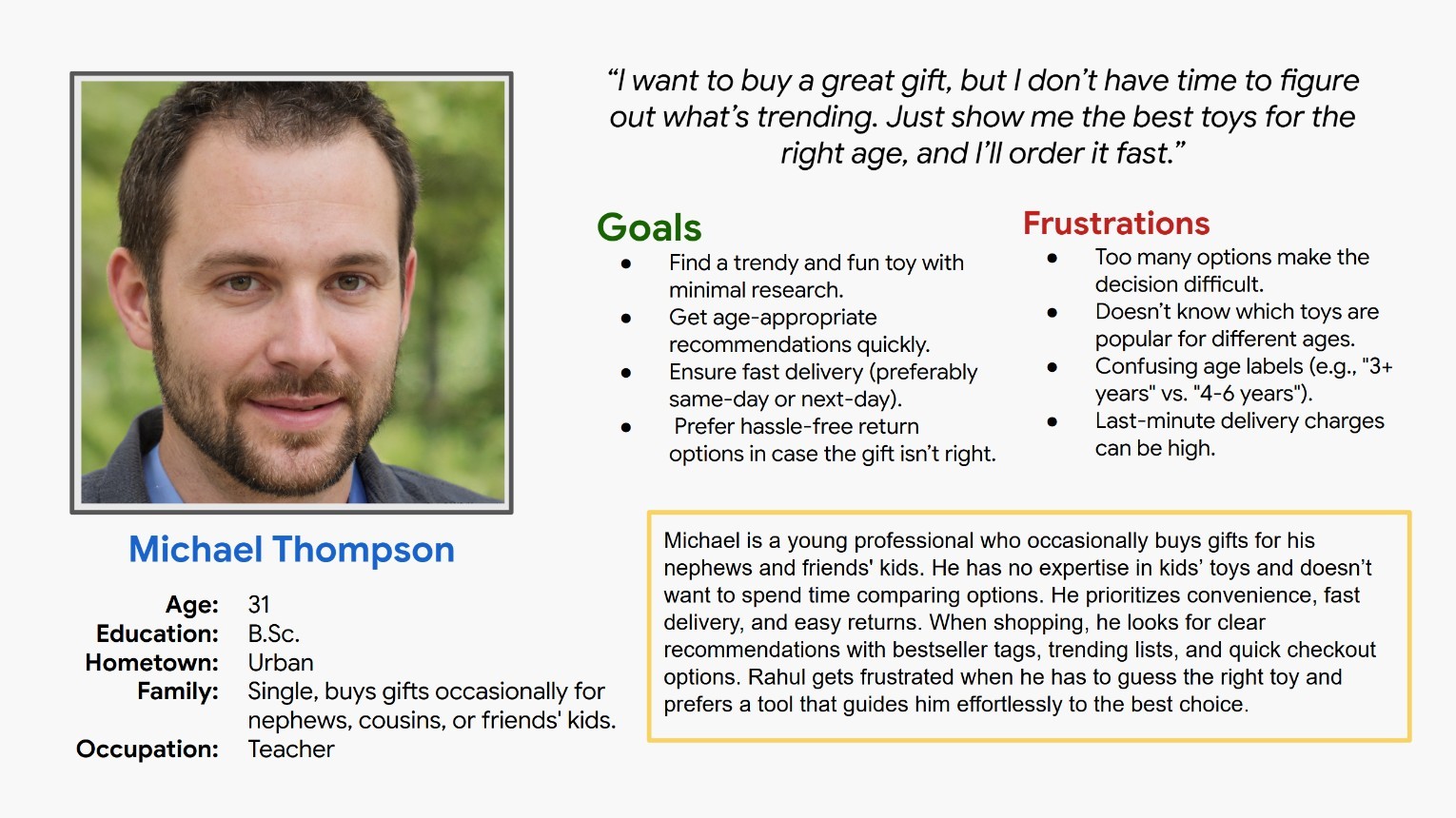
Persona
To humanize the target users and their shopping journey, I created detailed personas
representing different types of toy shoppers. These included a busy parent looking for quick
and reliable toy recommendations and a thoughtful gift-giver unsure about the best toy choice.
The personas helped in defining pain points, motivations, and expectations, ensuring that the
app’s design caters to real-world shopping behaviors.
Persona [Emily]
Persona [Michael]
User Stories
To translate user needs into actionable design goals, I wrote user stories that reflect common toy shopping scenarios.
For example, “As a parent, I want to quickly find age-appropriate toys so that I can make a
purchase without spending hours researching.” These stories provided clarity on how different
users would interact with the app, what features they would rely on, and the value they expect.
User Stories
User Painpoints
Problem Statement
Toy shopping often becomes overwhelming, time-consuming, and confusing, especially when choosing
age-appropriate toys or finding the perfect gift. Users need a simplified, guided, and efficient
way to discover and purchase toys that suit their needs. How might we create a seamless toy-shopping
experience that offers smart recommendations, fast delivery options, and an intuitive user
interface to help users find the perfect toy effortlessly?
By framing the problem clearly, I was able to align the design process with user needs,
ensuring that every feature solves a real challenge.
Problem Statement: Parents and gift buyers struggle to find the right toys
quickly due to overwhelming choices and unclear product information. This
results in frustration and abandoned purchases.
Ideation: Turning Insights into Concepts
With a clear understanding of user needs and challenges, I started on
brainstorming creative solutions to address the problem areas identified during research.
Here I focused on generating multiple design concepts, refining ideas, and prioritizing
features that would have the greatest impact on user experience. Through methods like:
Sketching Initial Concepts
Crazy 8s
Mind Mapping
Prioritisation Matrix
This structured yet flexible approach allowed me to explore a wide range of ideas before narrowing
them down into a refined direction, whcih will set the foundation for wireframing and prototyping.
Initial Concepts & Crazy 8s
To quickly generate a variety of possible solutions, I used the Crazy 8s technique, where I sketched eight different layout ideas in just eight minutes.
This fast-paced exercise pushed me to think beyond the obvious and explore innovative ways to design
the Smart Toy Finder quiz, product listing pages, and checkout flow. From different UI structures to
interactive elements, these sketches helped visualize how the app could guide users seamlessly through
the shopping journey..
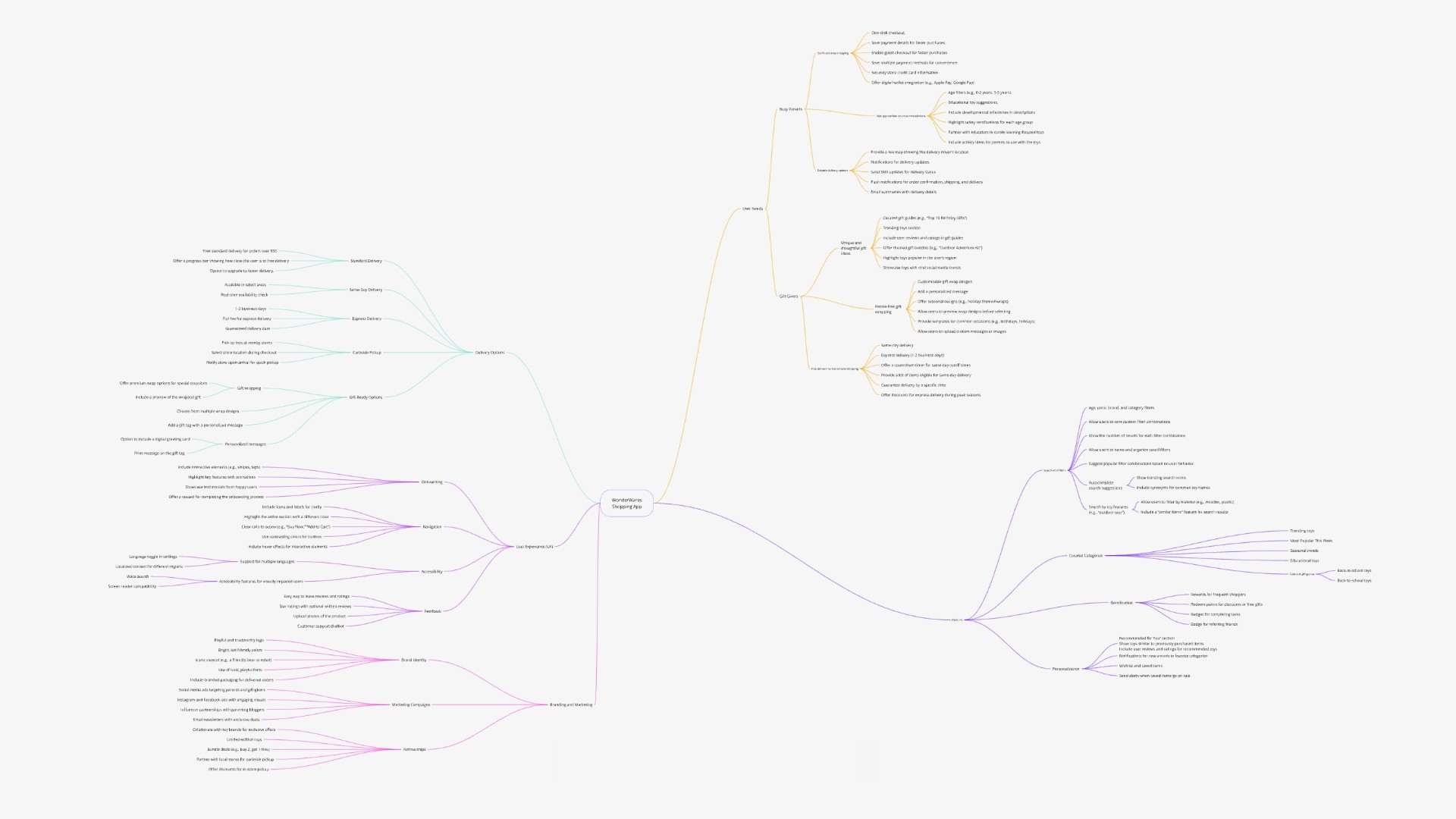
Mind Mapping
To organize and refine ideas, I created a Mind Map, visually breaking down the app’s key features,
user interactions, and design priorities. This technique helped in structuring the app’s flow,
ensuring that all touchpoints—from searching for toys to receiving recommendations and
checking out—were intuitive and efficient. It also allowed me to connect user pain
points with potential solutions, ensuring a user-centered approach in every decision.
Mindmap
Prioritisation Matrix
Finally,
the With many ideas on the table, I needed to determine which features should be implemented first. Using a Prioritization Matrix,
I evaluated each idea based on impact and feasibility, ensuring that high-value features like personalized
toy recommendations, age-based filtering, and fast delivery options were given priority. Features
that added value but were less critical, like social sharing or wishlist functionalities, were
noted for future iterations.
With all the research, findings, and pain points identified in the previous phase,
I began working on digital wireframes while focusing on the layout structure and key features
essential for a seamless experience. My goal was to create an interactive prototype to test
with users, gather insights from usability testing, and refine the design iteratively based
on their feedback.
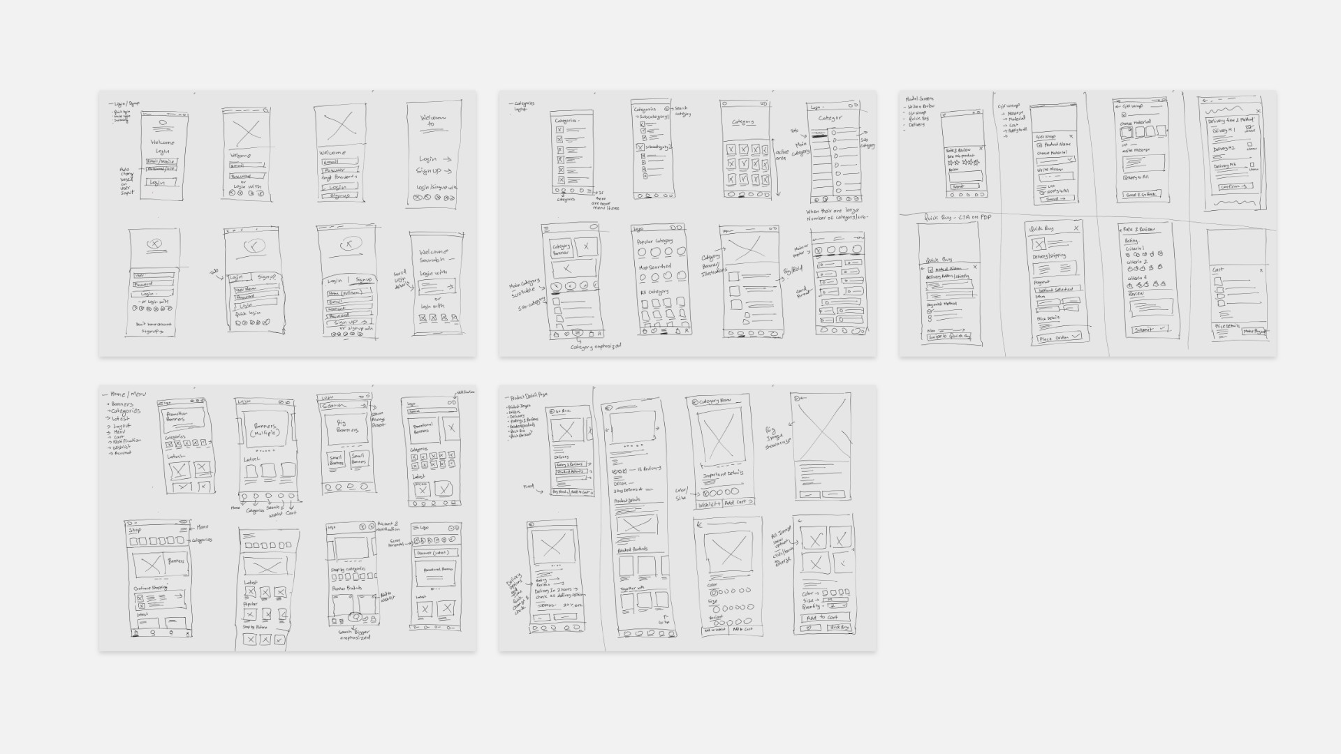
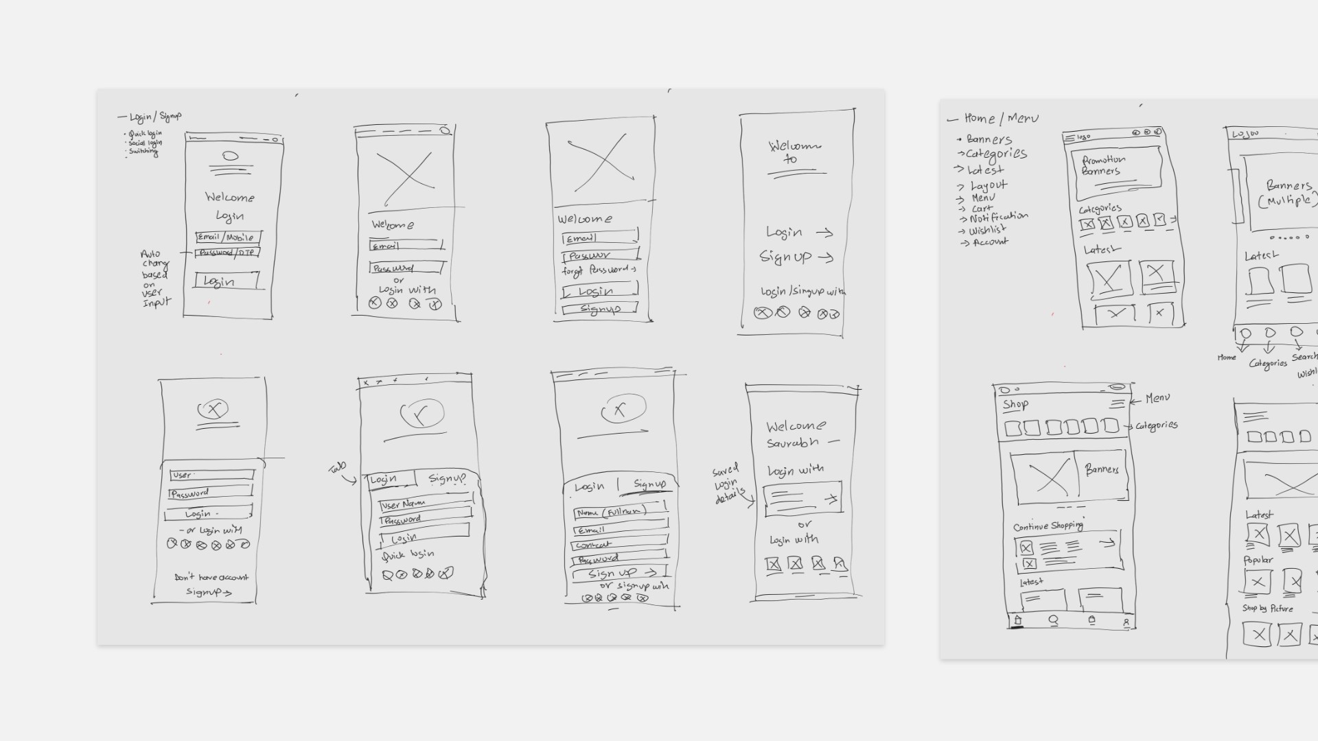
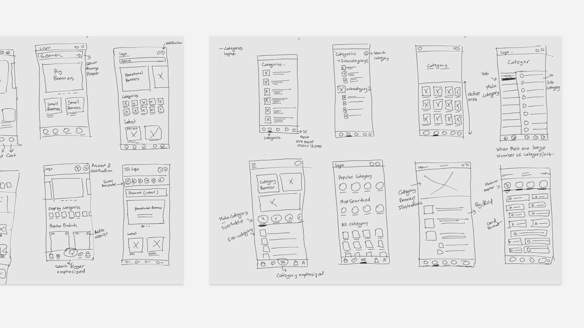
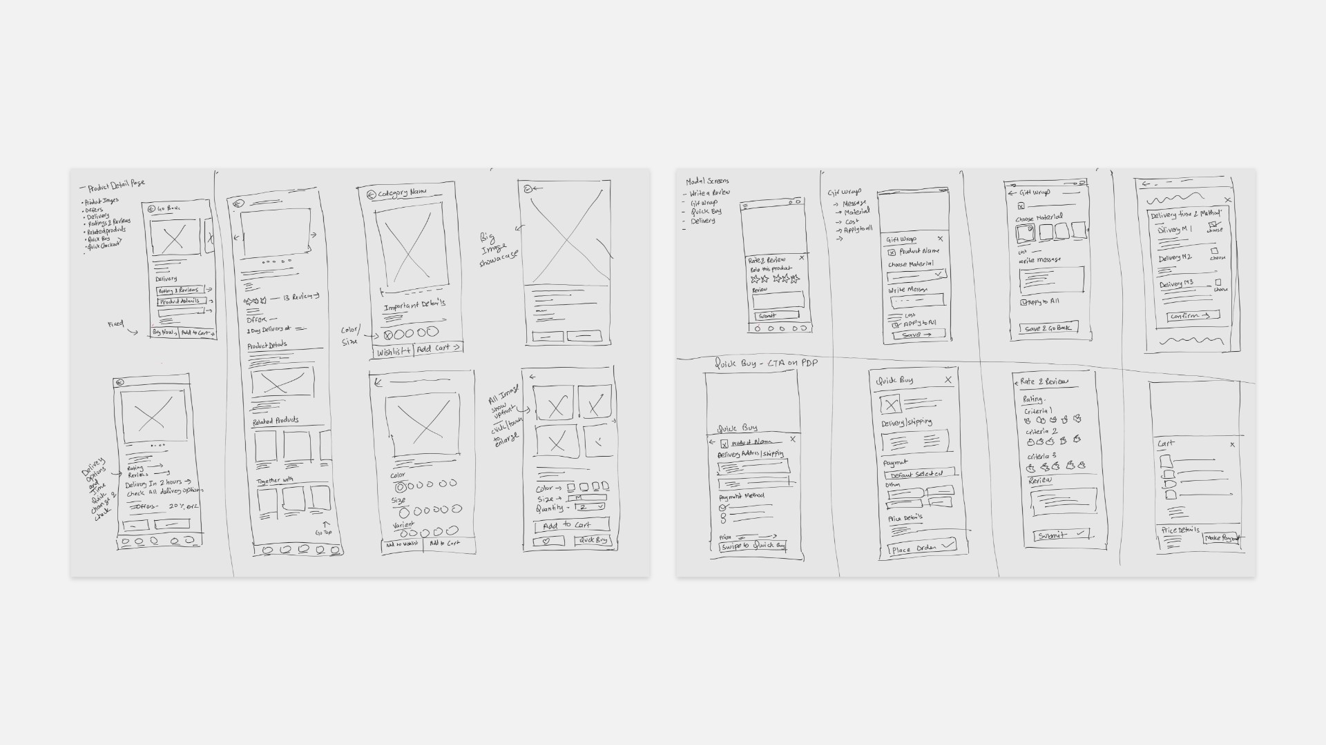
Digital Wireframe
I started creating digital wireframes, where I sketched out the primary user
flows focusing on task completion and the Smart Toy Finder quiz. These wireframes mapped
out the core navigation, product browsing, toy recommendation quiz, and checkout process.
The goal was to ensure that users could seamlessly find, select, and purchase toys without
friction. At this stage, I concentrated on layout, hierarchy, and interaction flow, keeping the
design simple and functional.
Here I have shown all the wireframe that was necessary to make for the user journey
to complete and so that later on I can do usability test connecting all these low fidelity
digital wireframe.
Low-fidelity Prototype
Based on the digital wireframes, I built a low-fidelity prototype to test the
core functionalities. This interactive prototype allowed users to navigate through
the main shopping journey, interact with the Smart Finder quiz, and proceed through checkout.
It was a crucial step before adding visual details, as it helped identify any early
usability issues and areas for improvement. I conducted initial user testing to gather quick
feedback on how intuitive the flow was.
Low-fidelity Prototype for UT
Usability Study
To ensure the design met user expectations, I conducted a usability study on the
low-fidelity prototype. The goal was to observe how users interacted with the interface
and identify any pain points or confusion they encountered.
The study helped in validating the navigation, ease of completing tasks,
and overall shopping experience.
At this point, I had received feedback on my designs from my peers
and other visual designers about things like placement of buttons
and page organization. I made sure to listen to their feedback,
and I implemented several suggestions in places that addressed
user pain points.
Usability Study: Findings
Key insights gathered from the usability study are listed below.
These findings helped refine the design before moving to high-fidelity mockups.
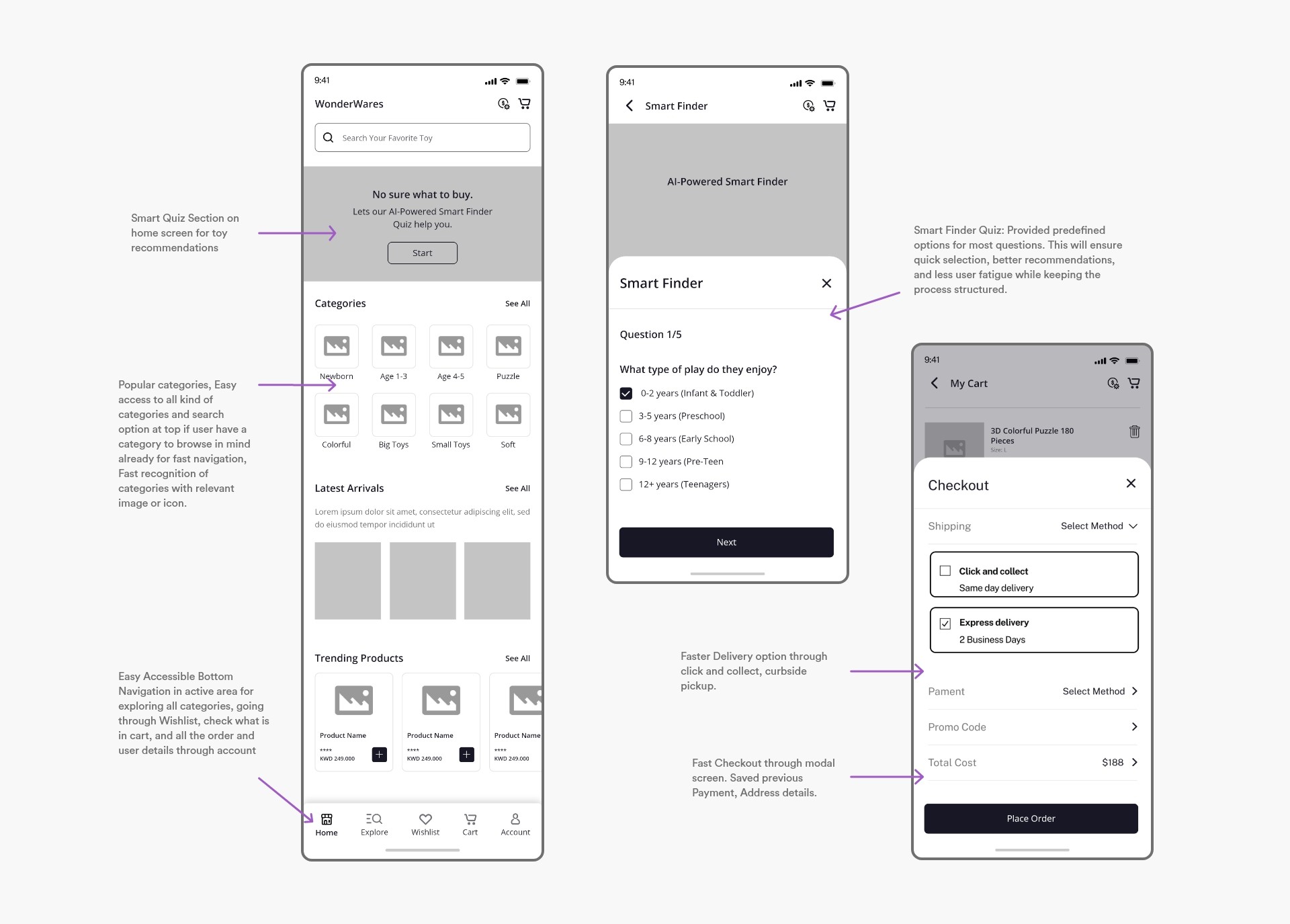
High Fidelity Mockups
After implementing usability study feedback, I designed high-fidelity mockups, focusing on
visual appeal, accessibility, and branding. Colors, typography, and imagery were applied to
ensure the interface was both engaging and intuitive. The Smart Finder quiz was refined to be
more interactive and visually appealing, while the product browsing and checkout flow were
optimized for efficiency.
I focused on providing clear next steps so users could navigate naturally in any context.
The best interface is one that feels invisible, offering a direct, accessible, and seamless experience.
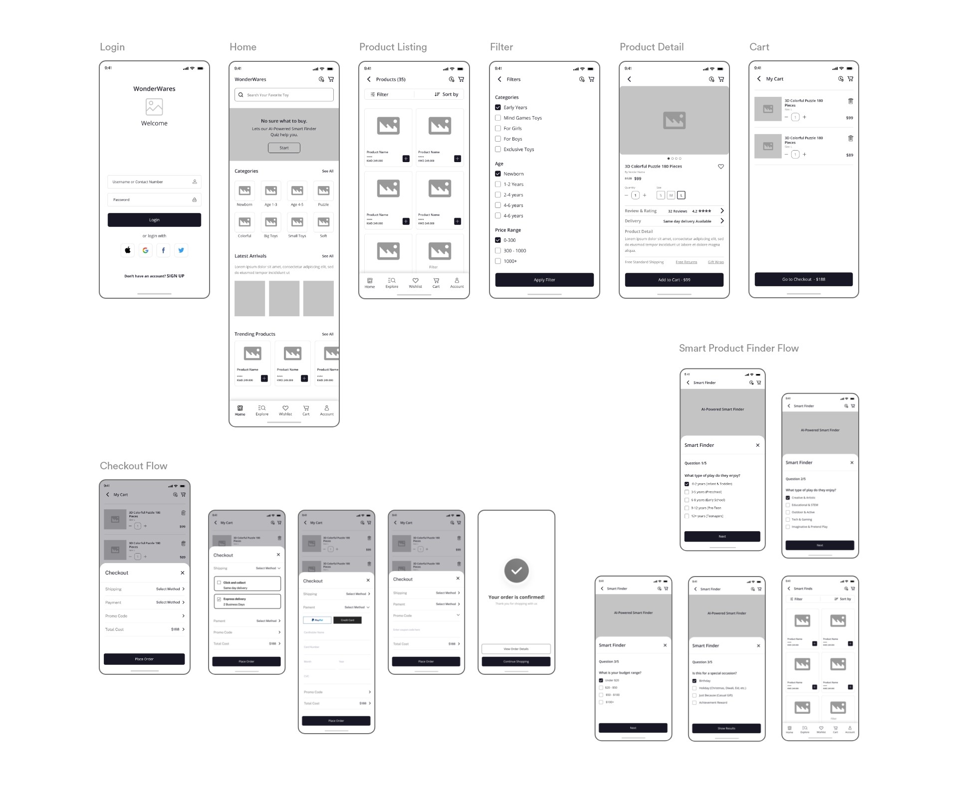
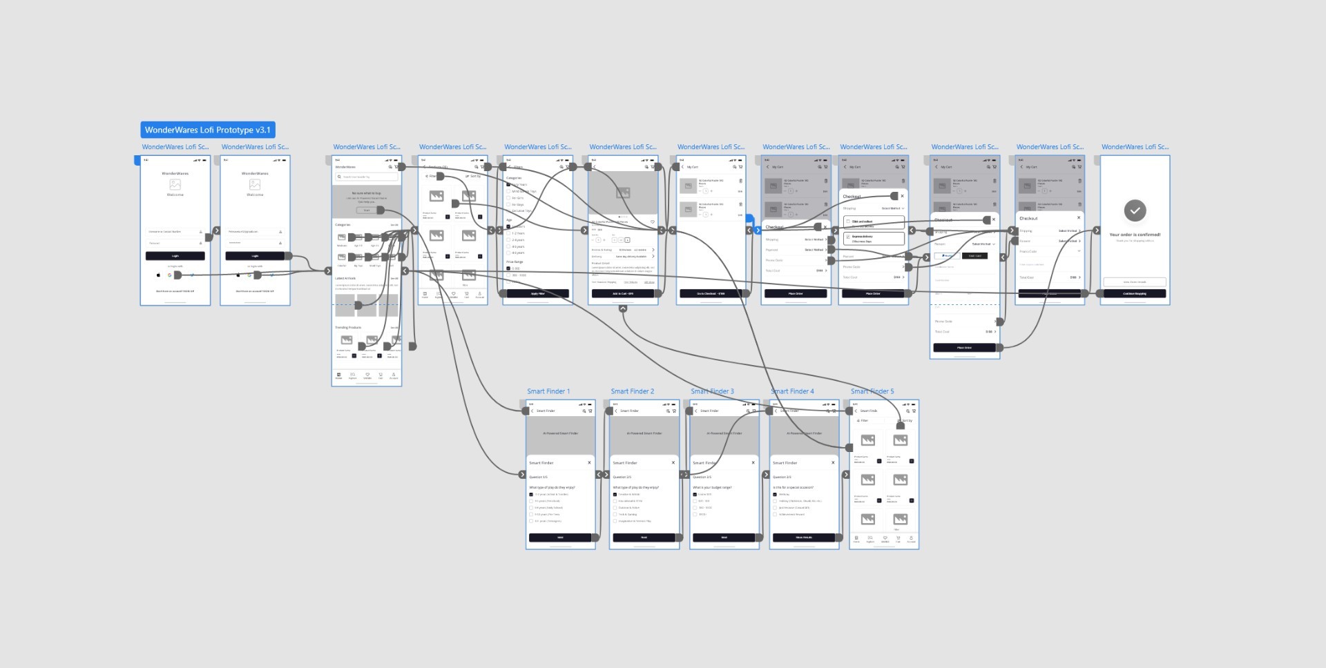
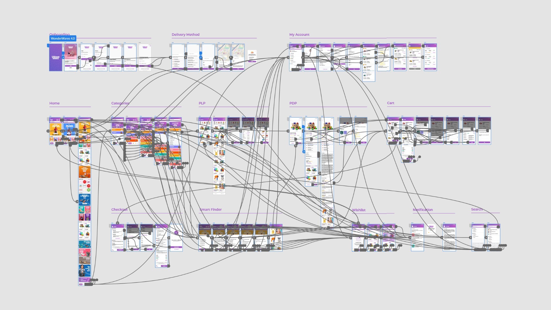
High-fidelity prototype
With all refinements in place, I built the high-fidelity prototype, showcasing the final design
with interactions, animations, and UI enhancements. This prototype closely resembled the final
product and was tested with users to ensure a smooth and delightful experience. The final design
successfully streamlined the toy shopping process, making it fast, personalized, and user-friendly.
Accessibility Considerations
Accessibility was a key consideration throughout the design process to ensure that WonderWares
could be used by a diverse range of users, including those with disabilities. I focused on
elements like color contrast for readability, clear typography, and intuitive navigation to
enhance usability for individuals with visual impairments or cognitive differences. Additionally,
I incorporated voice search and screen reader-friendly labels to assist users who rely on assistive
technologies. Simplified interactions, large touch targets, and an inclusive design approach
ensured that the experience remained seamless for everyone, regardless of their abilities.
Going forward
As the project evolves, the focus will be on continuously improving the user experience
based on feedback and real-world usage. Monitoring user interactions, analyzing behavioral
patterns, and addressing any friction points will help refine the app further. Additionally,
exploring AI-driven recommendations and personalized toy suggestions will enhance engagement
and usability.
Takeaways
Understanding user needs through research helped shape an experience that is not only functional
but also intuitive and enjoyable. Testing and refining based on usability studies highlighted the
significance of small design choices in improving overall accessibility and efficiency.
I learned that even a small design change can have a huge impact on the user experience. The most important takeaway for me is to always focus on the real needs of the user when coming up with design ideas and solutions.
Next Step
The next phase will involve further iterations based on additional usability testing,
optimizing the high-fidelity prototype, and preparing for development.
Expanding features like a voice-assisted smart finder and refining delivery options
based on user preferences will be key priorities to enhance the overall shopping experience.
Reflection
Working on this project helped me realize how crucial user research is in shaping the entire design process.
Understanding user needs and behaviors played a huge role in creating an app that doesn’t just function well but
actually resonates with users.
When the app shows the user immediate consequences of their action, there is a more personal connection.
There’s a common belief that digital products should be strictly minimalist and functional,
but my experience tells me otherwise. Users don’t just want to solve problems, they also want
to enjoy the experience while doing it. Striking that balance between functionality and aesthetics
was my responsibility as a UI/UX designer on this project.
After finishing and looking back, I felt proud of what I had accomplished. The pressure of completing
everything in limited time was immense, but it pushed me to deliver my best. I’ve learned that when
faced with challenges like this, I perform well under pressure and find ways to make things work.
Seeing the final product function as intended, making toy shopping easier and more delightful, was a truly rewarding moment.
I happen to find myslef to go through the process and happen to find something to improve in the app.
Stuff I did
✔ User Research✔ Competitive Analysis✔ Mind Mapping & Crazy 8s✔ Wireframing & Prototyping✔ Smart Quiz Design✔ Usability Testing✔ High-Fidelity Mockups✔ User Journey Mapping✔ Branding & UI Design✔ Accessibility Checks✔ Late Night Work✔ Design Meetings✔ Defending UX Decisions✔ Collaboration✔ Iteration & Testing✔ Lots of Fun
When the app shows users immediate feedback on their actions, it not only creates a personal
connection but also exemplifies the essence of great design, delving deeper into how people think and act.