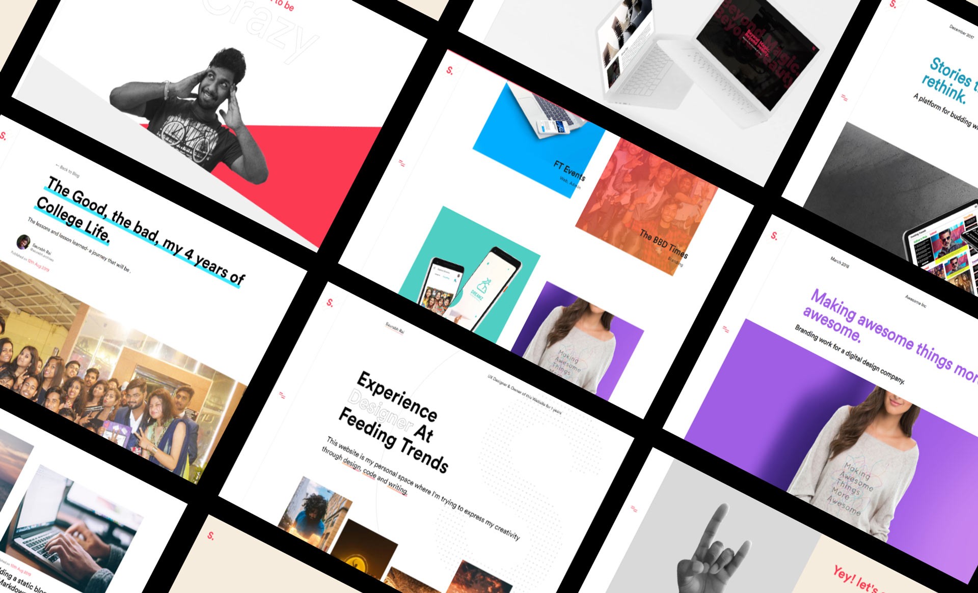
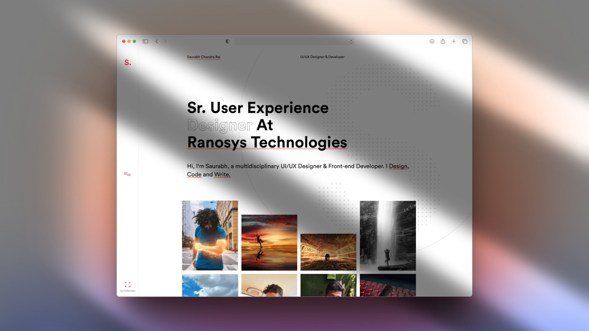
Jun-Dec 2019 Portfolio Website Website
Building My Personal Portfolio: A Designer’s Leap into Development
Jounery of challenging myself to code and stepping out of my comfort zone each day for 7 months.
Timeframe
June 2019 - December 2019
7 months
Role
UI/UX Designer
Web Developer
Team
Saurabh
Shekhar & Aman: Supported whenever I got stuck
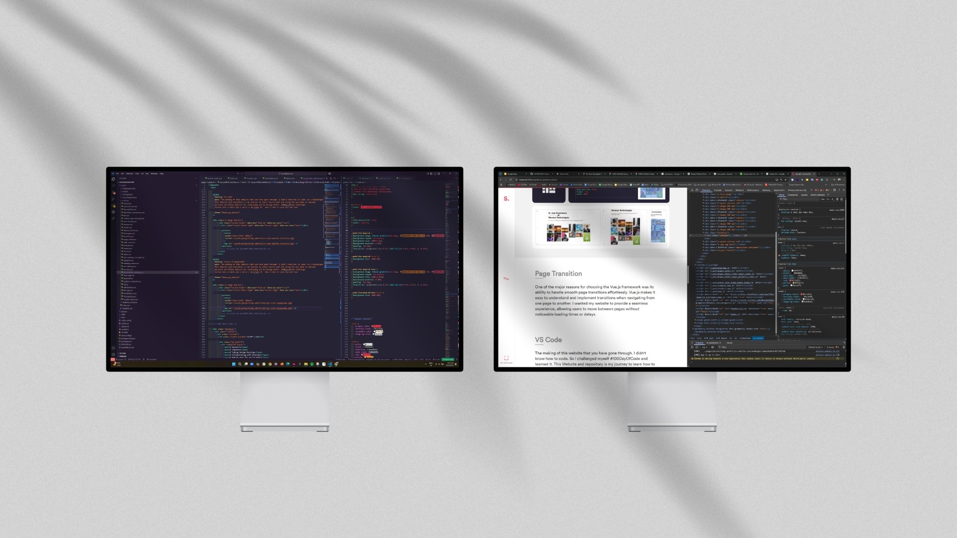
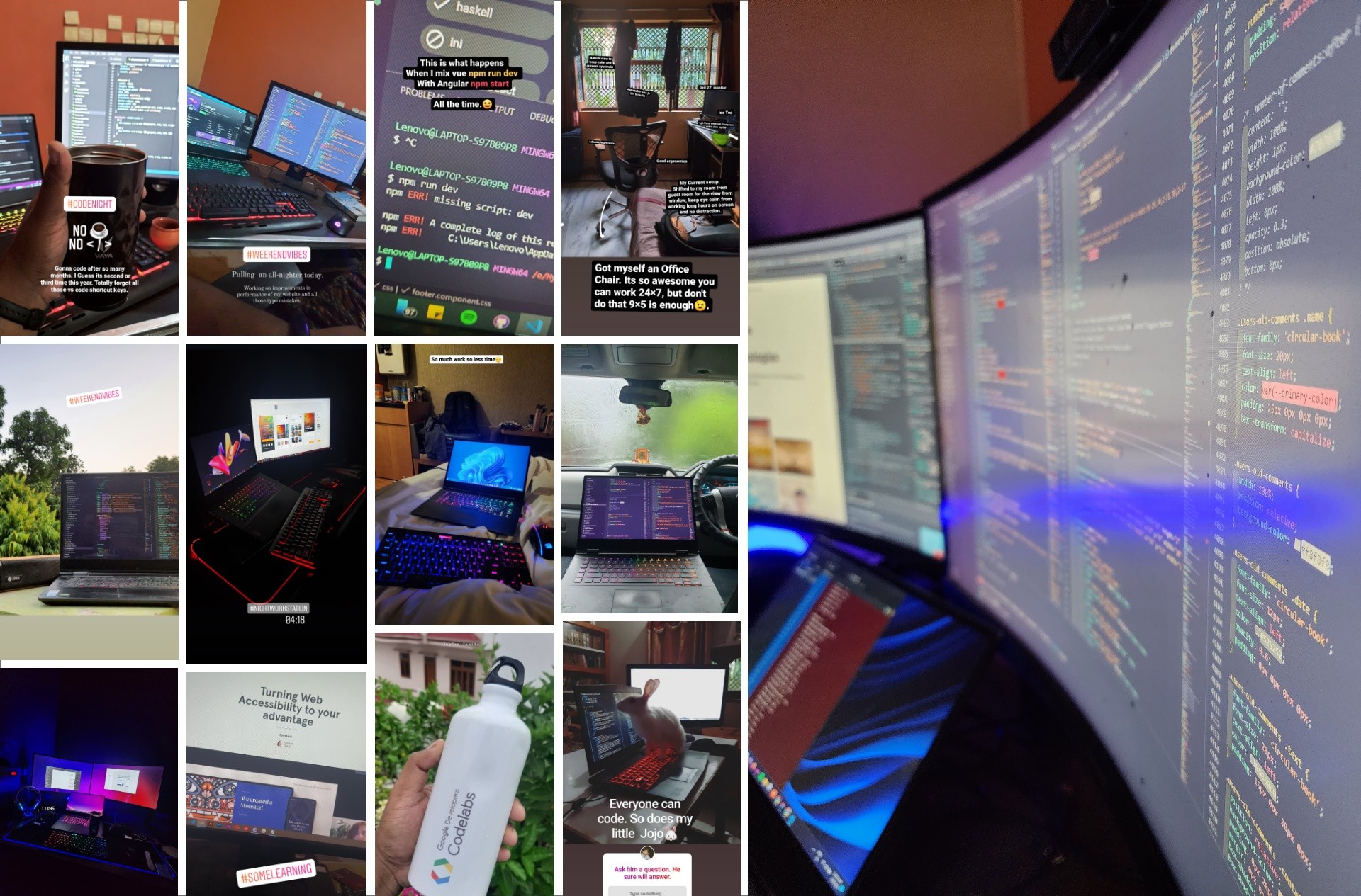
The making of this website has been a journey in itself. I didn’t know how to code, so
I challenged myself with #100DaysOfCode and learned it along the way. You can find the daily update on my Instgram under saved stories.
This website and its repository document my journey—learning to code while building an awesome personal portfolio to
showcase my design work. What started as a challenge turned into a habit and a skill I’m proud of.
Now, I enjoy coding every now and then.
I took a challenge to code design and code daily for the next 100days
and call it #100daysOfCode
Designing, Coding & Growings
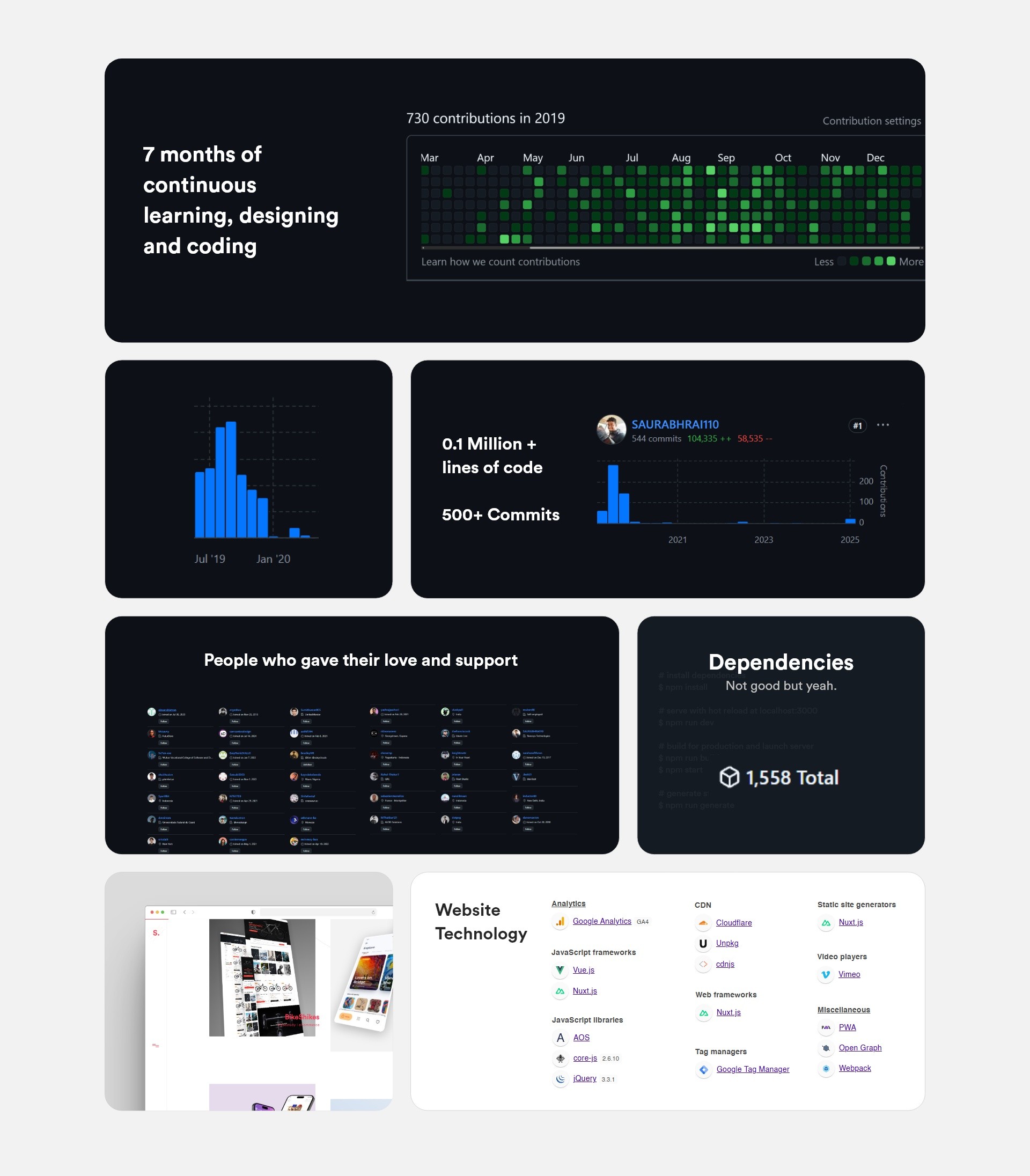
This portfolio is more than just a showcase. It's the result of seven months of continuous
learning, designing, and coding. From zero coding knowledge to over 500 commits and 100K+ lines of code,
every step has been a lesson. The #100DaysOfCode challenge turned into a habit, shaping this website into
what it is today. Built with Vue.js, Nuxt.js, and various modern web technologies, it’s a testament to persistence,
growth, and the power of iteration.
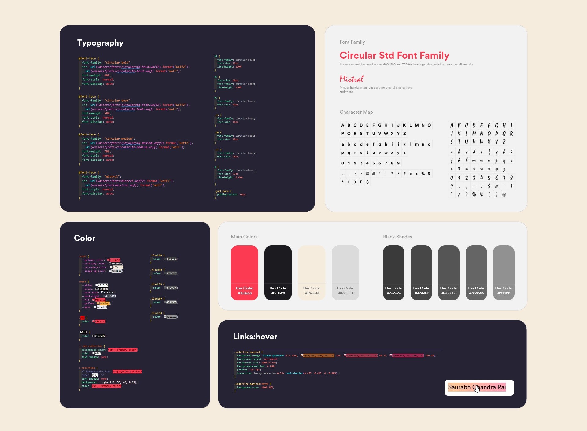
When it came to defining the look and feel of my portfolio, I wanted a color palette that felt bold yet balanced.
The mix of vibrant reds, deep blacks, and soft neutrals helped create a contrast that’s both striking and easy on the eyes.
The black shades added depth, making sure the text and UI elements stood out just right.
For typography, Circular Std was my go-to choice for its clean and modern vibe,
while Mistral added a playful, handwritten touch here and there. I played around with different weights
and styles to keep things consistent and readable. Every little detail, colors, fonts, and even hover
interactions—was fine-tuned to make the experience smooth and visually engaging.
This portfolio is built for a smooth, enjoyable experience. My main focus was getting the
hierarchy right and maintaining a clean, consistent layout. I experimented with many card
variations before settling on one. Even the main heading copy took days of iteration to get just right.
Most of the project took shape during development.
I designed only essential assets in XD and refined everything directly in code. Clean layouts,
easy navigation, and subtle animations make it both functional and visually engaging across all devices.
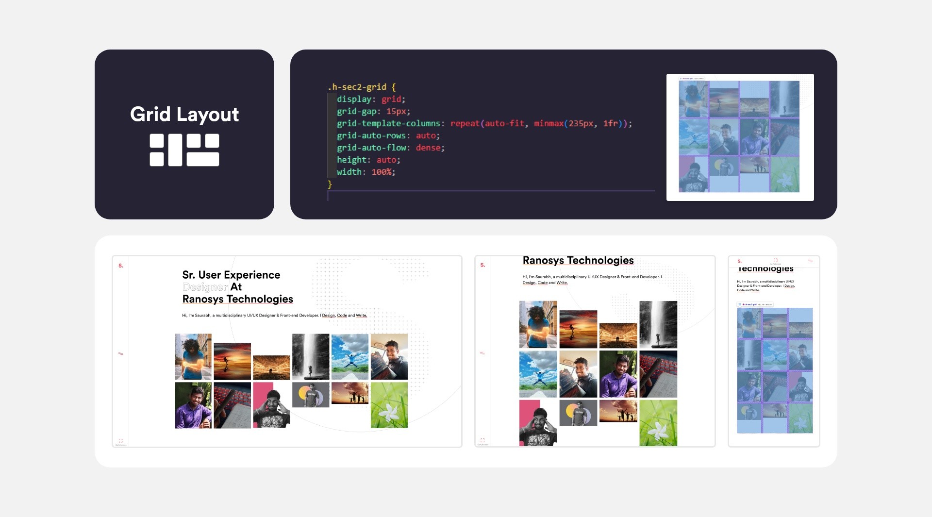
I chose CSS Grid instead of Flexbox for coding the layout because Grid makes it easier
to arrange elements in both rows and columns. Flexbox is great for layouts in one direction,
but Grid gives more control over the entire structure. This helped me keep everything well-aligned,
properly spaced, and easy to manage, making the design more organized and flexible for future changes.
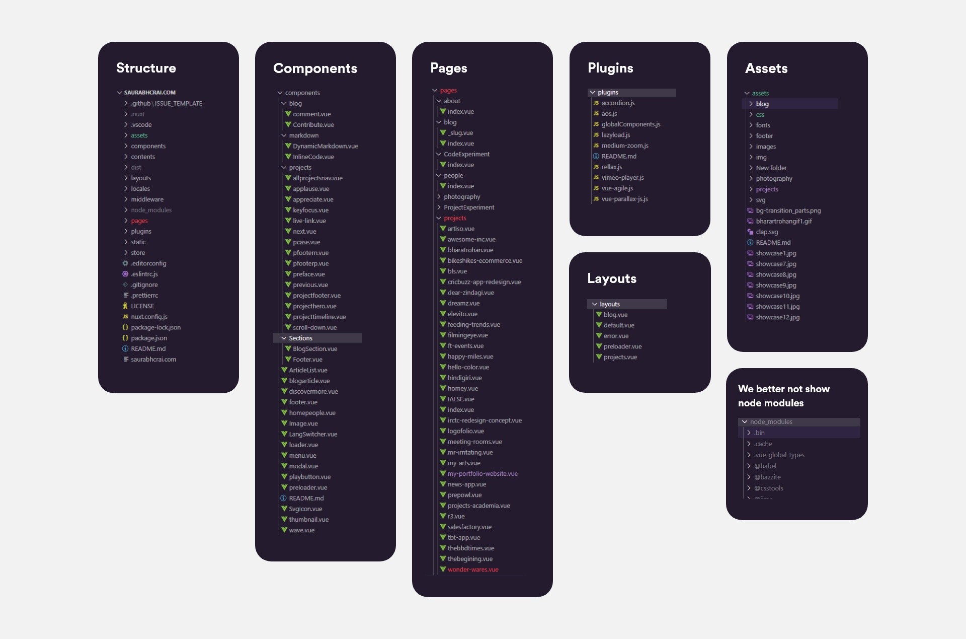
I built my portfolio on Nuxt.js for its powerful file-based routing and performance optimizations.
The structure follows Nuxt’s conventions while keeping customization flexible:
- Pages & Routing – Each .vue file in /pages automatically becomes a route, with dynamic paths for project case studies.
- Layouts System – Base templates (like default.vue) handle shared elements (header, footer) while allowing per-page overrides.
It helped me to quickly layout similar pages,
like all Projects Pages, All Main Page, whenever there is an error etc.
- Plugins & Modules – Integrated GSAP (which I dropped later), AOS, and SEO modules cleanly via nuxt.config.js. Plugins were easy to setup and use. This way I have experimented what worked for me and what not quickly.
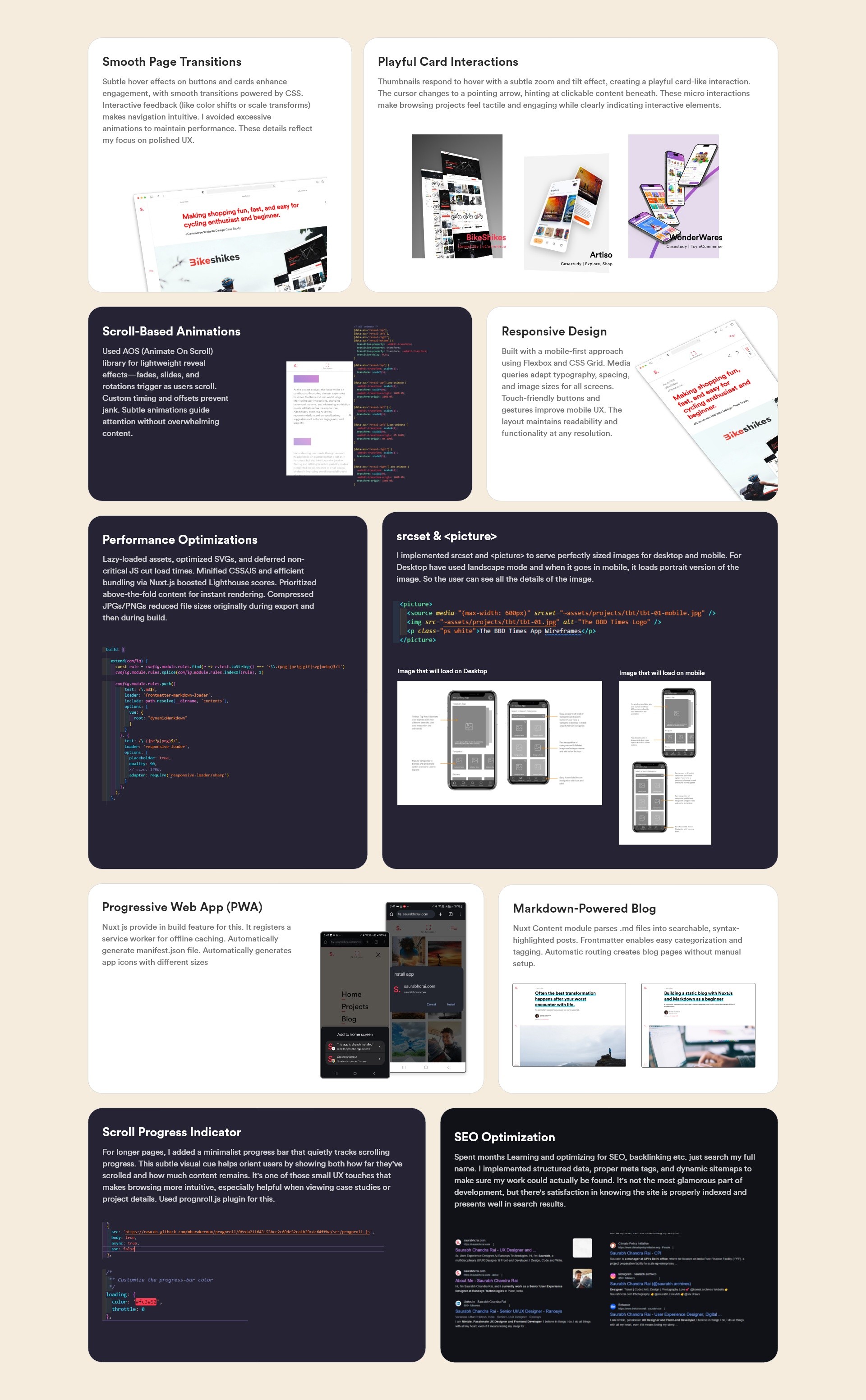
Every element of my portfolio was designed to create a seamless, engaging experience.
From playful hover effects that make thumbnails come alive to subtle scroll animations that guide exploration,
I focused on crafting intuitive interactions. The responsive design ensures flawless performance across devices,
while smart image loading delivers crisp visuals without compromising speed.
Thoughtful touches like the scroll progress bar and PWA capabilities enhance usability,
and behind-the-scenes optimizations keep everything running smoothly. Each feature balances
aesthetic polish with functional purpose—making the portfolio not just visually appealing,
but genuinely enjoyable to use.
Learning to code changed the way I think about design. It made me realize that great design isn’t just
about how things look but also about how they work. Understanding development constraints helped me create
interfaces that are both visually appealing and easy to build. I learned the value of efficiency,
precise prototyping, and solving UX problems at their core rather than just covering them up with aesthetics.
Looking back, this journey wasn’t just about learning a new skill—it was about shifting my mindset.
I now see design and development as two sides of the same coin, working together to bring ideas to life.
This experience has given me a new level of confidence, knowing that I can bridge the gap between
creativity and execution.
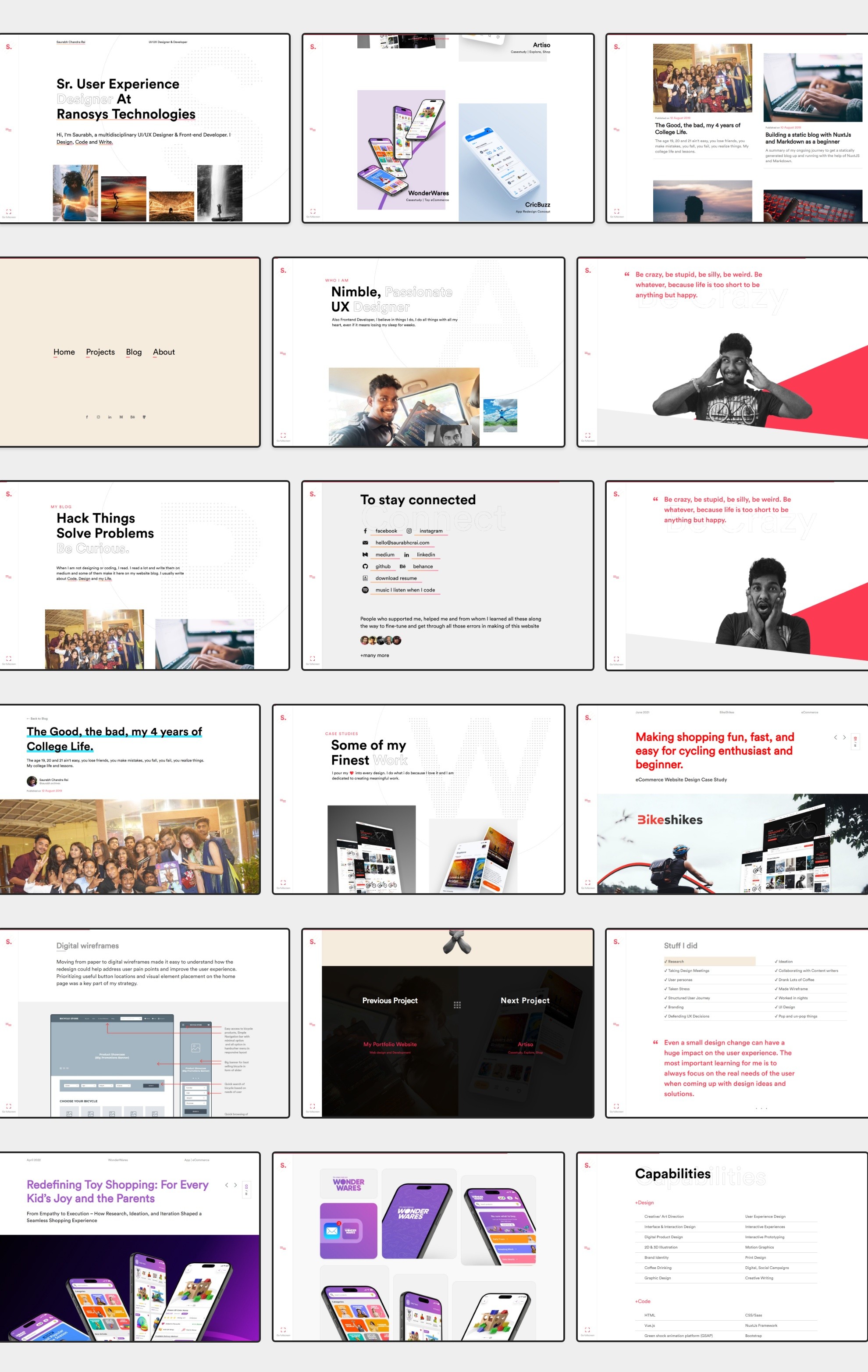
Stuff I did
✔ Research ✔ Ideation ✔ Taking Design Meetings ✔ Collaborating with developer ✔ Making Post for social Media ✔ Lots of IceTea ✔ Exporting Assets ✔ Wireframe ✔ Testing with users ✔ Creating A design System ✔ Branding ✔ Identy Design ✔ Defending UX Decisions ✔ Pop and un-pop things
Share Your thoughts
Damn you really like to scroll. Click Me.