Making shopping fun, fast, and easy for cycling enthusiast and beginner.
eCommerce Website Design Case Study
Timeframe
June 2021- July 2021
Tools
Adobe Creative Suite, Marvel, Invision
Pen, paper
Role
UX Researcher, UI/UX Designer
Designing Bicycle eCommerce from concept to delivery
Team
Me, Friends
and lot of fun.
Preface
BikeShikes is a bicycle online store that offers many brands
bicycle from categories like MTB, Road, Hybrid, eBike etc. It also
offers accessories and clothing. The typical user is between 12-45
years old, and most users are students or early career professionals.
BikeShikes goal is to make shopping fun, fast, and easy for
all types of users.
The problem
Available online shopping websites have cluttered designs, Lots
of technical terms, inefficient systems for browsing through products,
and confusing filtering out for products and checkout processes. We wanted
to tackle these problems ealry in the design stage.
The Goal
BikeShikes website overaall experience to be user friendly with easy navigation,
clear context for technical terms with no or less jotgan words. Provide all the required filter
options that the user will need while browsing for the prodcuts and offering a fast checkout process.
Design BikeShikes website to be user friendly by providing
clear navigation, clear context for technical terms, required filter
options and offering a fast checkout process.
Understanding the user
I conducted user interviews and created empathy maps to better understand the target users
and their needs. I discovered that many users see online shopping as a fun and relaxing
activity when they need a break from school, college, or work. However, many shopping websites
are overwhelming and difficult to navigate, with excessive technical jargon and little context,
which frustrates users. This turns an otherwise enjoyable experience into a challenging one,
defeating the purpose of relaxation.
User research
Personas
Problem statements
User journey maps
UX Research Study Plan
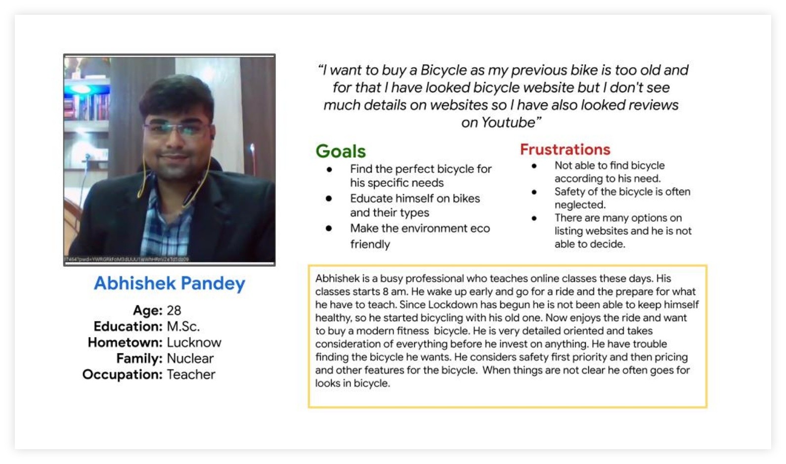
Personas
Problem statement:
Abhishek is a busy professional, Science teacher and early riser who needs a new bicycle
that can perfectly fits his specific needs related the safety and security because he wants
to able to focus on his health and fitness and also remain worry free from unwanted incidents.
Persona [Abhishek]
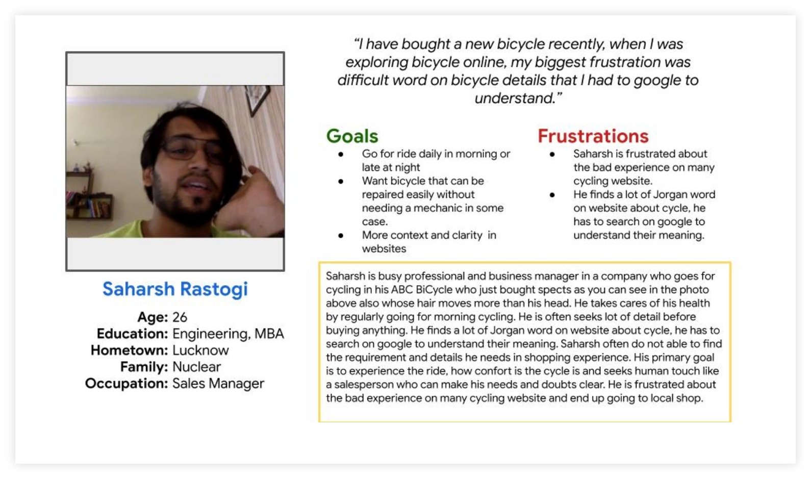
Persona [Saharsh]
Saharsh is a busy sales student manager who needs Jargon free website, and
required search filters because he want online shopping to be fast and stress-free.
I have bought a new bicycle recently, when I was exploring bicycle
online, my biggest frustration was difficult word on bicycle details
that I had to google to understand.
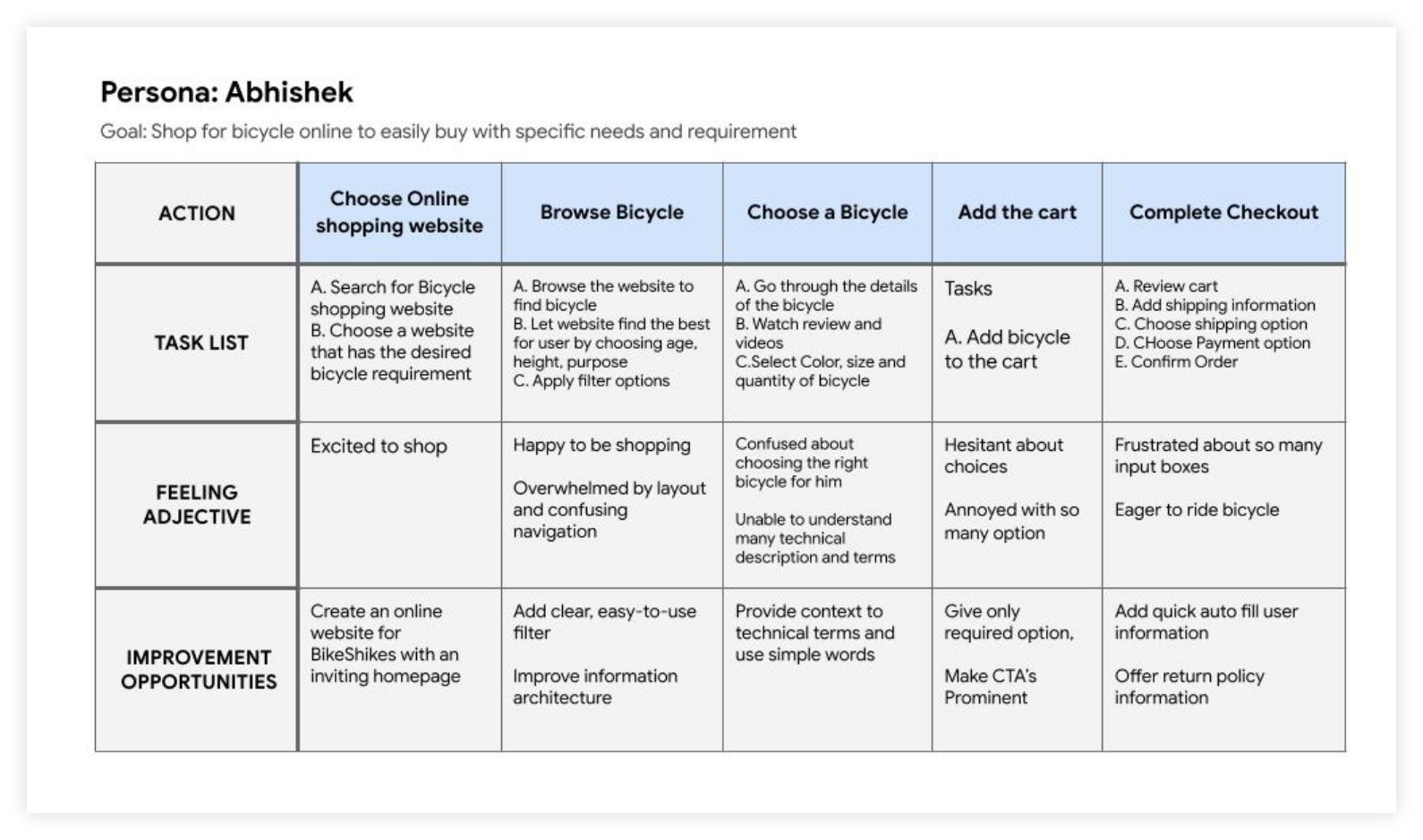
User journey map
I created a user journey map of Abhishek experience using the site to
help identify possible pain points and improvement opportunities.
User Journey Map
User Painpoints
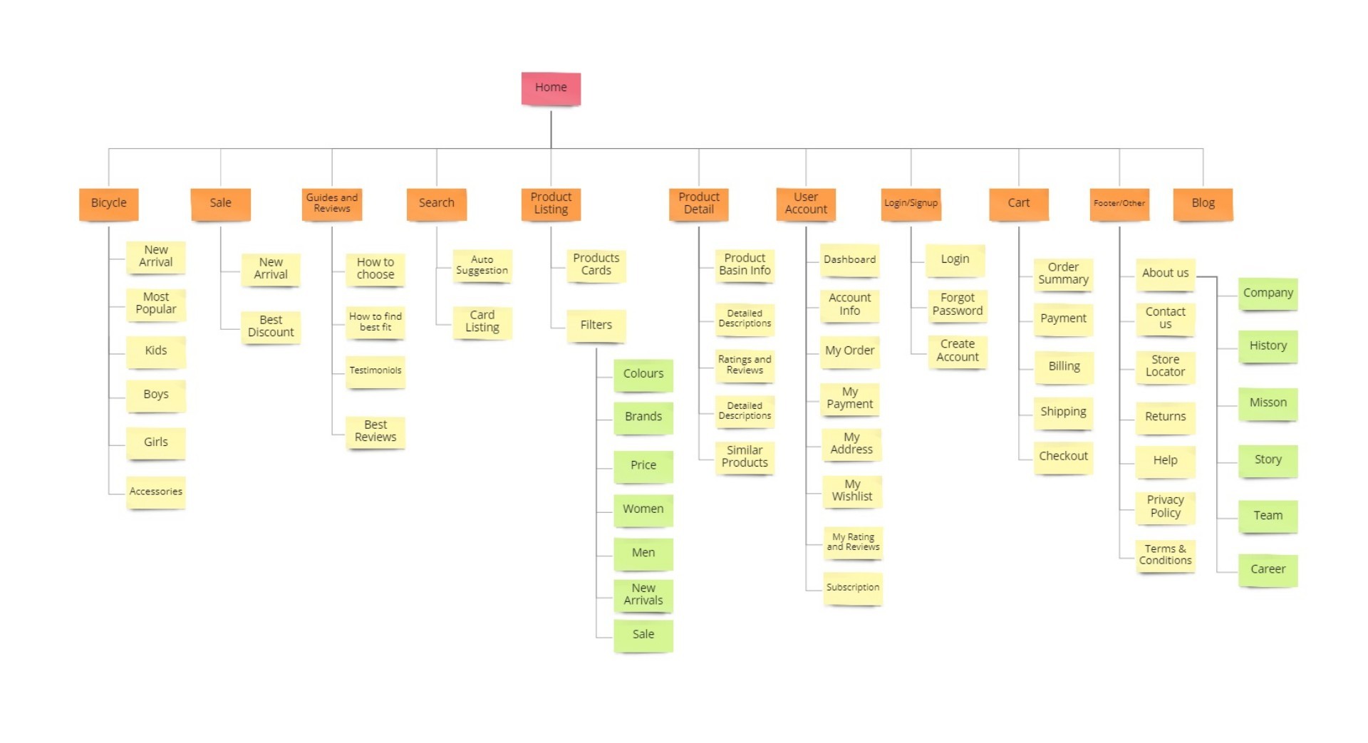
Sitemap
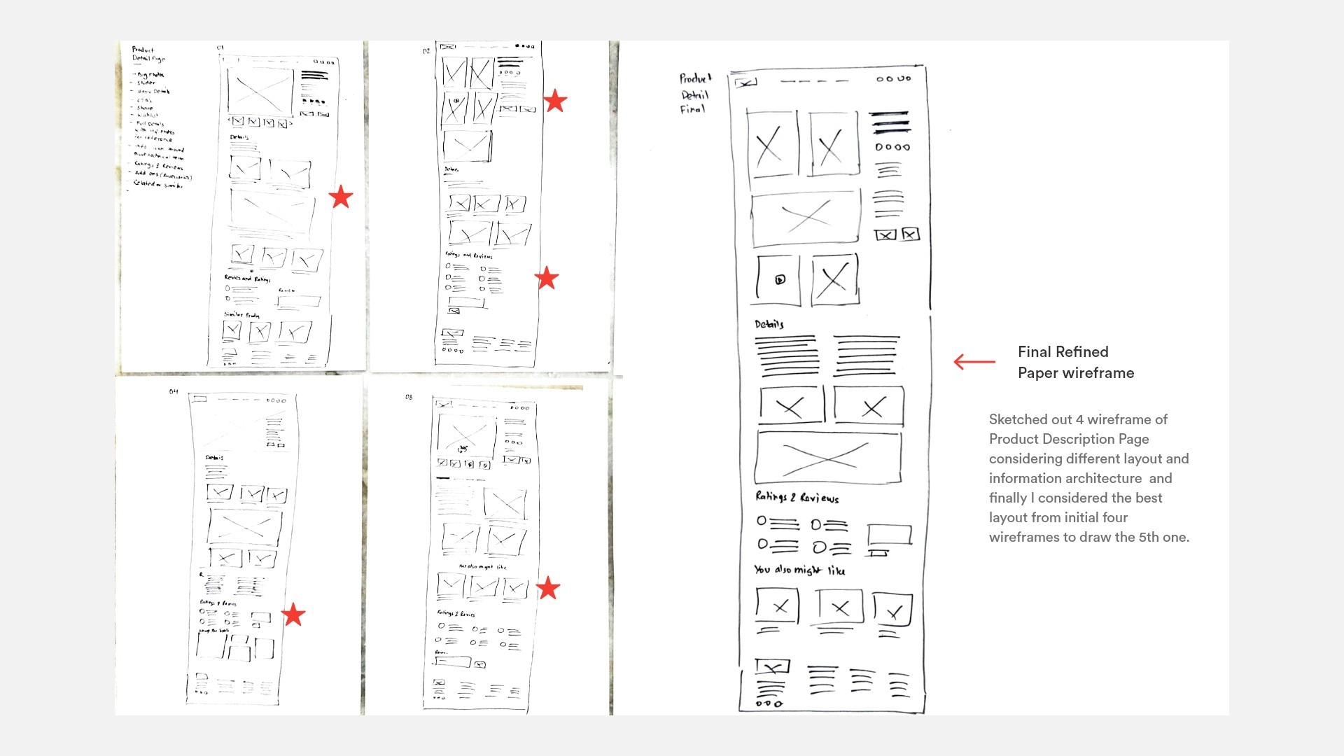
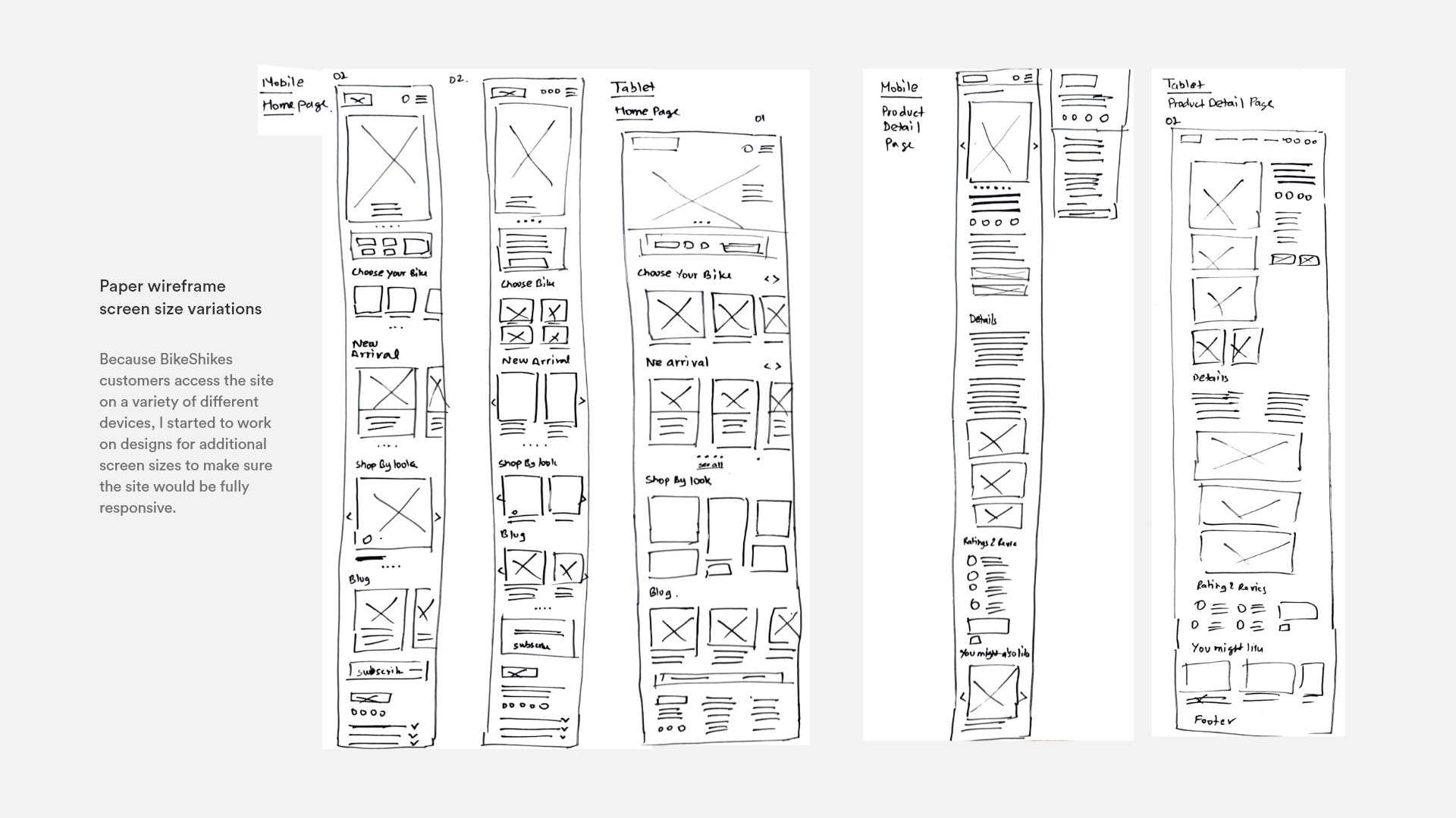
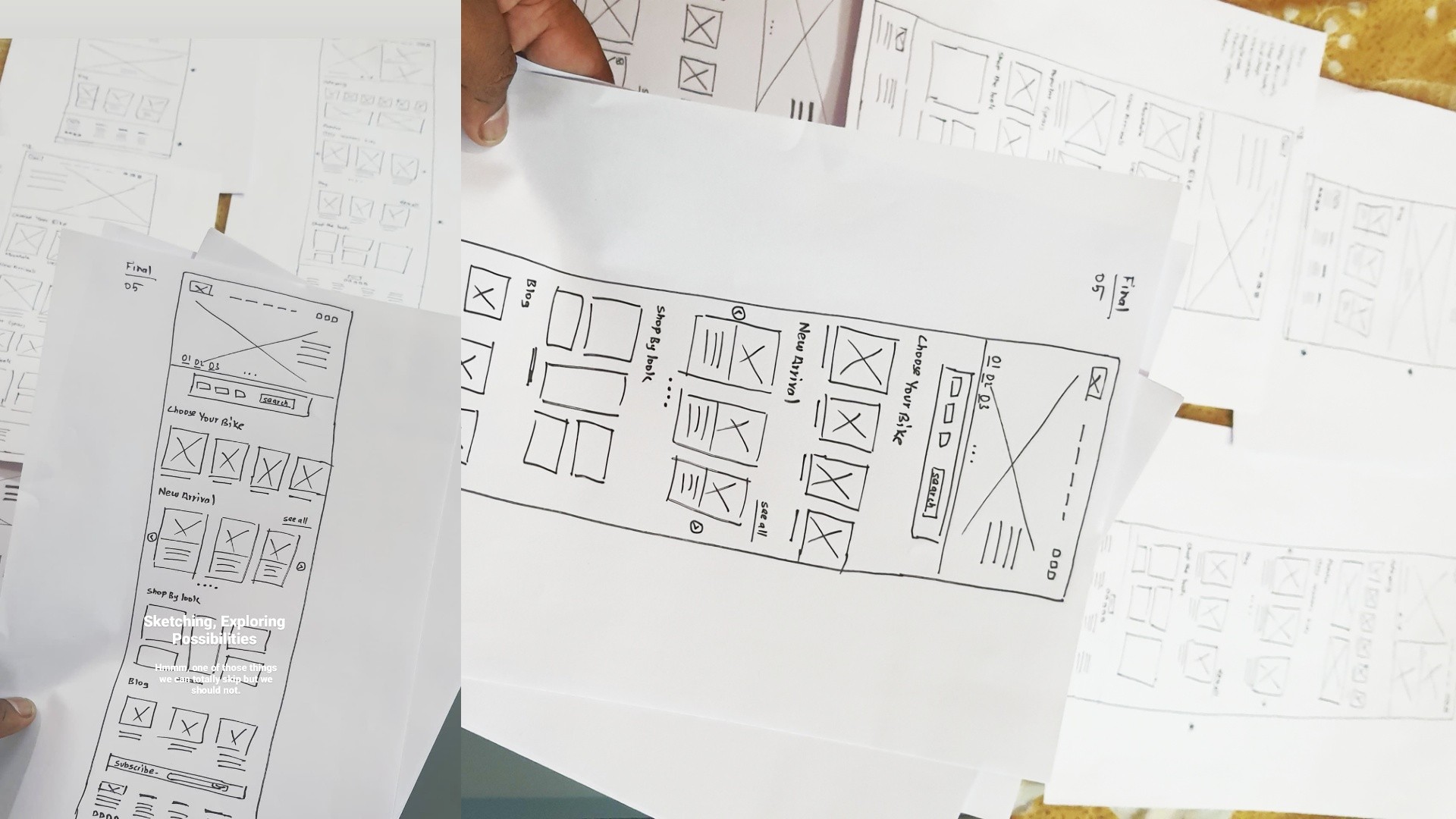
Paper wireframes
Next, I sketched out paper wireframes for each screen,
keeping the user pain points about navigation, browsing, and
checkout flow in mind.
Paper wireframes served multiple purposes. They helped me connect the site's information architecture
to its visual design by mapping out paths between pages. They also established consistent ways to display specific types of
information on the user interface and defined the intended functionality of the interface.
Digital wireframes
Moving from paper to digital wireframes made it easy
to understand how the redesign could help address user pain
points and improve the user experience. Prioritizing useful button
locations and visual element placement on the home page was a key part
of my strategy.
Here I have shown all the wireframe that was necessary to make for the user journey
to complete and so that later on I can do usability test connecting all these low fidelity
digital wireframe.
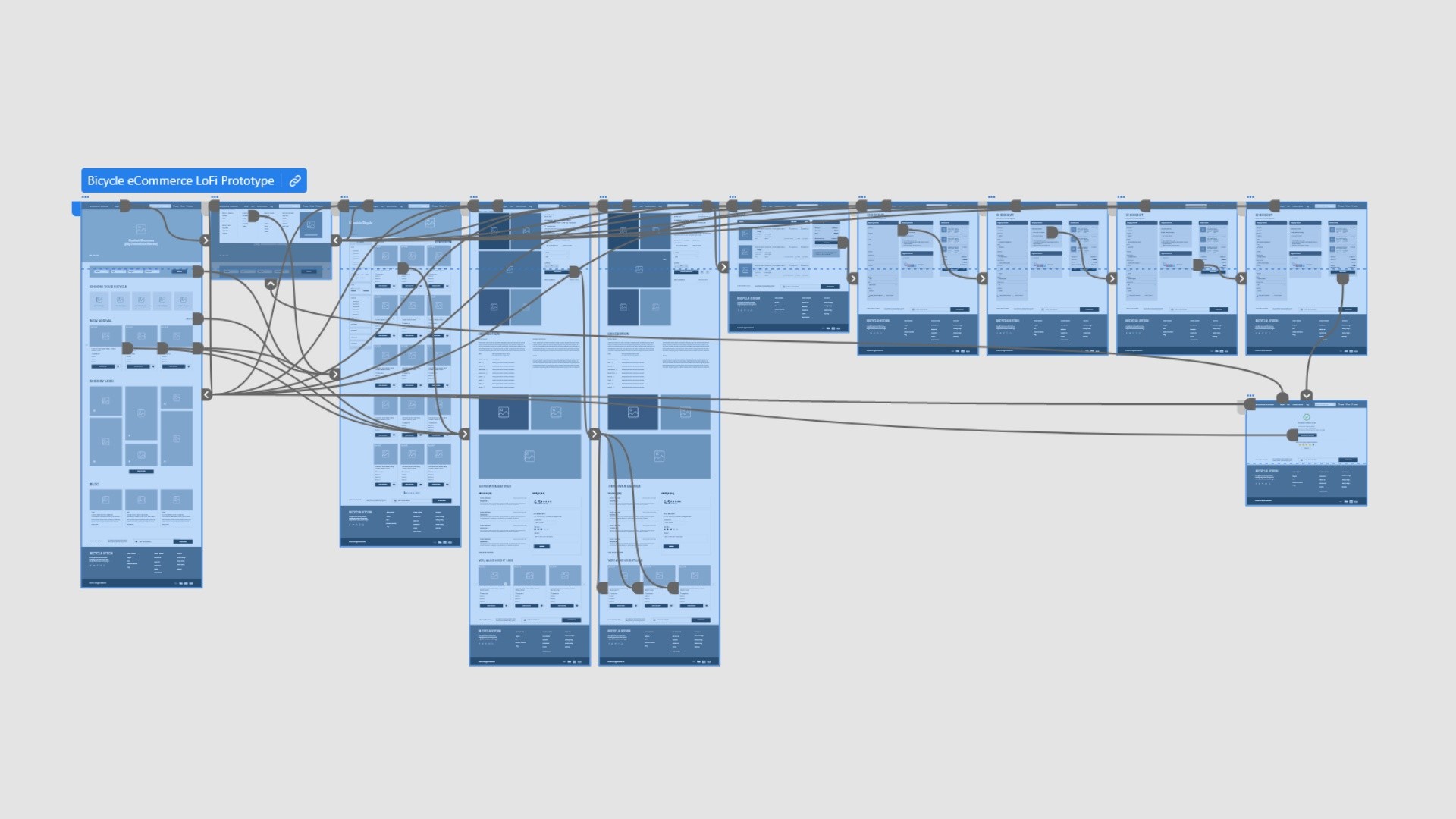
Low-fidelity prototype
To create a low-fidelity prototype, I connected all of the
screens involved in the primary user flow of adding an item to the
cart and checking out.
At this point, I had received feedback on my designs from my peers
and other visual designers about things like placement of buttons
and page organization. I made sure to listen to their feedback,
and I implemented several suggestions in places that addressed user pain points.
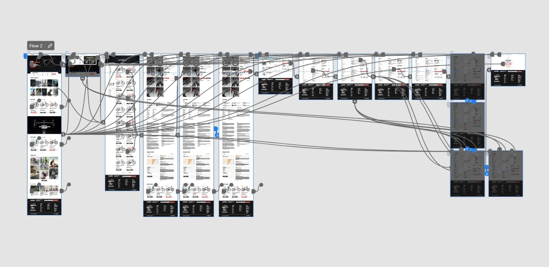
Low-fidelity prototype Page connection in Adobe XD
Usability study
To create a low-fidelity prototype, I connected all of the screens
involved in the primary user flow of adding an item to the cart and checking out.
At this point, I had received feedback on my designs from my peers
and other visual designers about things like placement of buttons
and page organization. I made sure to listen to their feedback,
and I implemented several suggestions in places that addressed
user pain points.
Usability study: findings
The usability study revealed key pain points in the shopping experience, particularly in product discovery,
cart interaction, checkout, and account access. Users had trouble finding relevant filters on the product listing page,
lacked clear feedback when adding items to the cart, and faced difficulties selecting payment methods and copying address
details during checkout. Additionally, the absence of a seamless login option prevented users from pre-filling their billing
and shipping information. Addressing these issues will enhance navigation, improve user confidence, and create a more intuitive
shopping experience.
Mockups
Based on insights from the usability study, I refined the filter options to
be more relevant and specific. I added filters such as age, categories, number of gears,
and more. This gave users greater flexibility to filter bicycles according to their specific needs and preferences.
High Fidelity Mockups
Bringing together research, user personas, and wireframes, I began adding details to each page, starting with the homepage to
establish a cohesive design theme. Once I was satisfied with its look and feel, I applied the same approach to other pages,
ensuring consistency and a smooth user flow.
I focused on providing clear next steps so users could navigate naturally in any context.
The best interface is one that feels invisible, offering a direct, accessible, and seamless experience.
Mockups: Screen size variations
I included considerations for additional screen sizes in my
mockups based on my earlier wireframes. Because users shop from a
variety of devices, I felt it was important to optimize the browsing
experience for a range of device sizes, such as mobile and tablet
so users have the smoothest experience possible.
High-fidelity prototype
My hi-fi prototype followed the same user flow as the lo-fi
prototype, and included the design changes made after the
usability study, as well as several changes suggested by members of my team.
View the Bikeshikes high-fidelity prototype
Accessibility Considerations
While designing I have kept an eye on the accessibility
consideration like color contrast, Hierarchy and Layout,
typography and all those design principles. It's always
easier to fix things that you uncover in the design process,
so it's best to consider accessibility upfront in the design process.
Going forward
Moving from paper to digital wireframes made it
easy to understand how the redesign could help address
user pain points and improve the user experience.
Prioritizing useful button locations and visual element placement on the
home page was a key part of my strategy.
Takeaways
Impact:
The website makes users feel engaged with lots of product to explore with modern, simple and intuitive design.
Our target users shared that the design was intuitive to navigate through, more engaging with the images, and demonstrated a clear visual hierarchy and users were able to easily sort products according to their need.
What I learned:
I learned that even a small design change can have a huge impact on the user experience. The most important takeaway for me is to always focus on the real needs of the user when coming up with design ideas and solutions.
Next Step
Moving from paper to digital wireframes made it
easy to understand how the redesign could help address
user pain points and improve the user experience.
Aftermath of this Project
I got into Cycling.
365 Days by 29th July and counting
Journey in photos
Stuff I did
✔ Research✔ Ideation✔ Taking Design Meetings✔ Collaborating with Content writers✔ User personas✔ Drank Lots of Coffee✔ Taken Stress✔ Made Wireframe✔ Structured User Journey✔ Worked in nights✔ Branding✔ UI Design✔ Defending UX Decisions✔ Pop and un-pop things
Even a small design change can have a huge impact on the user experience.
The most important learning for me is to always focus on the real needs of
the user when coming up with design ideas and solutions.